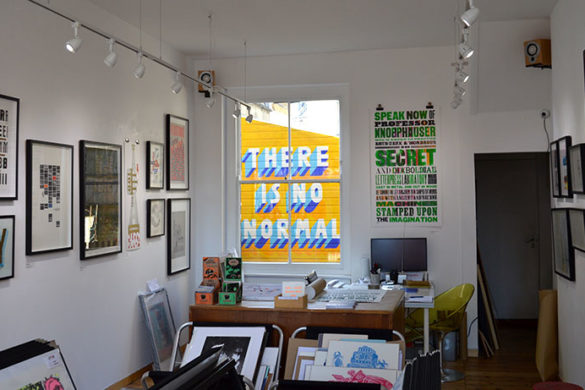
Tuesday night we had the pleasure of going to Printout, an evening hosted by Jeremy Leslie (magCulture) and Steven Watson (Stack). The evening hosted a series of talks from three magazine founders, with a focus on the element of design. It was clear that their design-focused outlook had resulted in not just boundary pushing magazines, but beautiful designed products as well. Their aims are not to just produce soulless content to fill the needs of our fast paced generation but create a product that is cherished in its own right, beautifully designed, with considered content and with their own unique identity. We couldn’t agree more and had a thought provoking and thoroughly enjoyable evening.
A Mag For All Seasons
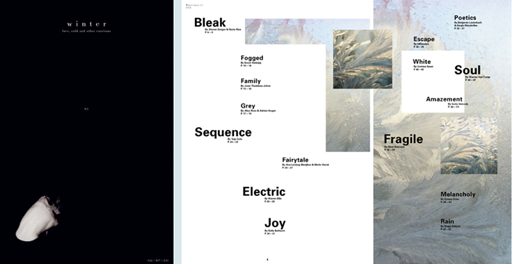
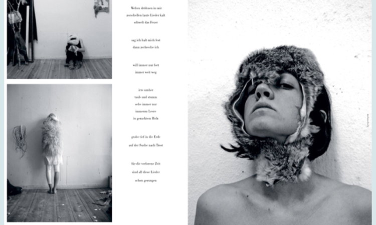
To kick of the evenings proceedings Ana Lessing & Kevin Braddock from A Mag For All Seasons opened up about the design inspiration behind their first issue, Winter magazine. As the name suggests their publication focused on the subject within each season, the first being Winter. Like us Brits it seems everyone loves to talk about the weather, and for Ana living in Berlin this was equally apparent. After extreme Winter weather conditions, (that we have been lucky enough not to experience in the UK) she decided to take an in-depth focus on this particular period, to visualise and evoke feelings and events of this long bleak month in a powerful and new way. With Winter magazine, they didn’t want to be too literal, so they focused on essays and interviews with artists and designers, featuring poetry and photography as content that tells stories and opportunities. As she explained the whole publication had to embody the feeling of the month, the cover is black, the text is small and breaking away which is almost unnoticeable on a shop shelf, and the stark naked body adds the feeling of isolation to the sparse cover. Physical design elements such as paper stock were also important for Ana, their method means the magazine has a range of paper stocks that actually reduce in weight, texture and finish throughout the magazine to illustrate heavy snow and an overbearing feeling in the depth of Winter to the lightness and freedom that is felt towards the end of the month and end of the magazine with the change in paper stock. As well as the tactility of the paper and unique size the publication the imagery, type and pace of the magazine are all considered together to form a piece of work to cherish. What’s more Ana and Kevin are now working on their next issue, Summer. It sounded like they had lots of exciting ideas up their sleeves and we look forward to seeing what they produce for this very contrasting month.
Talc Magazine
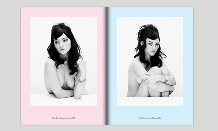
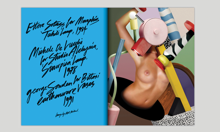
Next up we heard from Ed Vince, the buoyant young editor-in-chief of Talc magazine. Also their debut publication, it was great to hear from Ed about how his passion to publish his own magazine from the initial idea 4 years ago and its journey finally coming to print. Greatly inspired by magazine such as WET, Ed wanted to create something that had flair and passion with content that includes both the female form and great design. He wanted something that embodied its own design identity that would take you by surprise and wouldn’t give you the expected content from a saddle stitch glossy mag; and we really think he achieved that. The cover gives hints of the inside content without giving too much away, the back cover plays on the traditional use of a full page back image by actually hiding the images under a sweeping colour fade. Describing themselves as “An adult magazine for modern times” this seems exactly what they have achieved. Ed talked about how the magazine plays with the conversation of the pornification of culture where traditional porn has been replaced by, “architecture porn”, “graphic design porn”, “book porn”, “cat porn” and this is defined in Talc in one of their essays; “Porn is now also used to describe a collection of objects or photographs of objects that appeal greatly to our particular tastes and aesthetic preferences.” This seems to sum up the ideology of this smart magazine. They appear to know what their audience want to see and read, taking them as intellectual observers of todays culture and what the magazine and the brand offer.
For them Talc is not just a magazine. Ed explained that Talc being produced as a magazine was a platform that seemed most appropriate way to display the content at the time. By considering Talc as a brand they have not settled to a monthly release date of a scheduled magazine but are open to see how the brand grows, creating successful merchandise, collaborating with large brands and pursuing design and content as their main goal. This means creating short films as content and diversifying into a fashion brand, simply finding the most suitable form that most suitable highlights their content.
mono.kultur
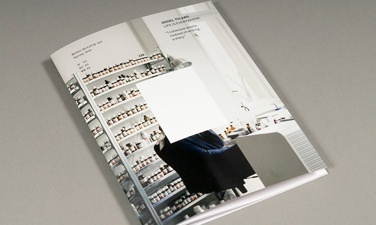
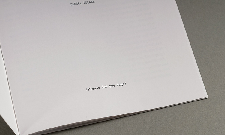
Lastly, was the well-established mono.kultur who have just released their 36th issue of the magazine. Like both Ed and Ana touched on in their talks the issues of funding have generated difficult hurdles for the production of their magazines. The bold step in which all three publishers have taken to not have any advertising in the magazines was also an interesting link, and their unanimous agreement for this was that they “didn’t want adverts to take away from the design feel and concepts” of their publications. This essentially meant they all took different means to fund the publishing. For Kai von Rabeneau of mono.kultur this initial directed the concept of their magazine by reducing their page count for financial reasons, this set up the idea for the magazine. Instead of trying to squeeze a lot of content into a smaller magazine came the idea of focusing solely on one artist / designer for each issue. This with it has brought the magazines ongoing success. The design used to be structured with simple layout out that drew full attention the person in discussion, but with time they have collaborated with designers letting them play with design – even featuring a purely digital magazine that would give the reader (viewer) a different experience being able to listen to music that was being discussed in the magazine. He also gave into to another fear of his, producing a magazine with no imagery. When Kai met scientist and artist Sissel Tolaas and dedicated an issue to her, he came across the challenges of working with an artist that has no visual media but instead has spent her whole life studying and making smells. After some gentle persuasion and with some hesitation the magazine was published with no imagery apart from the cover and instead infused with 12 hand created scents by Sissel Tolaas. This issue was a huge success and shows there really are no boundaries with print. Kai’s attitude to print and publishing was great, he was once asked why the name of the magazine was so small and he just replied that it doesn’t need to be bigger its about the artist on the front and the design and content that matters.
It was fascinating to hear from three great speakers and their stories of how they have fought to produced publications that they themselves sometimes claim as ‘self-indulgent’ – but essential don’t conform to any rules and give them freedom to produce new and exciting content in a method that adds to the history of all the things you can do within print.
http://www.amagforallseasons.com
http://www.talcmagazine.com
http://mono-kultur.com/current
http://magculture.com/blog/printout-designing-difference/
- Amelia Graham | Interview - February 8, 2016
- Steffie Brocoli - December 21, 2015
- Hello!Lucky - October 8, 2015

