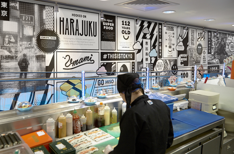
After almost 20 years since its establishment in 1997, UK’s first Japanese conveyor belt sushi restaurant, Yo! Sushi, has recently undergone an incredible makeover and is also announcing its new strapline ‘This is Tokyo’. Specialising in branding for hotels, food and drink, London-based design studio &Smith have teamed up with Yo! Sushi to refine their brand strategy and have created some designs that have been rolled out across 70+ Yo! Sushi restaurants across the country and are about to appear on all sites in the US later in spring 2016.
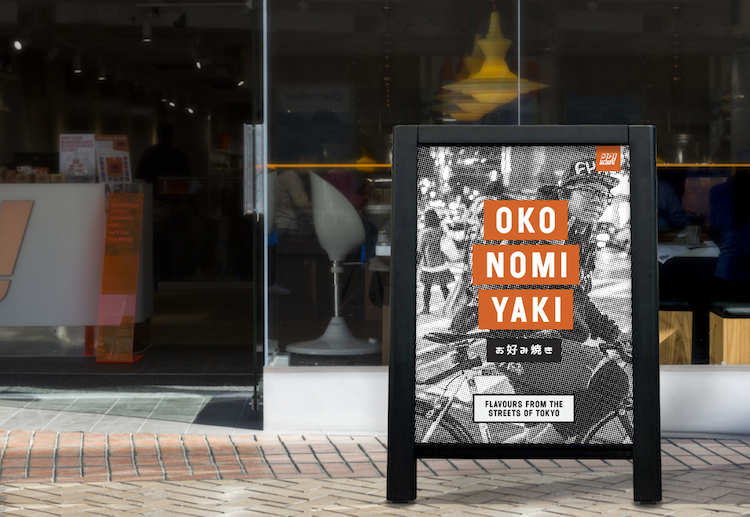
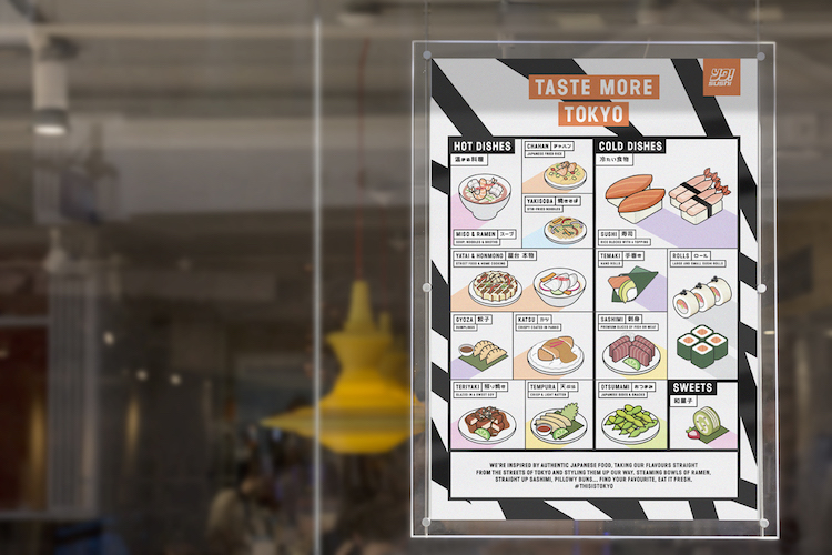
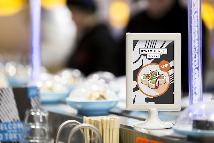
Inspired by Japanese anime and manga culture, A-boards, menu boards as well as window wraps and other illustrations were designed for customers to experience ‘a true taste of modern Tokyo’.
“We wanted to give everyone a taste of what’s going on in Tokyo right now. That’s where the zine/newspaper menu idea came from. It gave us the chance to show some nice snippets of art, fashion and music alongside their food. The idea is that the editorial content will change four or five times a year.” – Dan Bernstein, &Smith Director.
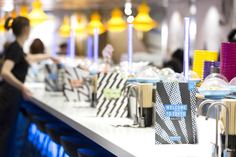
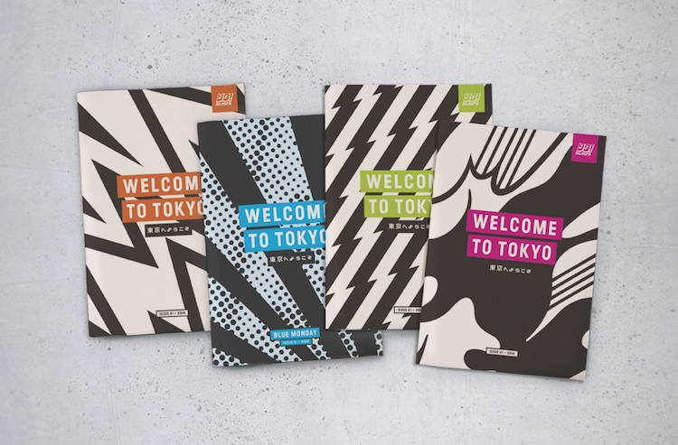
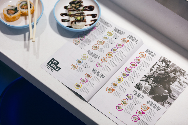
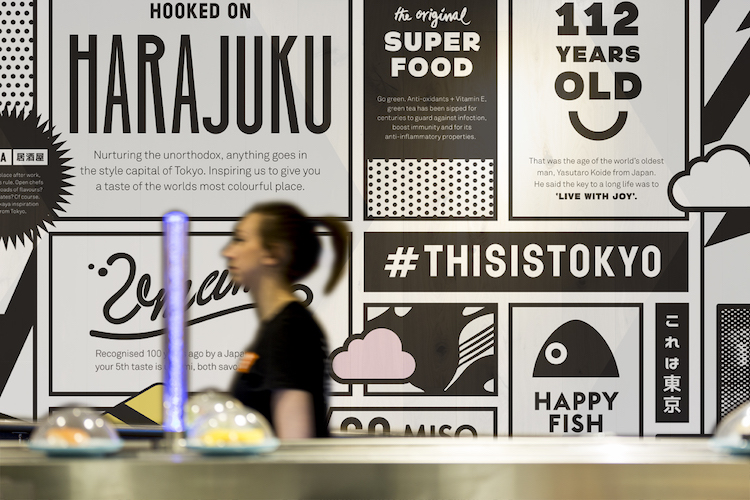
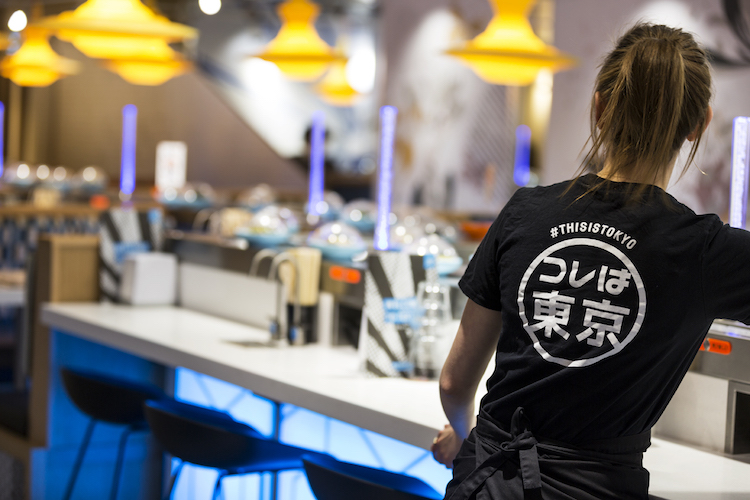

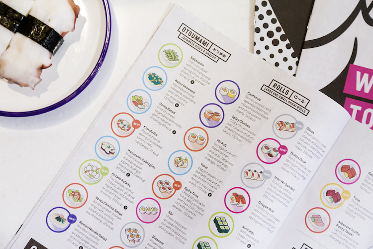
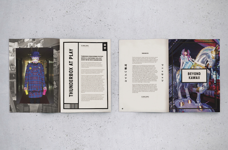
“As soon as I interviewed Mike Lewis (the executive chef) on day one, I knew our idea had to be centred around authenticity. He told me his tales of searching the streets, homes and restaurants of Tokyo hunting down the best recipes and ingredients to bring back to the UK. From then on it was obvious this was something we had to shout about.” – Dan Bernstein, &Smith Director.
www.andsmithdesign.com
www.yosushi.com
You might like...
- Icinori - February 9, 2021
- Sergio Membrillas - December 18, 2020
- La Perruque: Type Magazine - December 8, 2020


