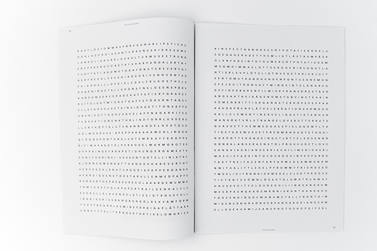
An intriguing experiment into how one can appropriate the use of typography to censor something private or personal is showcased through the exceptional design of Anna Ahnborg’s exquisite publication Fade into you / Can you read me. Combining minimal design with an array of mesmerising visual contrasts, the intelligent concept is undoubtedly powerful enough to successfully channel the less is more aesthetic, challenging perceptions as the receiver is forced to subvert their known way of reading and thus immerse themselves within the text to unveil the concealed messages.
The content consists of the results of a project between Ahnborg and a friend, where the same questions were answered every day for a period of a month, thus the results slyly communicate through typography as a form, extracts of important parts of their lives.
From the use of warping and layering to word-search grid structures and words acting as the base of a letter, answers of the project are fragmented through beautiful design, extracted from their context while still tied to memories, at first glance portraying a host of nonsense but once focused, the revealing of secrets and events both personal and private are amazingly apparent.
Dependent on the receiver, the words find new meaning and thus new context, ironically similar to the use of social media, as the publication portrays a deliberate nod to how we publish ourselves online, specifically how we censor ourselves with the help of filters and aliases, highlighted once more through the fact Fade into you / Can you read me features two covers and thus two beginnings.
Anna Ahnborg is a multidisciplinary Graphic Designer and Illustrator from Stockholm, Sweden, whose focus spans graphic design, typography and packaging. To view more of Ahnborg’s undeniably impressive portfolio, view here.
- Kristina Suvorova - March 27, 2017
- Andrés Gallardo Albajar - March 21, 2017
- Marietta Varga - March 14, 2017


