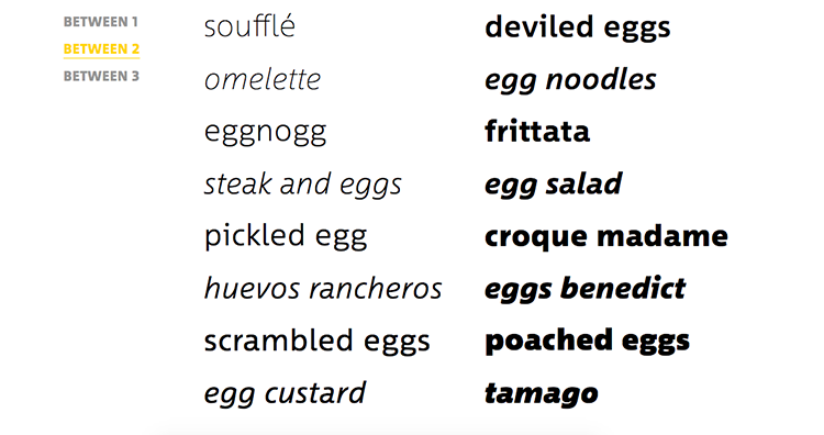
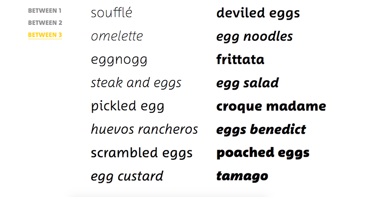
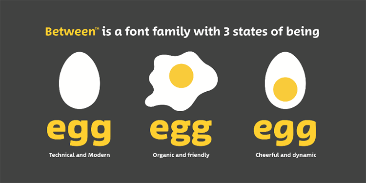
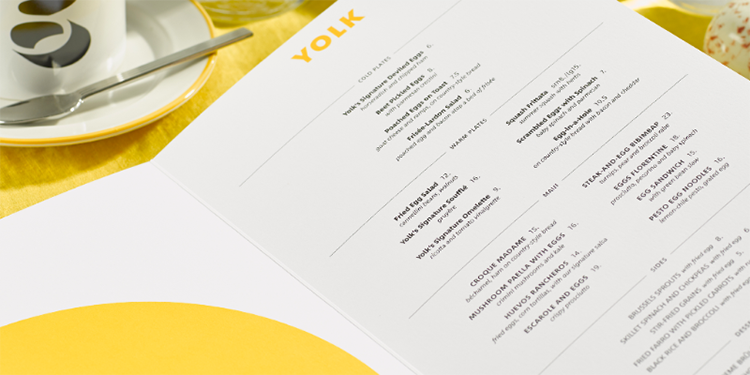
Monotype is a world leader in empowering expression and engagement through a combination of type, technology and expertise. Headquartered in Woburn, Massachusetts, US, Monotype provides the world with typeface solutions for a broad range of creative applications and consumer devices. Most recently Monotype introduces their new typeface designs created by Akira Kobayashi. Between incorporates the hard and sharp perfection of the 20th century typefaces and the approachability of human-centred designs, it’s three designs each offering a different level of energy and speed of movement. Monotype’s Akira Kobayashi has created eight weights and italics for each of the three, giving Between a fluidity and sophistication that makes it applicable for a wide variety of uses. The construction of the typeface plays on humanist and rounded sans serif designs, offering a typeface that can fluidly transition between the three different ‘energy levels’ as the context demands. Furthermore seamlessly switching from technical and modern to crisp and highly legible into warm and friendly.
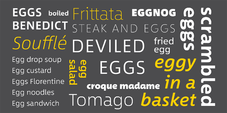 Akira Kobayashi lead his type constructions based on his response to a global trend of rounded and humanists sans serifs rather than more traditional typefaces. He set out to design a DIN®-style sans serif typeface that was approachable and versatile that offered the right blend of coolness and warmth to make it both confident and professional and engaging and friendly.
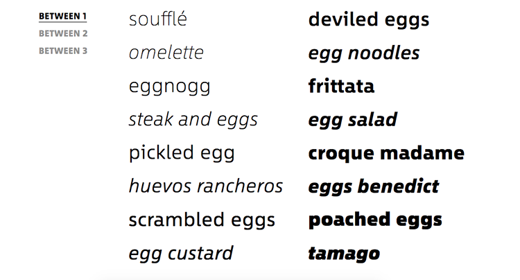
 “There is one characteristic that runs through the Between typeface family – the natural rhythm of letters. I did this deliberately to give Between the ability to transition from one use to the next. For instance, a brand can use one Between design for a bold and strong headline, and another design for body text. While the styles of Between are related, they are different enough to elicit separate and distinct reactions from readers. To me, Between is like an egg. It can be prepared a number of different ways based on the needs of the chef, and every form it takes can be pleasing to consume” says Akira Kobayashi.
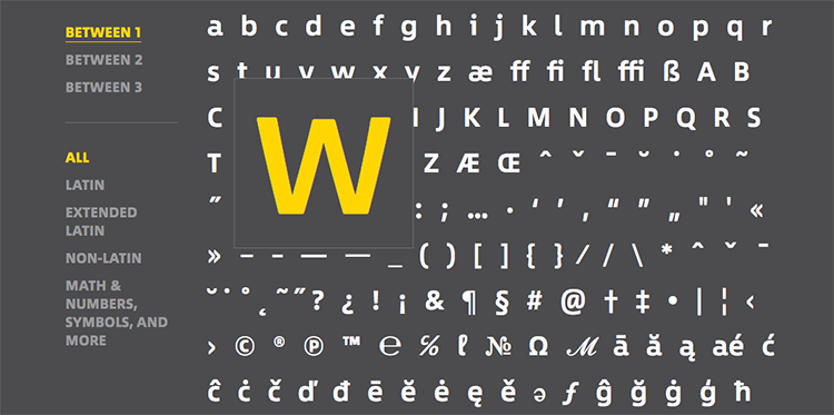
 In terms of what the three individual weights convey and represent, Between 1 is the most modern, fusing industrial and humanistic san serif styles. Between 2 comprises natural-looking letterforms that strike a balance between crisp legibility and friendliness. And finally, Between 3 offers a lively, handwritten look – a freestyle sans serif with an uplifting, youthful and dynamic feel. All three designs share the same cap height and x-height and have letterforms in common – establishing a clear family relationship between them. However, certain characters such as ‘e’ and ‘g’ both demonstrate the unique characteristics of each font in the family, and embody the differences between them.
You might like...
- Posterzine™ Issue 46 | Marylou Faure - September 16, 2019
- Posterzine™ Issue 45 | Mojoko - September 13, 2019
- Posterzine™ | Karl Grandin - August 21, 2019

