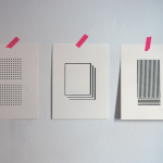
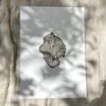
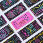
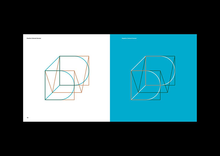
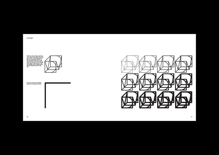
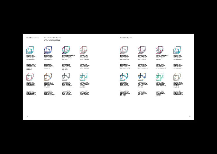
We present another fantastic project completed by TwoPoints Design studio consisting of a new corporate identity for NYC architecture firm Dash Marshall. A successful execution for a client comes from really understanding the brand attitude, approach to their particular medium and the context within which they operate in. So, when developing the identity TwoPoints realised that architecture acts in the intersection of the old and the new, the static and the flexible, the properties of matter and the lives of people. Within these constraints, TwoPoints tells us, Dash Marshall creates spaces which tell the stories of their habitats and invites them to create new ones.TwoPoints have also not just designed their Visual Identity, but also their website, the book “Matter Battles: 45 Lessons Learned” and the booklet “Small Measures”.
 A quote that helped their concept and ideas towards the design was:
“Just as Michel de Certeau argued that spatial stories are what actuate the notion of place, our physical environments can give rise to new characters and events by organizing, proffering and collectivizing human sensibilities. They may even allow certain transgressions to occur, as the Independent Group aspired to do. For this reason, an architecture that upholds its commitment to its users holds tremendous power: its narratives of the past and present are the framework from which to imagine the future scripts of tomorrow.” writes Esther Choi in the preface of the book “Matter Battle, 45 Lessons Learned” by Dash Marshall.

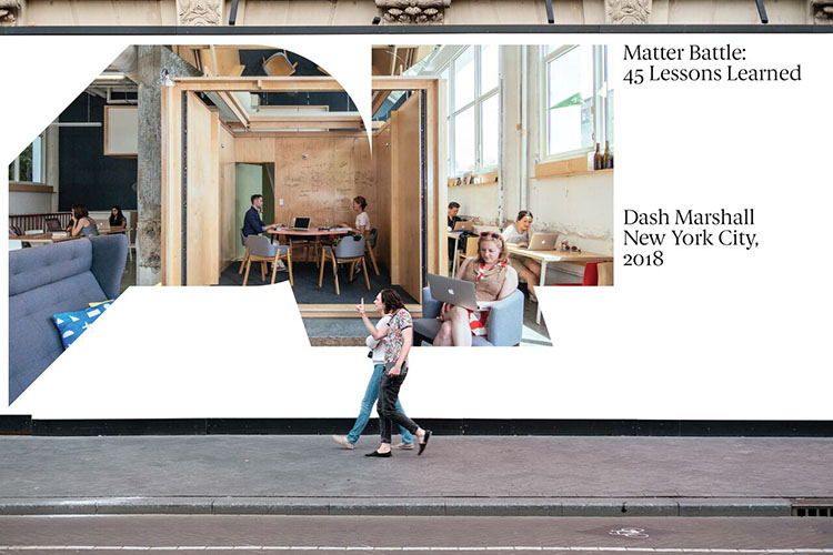
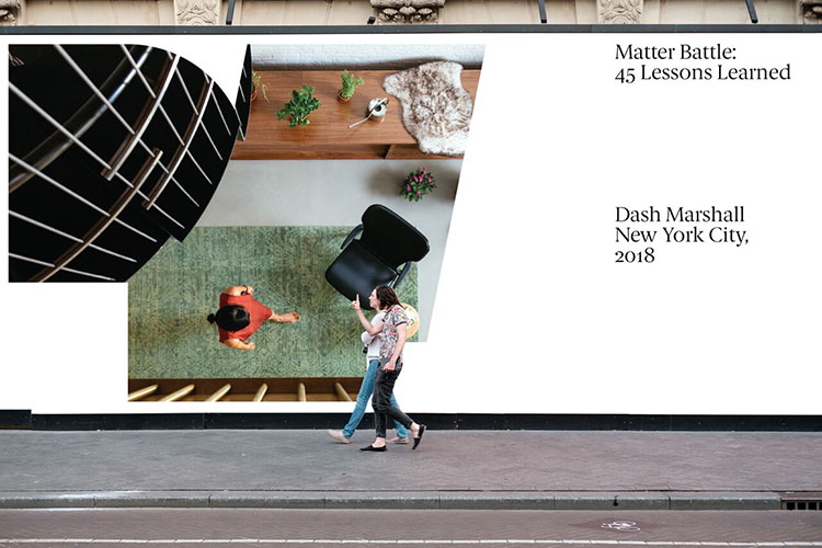
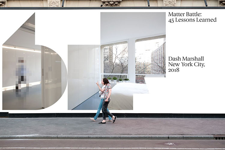 In the end, their solution took the form of a flexible visual identity which works within a confined space of the letters “D” and “M”. Like outer walls of an apartment or the plot of a house, the letters “DM” create a confined space, but within this framework nearly anything is possible. TwoPoints also tells us their biggest challenge was creating this particular corporate communication in an almost exclusively digital. To design a consistent visual language for an architecture office, acting in the material, but communicating in the immaterial world, was the challenge.
You might like...
- Posterzine™ Issue 46 | Marylou Faure - September 16, 2019
- Posterzine™ Issue 45 | Mojoko - September 13, 2019
- Posterzine™ | Karl Grandin - August 21, 2019


