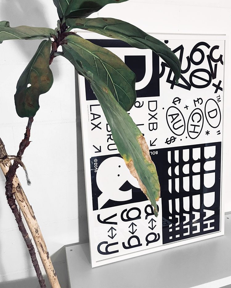
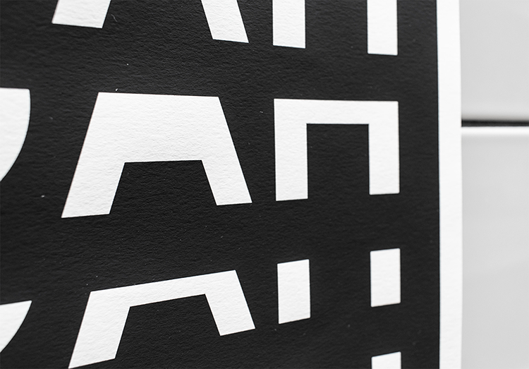
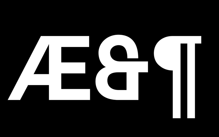
INCREASE is a new typeface designed by 22-year-old German graphic design student Fabio Biesel. Within his process, Biesel always tries to build a bridge between the clear and the surprising and having wanted to create his own typeface for a long time, we’re happy to feature this lovely typeface design our blog.
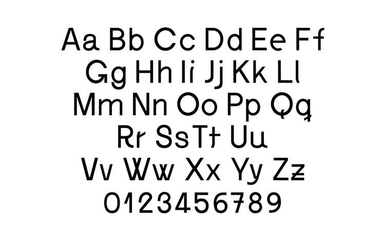
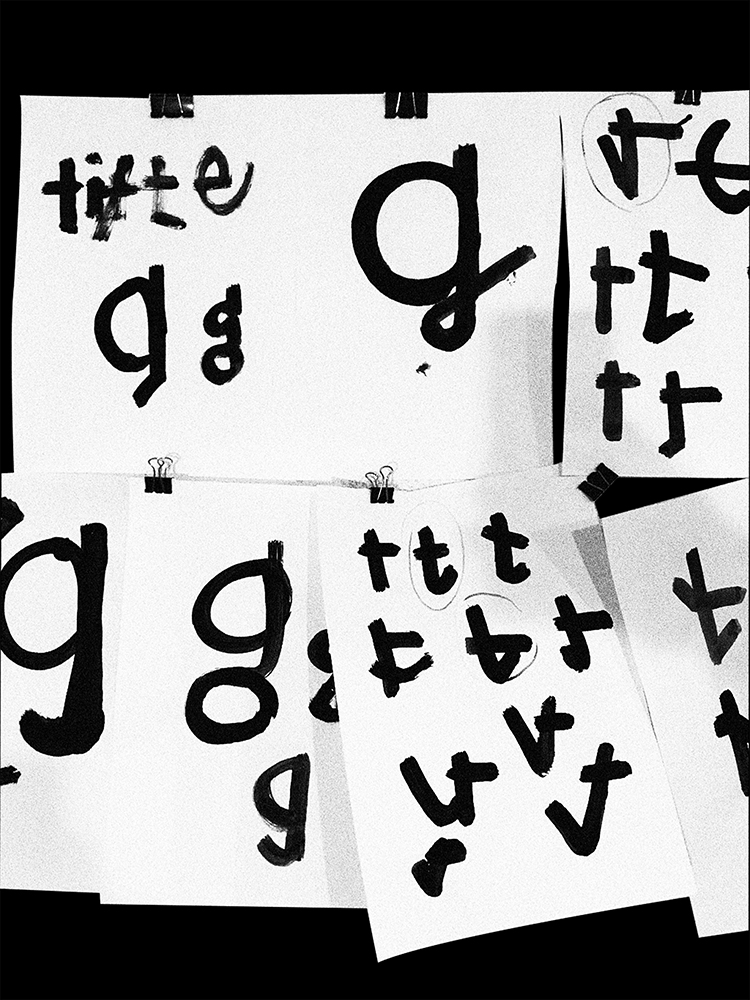
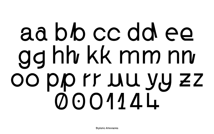
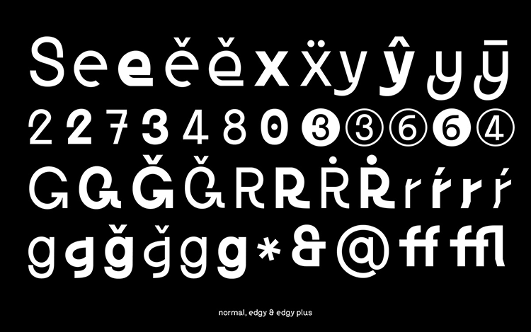
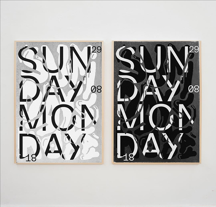
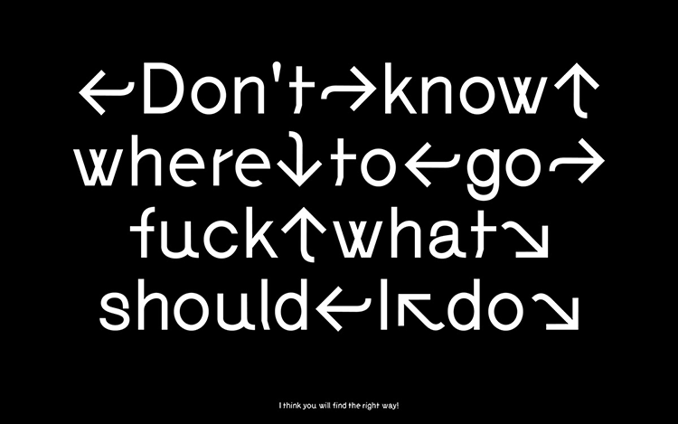 The process began with a series of experimental sketches which then turned into digital glyphs. The concept was to create a typeface with a balanced tension between being readable yet adopted with playful details that gave the face character and a uniqueness. INCREASE is available in two weights and three styles of glyphs with additional Latin language support and accents. Each weight has 680 glyphs allowing you to create a huge variety of things from a readable paragraph to a experimental poster design.
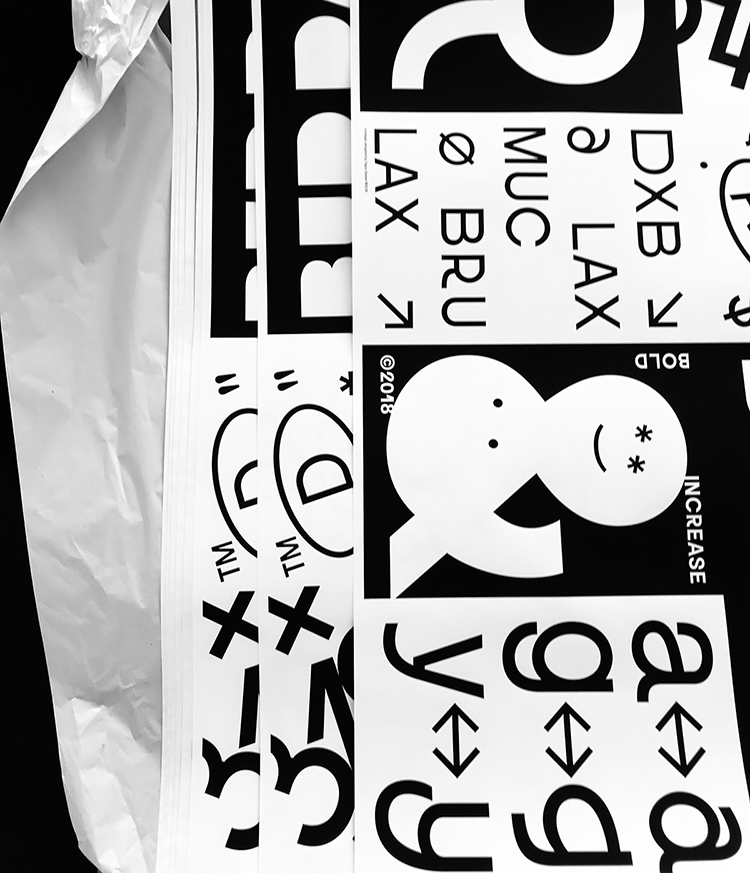
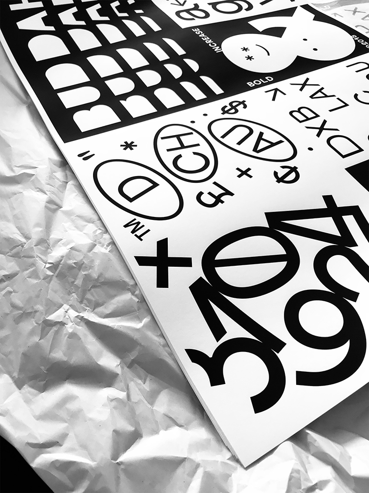
 You can shop his lovely type spec posters on our store! Shop below. 😉
behance.net/fl_fabiobb12
instagram.com/fabiobiesel
You might like...
- Posterzine™ Issue 46 | Marylou Faure - September 16, 2019
- Posterzine™ Issue 45 | Mojoko - September 13, 2019
- Posterzine™ | Karl Grandin - August 21, 2019
