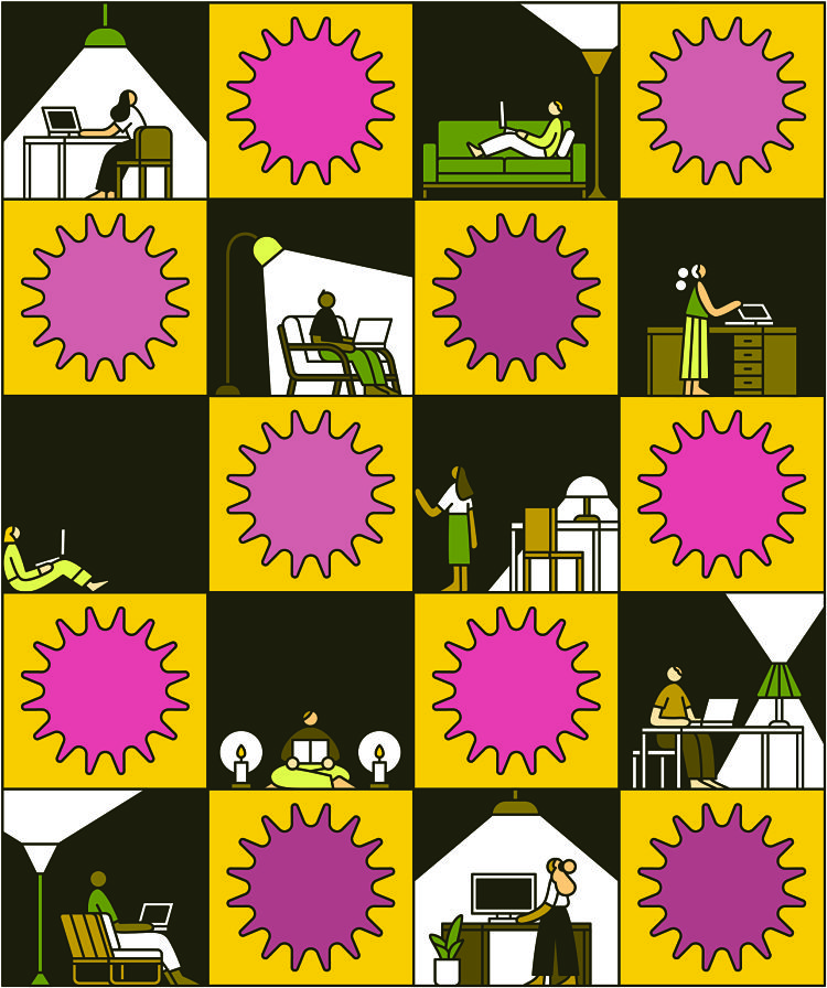
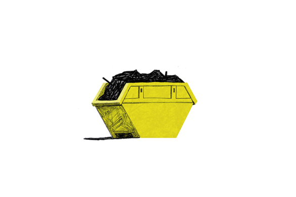
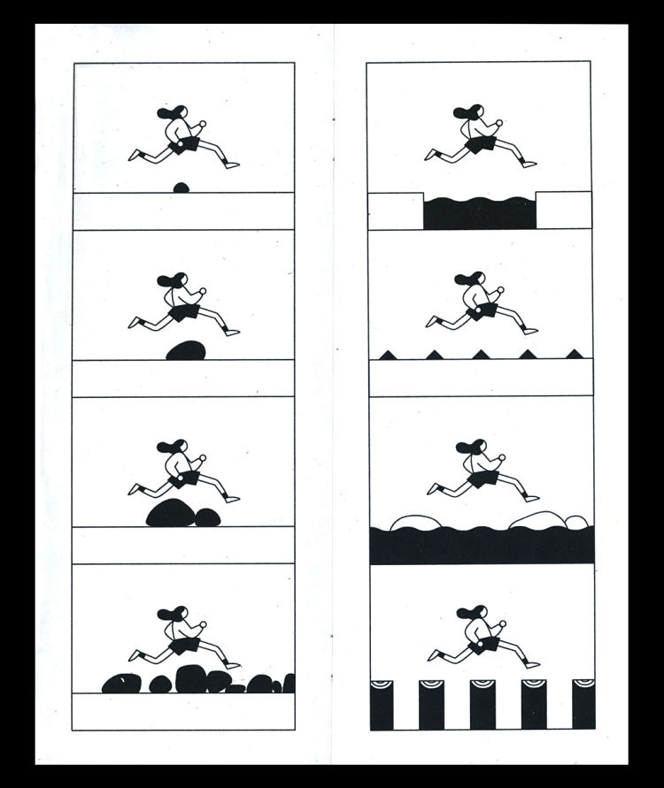
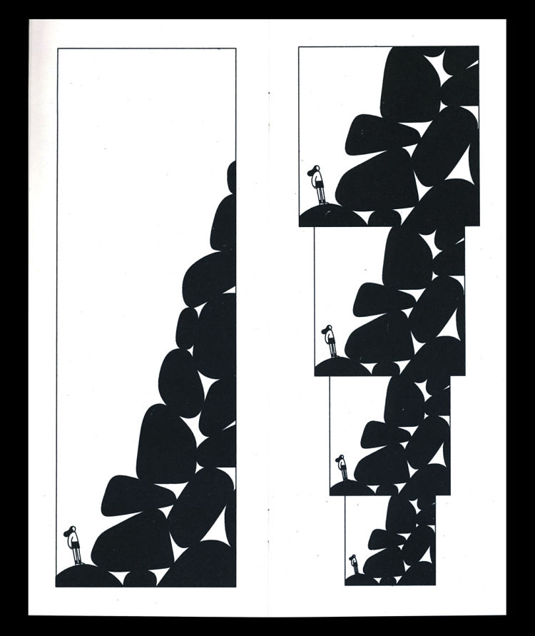
Rose Wong’s sharp outlines, bold colours and carefully honed compositions delineate her very smart approach to reducing often complex ideas into punchy, dynamic visual narratives.
Her work is characterised by its marriage of simplicity and complexity, driven by lines and patterns throughout. It’s little surprise that the Brooklyn-based illustrator has an enviable client list including the likes of The New York Times, Bloomberg Businessweek, Buzzfeed, The New Yorker, The Washington Post, The Atlantic, California Sunday Magazine, Penguin Random House and many more.
 Having studied illustration at Pratt Institute in New York, Wong—like so many creatives—tells us she’s loved drawing since she was little. But there’s more that her childhood has informed than just her job: it’s directly impacted her subjects, too. One of the pieces she’s most fond of in her portfolio is a short comic for The New York Times’ ‘Art in Isolation’ series about her mum’s experience at the restaurant her parents own, Golden Gate in Sterling Heights, Michigan, in the wake of the pandemic.
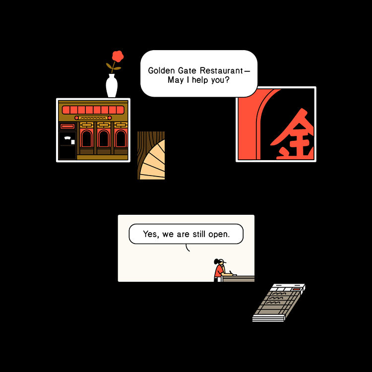 “I was really stressed out about this because it was so personal and I wanted to do my parents justice,” says Wong. Having gone through a fair few different iterations in experimenting with how to visualise this pretty personal story, she was finally happy—and so were her parents. “They loved the comic,” says Wong. “They thought I did a very good job making a simple story compelling, and they always enjoy seeing my work.”
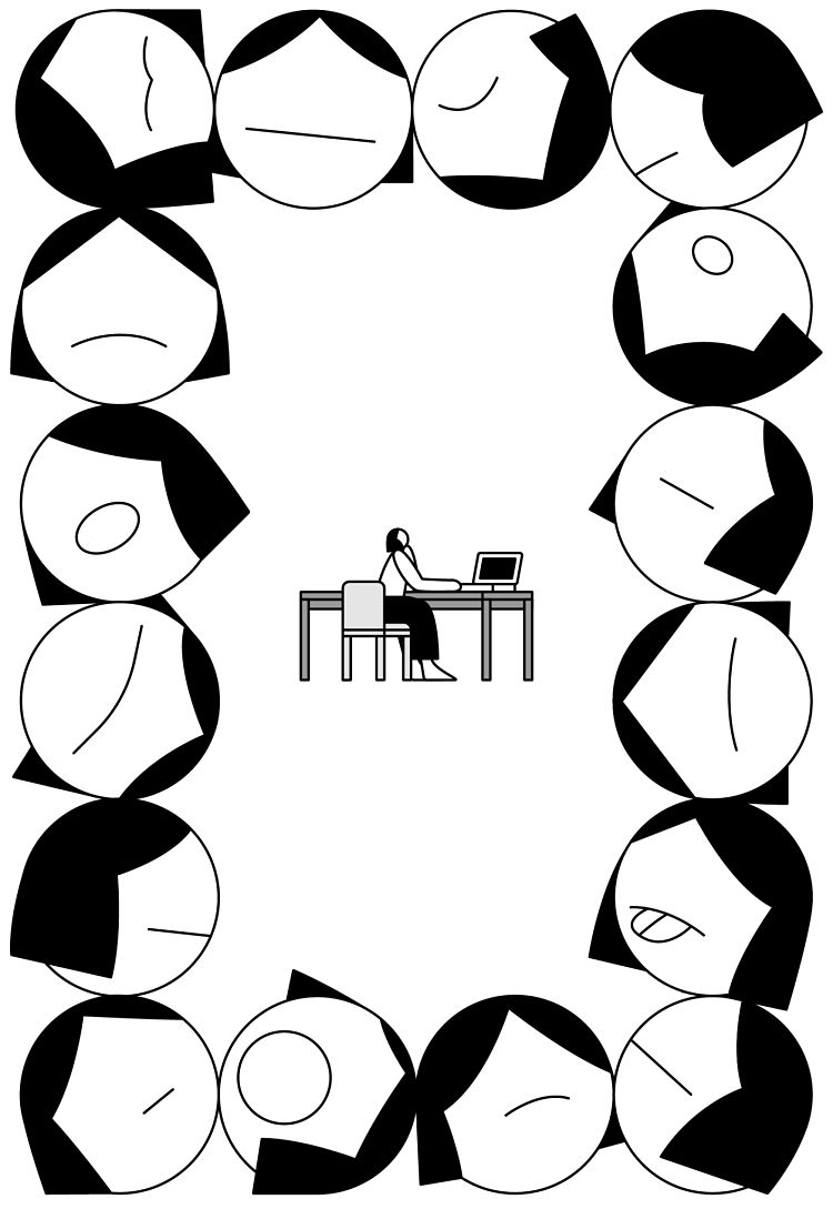 Wong describes her parents as “really creative people”, which might suggest her talents are partly genetic, as well as being thanks to her evident skill and hard work. Her dad’s a hobbyist woodworker who makes furniture and other bits and bobs, while her mum “doesn’t do as much crafting anymore but she’s a great cook.”
 The New York Times has been an important client for Wong: they were her first professional commission, for one thing. “I’ve learned so much,” she say. “Working with them has made me hone my skill of conceptualising and illustrating difficult prompts in a short amount of time.
“I learned how to illustrate very quickly and how to take an article and boil it down to its main points. Gaining the skill to simplify ideas and make them look good took a while. I didn’t really love how my early work looked but overtime, I figured it out. And now I’m really happy with how my work has evolved.”
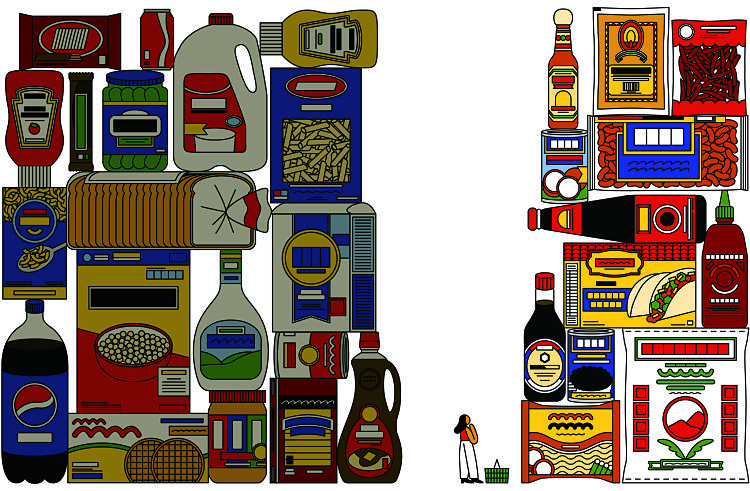 Elsewhere, Wong cites Metropolis Magazine as a joy to work with since their architectural and design focused content means she gets to “make more intricate and really cool pieces with them.” She also got to flex her knack for detail in a gorgeous editorial piece for an article titled ‘Are Ethnic Aisles Racist?’ for The Washington Post. “It was super fun illustrating grocery items,” says Wong.
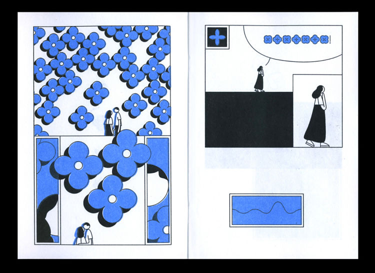
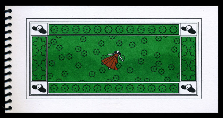 While most of Wong’s work is created and viewed digitally, as an antidote to that she loves working with Risograph on projects like her self-initiated zines. “The beautiful print texture it creates with its limited colour palettes breathes life into my digital vector drawings,” she says. “I also get to work on personal work that doesn’t need to make sense. I can just make beautiful drawings and also work on a longer series.”
 Her personal work often explores themes like “life and death and introspection”. Naturally, these sort of notions are rather more abstract than the average editorial commission, and as such, “those illustrations tend to feel on the quieter side compared to my editorial which are more conceptual and straightforward,” says Wong.
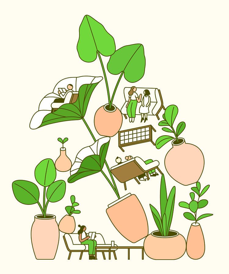 That idea of bringing the digital into the tactile realm has also led Wong to explore ceramics. We adore seeing her sharp monochrome lifework on his curved, minimal vase, for instance. “Putting illustration onto real objects brings my illustrations into the real world,” she says.
You might like...
- Autobahn - November 26, 2021
- Alphabetical - November 12, 2021
- SOFA Universe - November 8, 2021

