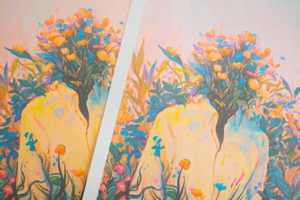
It feels as though Swedish illustrator Alva Skog has been a name ever since graduating in 2018. Their work is both distinctive—strangely proportioned limbs, often huge hands, simple but expressive black line facial features—and beautifully mutable. As such, Skog’s work is a dream for projects like editorial illustration (their client list includes The Guardian, The New York Times and Type Notes).
The vibrant, lively forms imbue Skog’s work with a subtle sense of celebrating what it is to live in a person’s body, and the works are underpinned by redressing and questioning ideas around gender identity and equality. These notions are resolutely the foundations to Sokg’s illustrations, but the subtlety with which they’re delineated means that the work is also a dream for brands.
Having worked with big names like Apple in the past, Skog has recently completed a series of custom spot illustrations and default Pro wallpapers for file sharing platform WeTransfer. The images were inspired by cartoons and comics, taking a playful approach to “breaking the frame.”
 Each image highlights key moments throughout WeTransfer’s interface, “creating micro-narratives to surprise and delight users and provide a visual aid in using the product,” according to the brand. These were animated by Kitchen, a part of illustration agency Jelly London (which also represents Skog.)
 We had a chat with them about their work, process and the shitty year we all know, not-so-fondly as 2020.
Tell me more about your WeTransfer work and the inspiration behind it.
It was a fun challenge to reimagine and create new designs for captions like ‘success’, ‘password protection’ and ‘oops something went wrong’.
The spot illustrations are small in size but I wanted to make sure they had a big impact. I wanted the characters in the spots to have a direction, movement and purpose or be a playful spin on the captions, ‘link expired’ or ‘password protection’.
For the wallpaper designs I played with scale and perspective and wanted to reflect feelings I’ve had (and many other people too I imagine) during lockdown. For example, the constant cycle of watching tv and scrolling social media for hours or dreaming about lying in a meadow and watching the clouds pass by.
While working on the roughs I was also in conversation with Jelly London’s animation team KITCHEN on how the spots and wallpapers could be animated.
When I had finished the final designs I drew the keyframes that Jelly’s KITCHEN then put together and started animating. KITCHEN sent me animation roughs that I then gave feedback on.
 How’s the last year been for you working as an illustrator, with lockdown and everything else?
The last year has been a rollercoaster in my personal life. I moved back to Sweden, for the time being, to be closer to my family during the pandemic. In the beginning of lockdown my mental health was in a bad state so the fact that I didn’t get as much work during the first couple of months was probably a good thing because it allowed me to focus on myself. During this time I started working on personal projects which, I realised, helped me a lot mentally and in turn is expanding my professional work and evolving my style.
 What have been the biggest challenges, or things that have surprised you about working as an illustrator since you graduated?
I’ve learned a lot since graduating, for example what kind of projects I actually enjoy and what kind of projects pays the bills. Also, how people play a role in collaborations—and it pays off to be a nice person. I really enjoy working with my agency Jelly, they are super lovely people and I feel very supported by them.
What do you wish you’d been taught at uni that you weren’t?
Nothing really! I feel that uni gave me most of the tools I needed for going out into the industry. It’s just a matter of utilising them, I believe.

 What sort of projects do you enjoy most and why?
I enjoy editorial projects the most because it’s fun to collaborate with talented art directors that give you a lot of freedom as well as making work for interesting journalism. Also, when you pick up the paper the next day to find your work is an amazing feeling that I never get tired of.
How would you describe your style, and what tools do you use?
I feel that my style is constantly evolving but the core of it is a queer and feminist take and that affects how I represent gender and identity positions in general. As a non-binary transperson this is something of great importance to me.
My style is defined by bold colors, sculptural bodies and skewed or exaggerated perspectives. I work on an iPad in Procreate and Photoshop.
 You studied graphic design—how has that informed your practice as an illustrator? Do you still do design work at all?
I find that the conceptual approach used in graphic design can be quite similar when working in illustration. I apply the same thinking when creating an illustration as I did when I studied graphic design. The idea informs the visuals in a way.

- Autobahn - November 26, 2021
- Alphabetical - November 12, 2021
- SOFA Universe - November 8, 2021
Discover more from People of Print
Subscribe to get the latest posts sent to your email.


