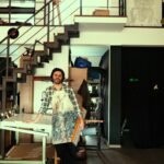
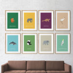
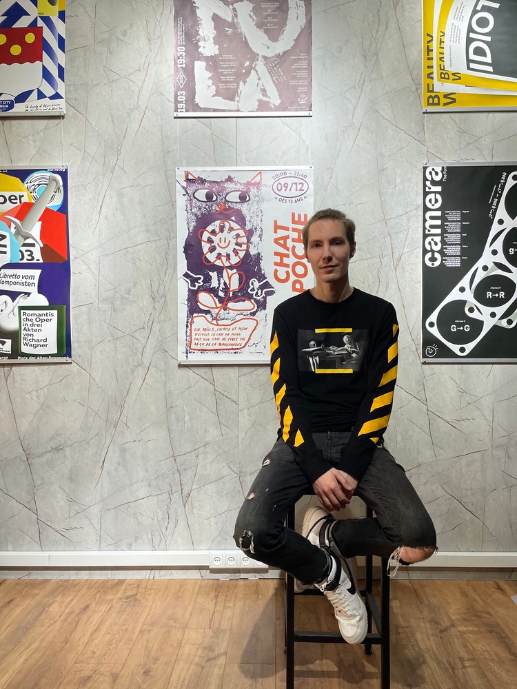
Born and raised in Minsk, for most of his adult life Mikhail Lychkovskiy was as far away from art and design as possible. There, he received his first higher education in Computer Science. He tells us; “It seemed that after seven years of working as a systems analyst in IT, it was too late to change anything in my life, but in order to become an even better specialist, I started studying user interfaces and even entered the British Higher School of Art & Design.”
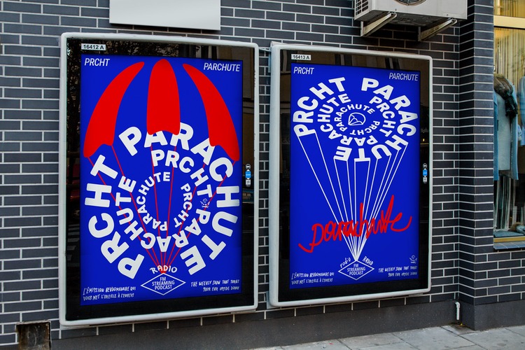
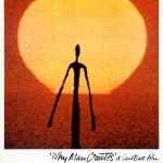
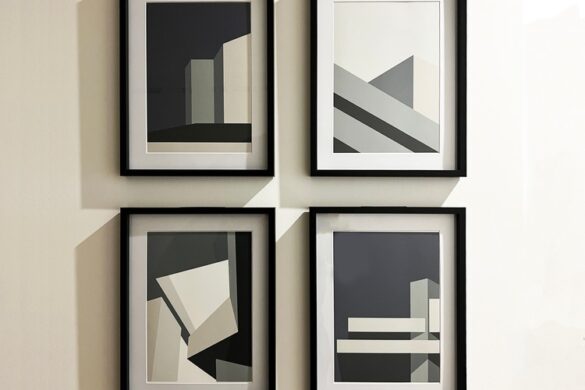
There, for the first time, Mikhail experienced the delight of getting acquainted with the classical Bauhaus theory, the Swiss poster, and began to dream of mastering this art, practicing rhythm, contrasts and analyzing from 100 to 300 posters daily.
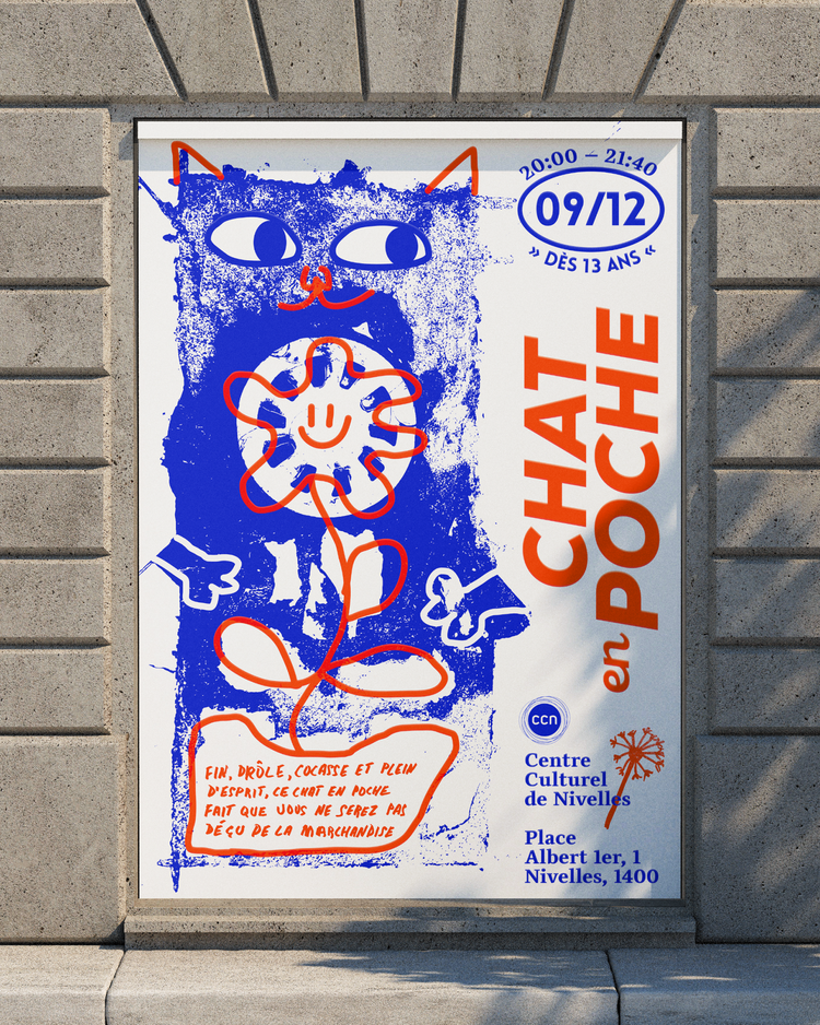
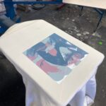
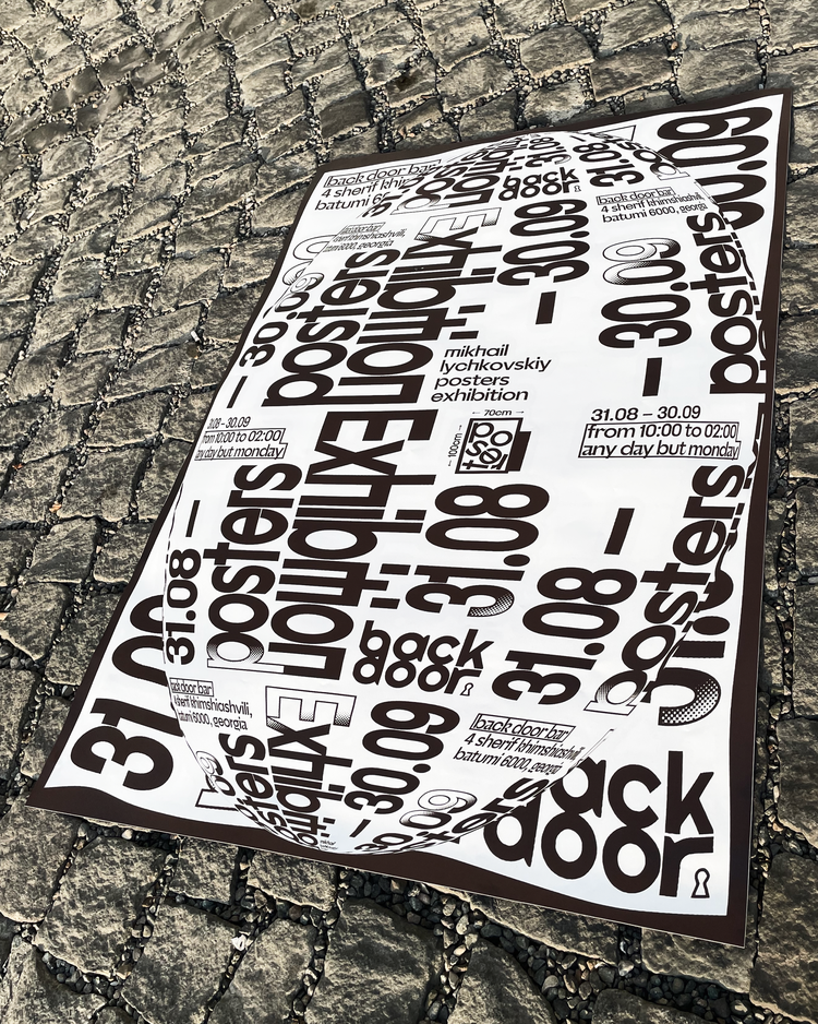 Now, his inspiration is not only the Swiss, but also other national graphic styles. Lately, Mikhail has been passionately fond of French modern posters. “It seems to me that in combination of artistic techniques of different schools and a different approach to typography, you can get a contemporary, timeless and unique work,” says the designer. Although his main design tool is Figma (“yes, absolutely all my works are entirely or partially made in Figma, even motion ones”), Mikhail also likes to create his posters physically, with metal, wooden and other letters, using paint and brushes and other improvised tools. These then have a very special texture and charm, which is further influenced by the letterpress posters by Dafi Kühne, painted posters by Michel Quarez, and the brutal posters with dripping paint and metal letters by Peter Bankov.
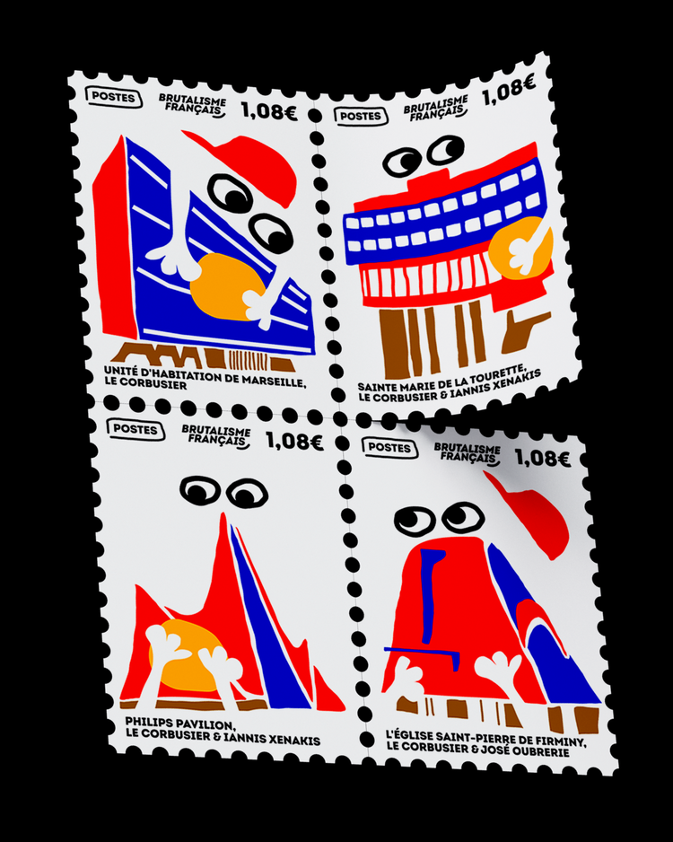
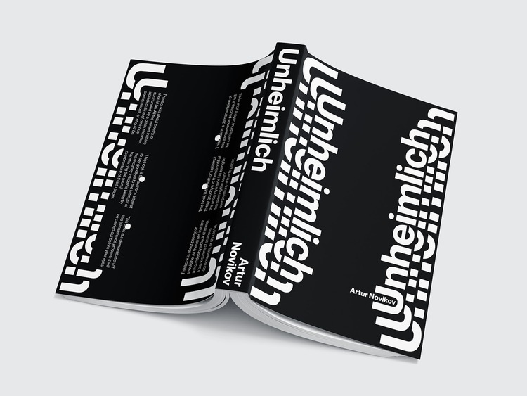 It is to Peter Bankov that Mikhail is grateful and obliged to have as a teacher; “He instilled in me a love for the French style and taught me how to use paints and improvised means. Once there was even a funny case when I heard Peter incorrectly and decided to draw with a toothpick, not a toothbrush. It was a torment to apply paint with a toothpick.”
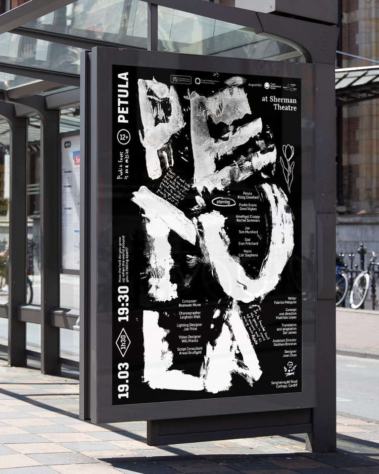
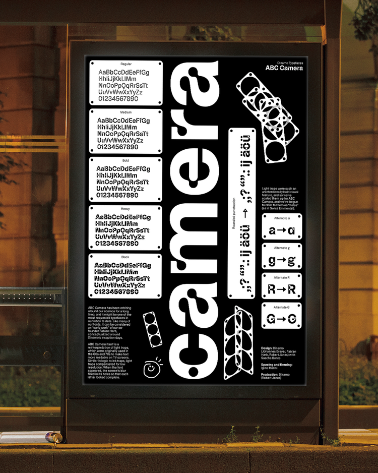
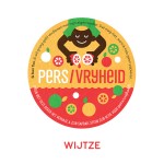
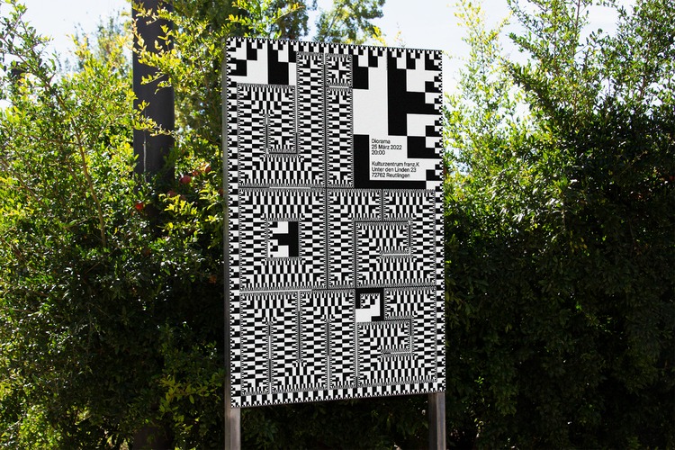 Recently Mikhail has been experimenting with creating other formats as well as the poster, including book covers, bar coasters, and colourful rally car bodies, and hopes to soon work on some designs for beer cans.
“I like the idea when design transforms into art. I.e., while the contents of the can are not drunk, the object has a function and it is a design object, but if the very same empty can becomes an interior decoration, then this function is lost, but the object acquires the properties of art.”
www.lychkovskiy.com
@khalitzburg
You might like...
- Amelia Bown - November 20, 2024
- Gilfalo Art Design | The Journey So Far - November 19, 2024
- Printed by Us: Printing Positive Change - November 18, 2024

