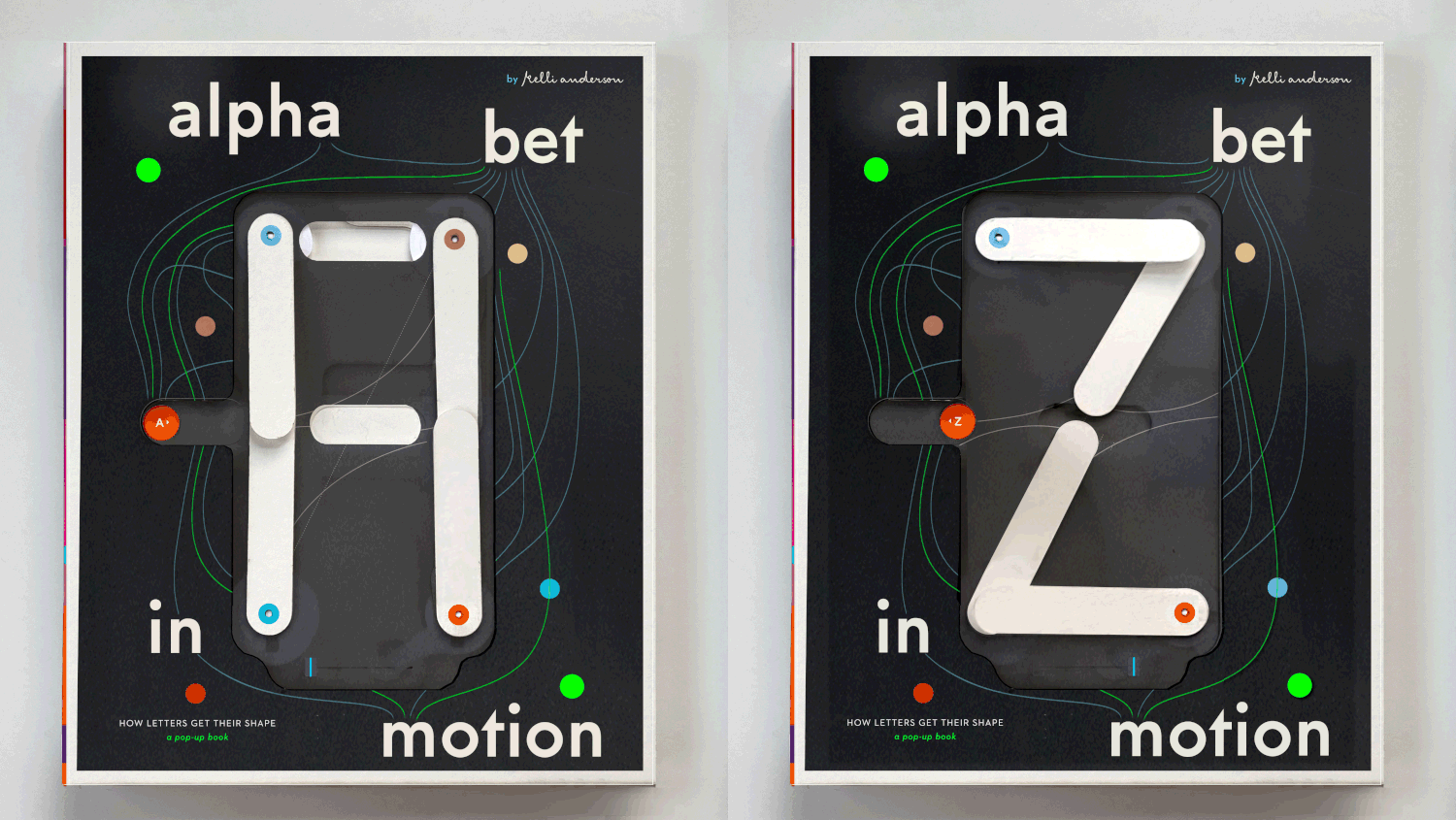
Alphabet in Motion is an ABC pop-up book, researched, written, designed, and paper-engineered by Kelli Anderson. The book explains how typography works, looking at the technologies and worldviews that have shaped letterforms through the ages. The premise of the book centres around the idea that if you look carefully, you can see the history of the world — from the Bronze Age to the Information Age — in the microcosm of type. Alphabet in Motion leverages tactile, interactive features, to help clarify how letters have transformed alongside technological upheavals and shifting aesthetic moods.
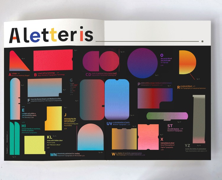
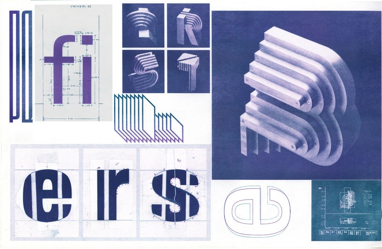
The book comprises two conjoined, detachable books. The first is an interactive pop-up book that features an interactive 7-segment display cover that animates A to Z, 17 interactive pop-ups, hands-on activities, and fluorescent inks. The second part is a 128-page companion essay that contains one essay for each pop-up, and 300 colour images illustrating the history of type design.
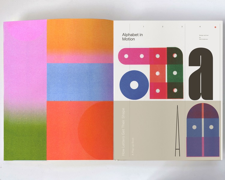
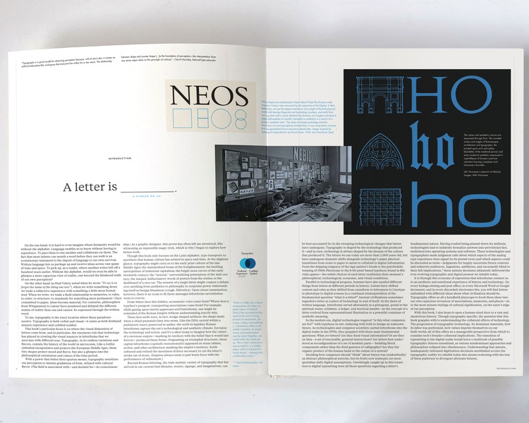
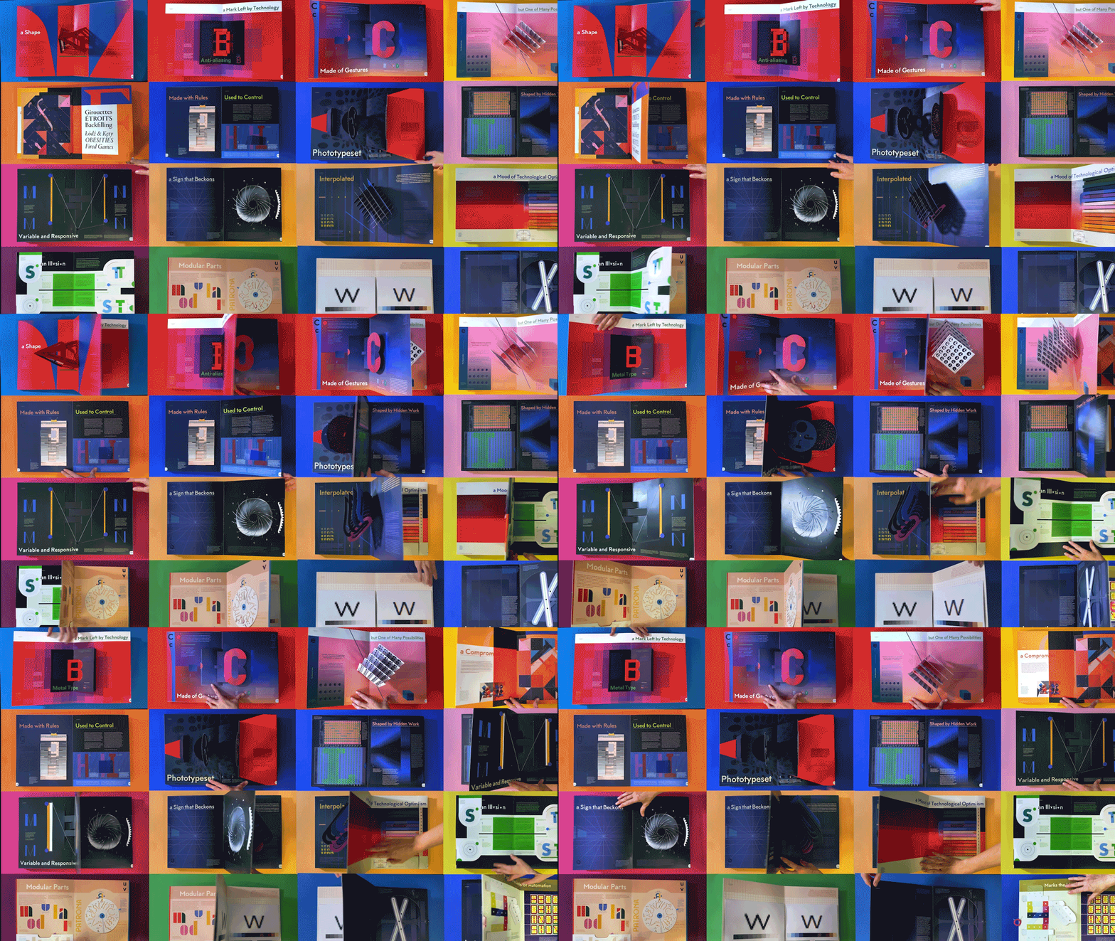 Alphabet in Motion is unique in that reading is completely optional. The essays pick up where each pop-up leaves off, expanding upon various themes. By following the progression of typographic technology and history, the book traces how design values imprint themselves on the future they usher in. Each of these questions in turn reveals a new perspective from which to consider the broader impact of design and tech on human societies.
With a surprising economy of expression, you’ll see how letterforms connect us to an aesthetic and emotional experience of history. On every sanitation building and post office, in every Microsoft Word or Google document, and in every discarded-electronics bin, you will find letters embedded with different ideas about what civilisation should be.
The essays explore how typography carries us to the early print culture of the Late Middle Ages; the standardised forms of the Enlightenment; the bustling metropolises of industrial capitalism; the bright neon curves of the early twentieth century; the “neutral,” universalszing pretensions of the mid-century International Style; the warped, hallucinatory words of posters from the sixties; and the dashboard of a race car.
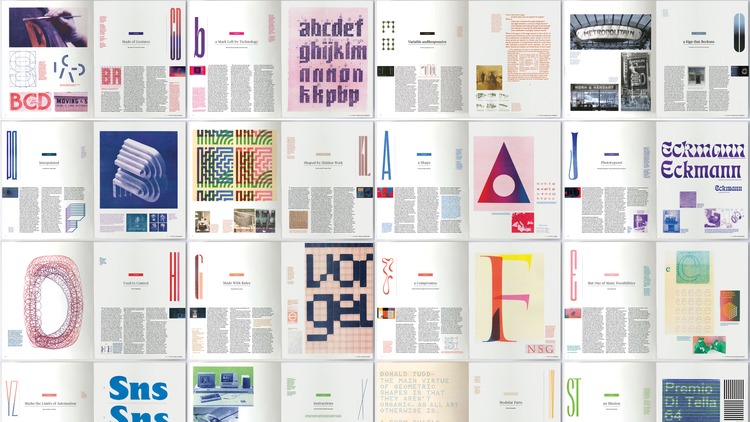 A single letter can conjure a debate over anything from aesthetics to philosophy, to corporate power whitewashing itself as benign-blandness. There are two layers of meaning in any use of typography: what it says, and what it says beyond the text. Alphabet in Motion is an exploration of the latter: the visual dimension of type.
The project is currently running on Kickstarter with various rewards including copies of the book project, a stunning limited edition all white ghost book, and even a team-building Pop-up workshop. Rewards start from $58. Support the project here. Campaign ends 21/11/24.
- CMYK Festival of Print and Illustration 2025 - May 6, 2025
- Print Isn’t Dead Element 006 | Now Funding on In Perpetuum - December 11, 2024
- OFFF Rebrand for 25th Anniversary - December 2, 2024
Discover more from People of Print
Subscribe to get the latest posts sent to your email.

