Taking our top spots for the most popular articles posted on our website throughout 2016 were our Department Store, Directory and Posterzine. These were followed by 20 amazing design studios, illustrators, printmakers and artists, all listed below…
Back in October 2015 we interviewed and featured freelance illustrator Polly Nor. Her devilish characters which are representative of real girls and their own personal space are still holding onto a top spot of most popular posts at the end of 2016. To find out more about Polly Nor and read the interview in full, please follow the link to the original post.

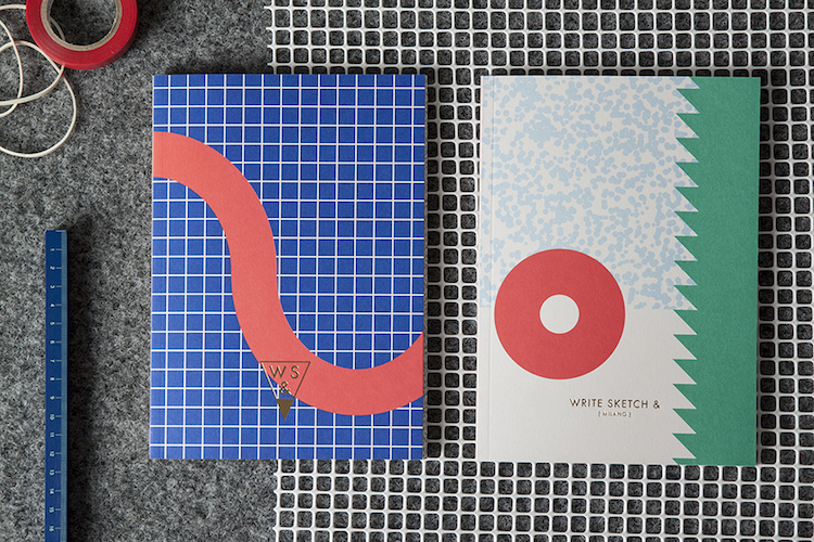
Milan based stationary collection ‘Write Sketch &’ is still as popular as ever after having launched back in 2014. Their eye catching colour palette, pattern design and high quality products have kept them on the People of Print radar and made sure they continue to grab the attention of our readers.

Have you ever been to Birmingham? Well don’t forget that you can now experience the city via a printed 32 page zine by Charlie Soffe. The Zine also comes with and bonus track acting as a soundscape while you take a visual tour.

Sofia Noceti’s broad range of work covers areas from branding to publishing with everything in between. Her recognisable aesthetic has continued to engage viewers throughout the year, and if you haven’t read about her already, now is the perfect opportunity…

Who doesn’t love a free font? Back in May the FontShop team announced the biggest list of free fonts including Pancetta, Cyntho Slab, Museo, and a dozen others. All the fonts are available to try, buy and download. So what are you waiting for?

Popular and unique Dutch artist Piet Parra’s surreal characters have dominated our most popular lists throughout the year. Check out our feature on him to find out more about his background, and how he became an artist unintentionally.

An innovative project which uses a Google Chrome plugin to turn your browsing history into a beautiful, printable newspaper. It has been a favourite with our audience as well as within our studio. Don’t miss our feature on this project to find out how it works.

Glasgow based studio Ilka were fresh on the scene back in 2015, with neon colour palettes and limited-edition large-scale screen prints. We posted a selection of designs by the studio back in November 2015, and they have remained a favourite in 2016 too.

The much-loved colour-themed collection, ‘Palette’ by Victionary, invites you to celebrate the subtlety of designing with the colour white. It considers the importance and significance of white space so if you wish to learn more, you should read the article in full…

Want to see what photographer Juno Calypso spent her student loan on? Armed with a suitcase of wedding lingerie, wigs and a selection of 1980s beauty devices, she went to Pennsylvania, checked into a honeymoon resort and staged self-portraits featuring her fictional alter-ego, Joyce.

bizarre bizarre studio’s infectious aesthetic not only caught our attention but our audiences too. Their combination of art and design practices leads to very experimental approach, which we think you should take some time to browse if you haven’t already!

It looks like we were not the only ones struck by Michael Thorsby’s successful use of gradients in his project, Bombay Electric. We love how Michael played with colour for this identity redesign, and how it gives everyone a sense of movement and joy.

‘MIN: The New Simplicity in Graphic Design’ is a publication showcasing a wide selection of contemporary minimalist graphic design. We first wrote about this publication back in April 2016, and posted a detailed round up of its contents.

If you are a hardcore print fan and haven’t yet watched this truly captivating video of French artists Ella & Pitr making Lithograph prints, then you really need to. Covering the process from start to finish, this short film shows true skill and craftsmanship.

Studio Plat is a graphic design studio we highly recommend you follow. Having only launched back in 2014, they already have a diverse portfolio and we have featured a selection of images from some of their projects in previous posts.

This popular guide features over 50 leading examples of Brutalist architecture from the National Theatre and Southbank Centre, the Barbican and Trellick Tower to lesser known buildings like the Elephant and Rhinocerous Pavilion at London Zoo, and Keeling House in Bethnal Green.

We always love receiving packages in the post, and this beautiful collection of typographic journals, written by designers for designers has been one of our ongoing favourites, from its packaging, right through to the contents.

This year we have been obsessed with Japanese artist Yoko Honda’s homages to all things 80’s. Her illustrated scenes are constructed through a combination of digital painting and print and we think she is well worth checking out.

Art direction and graphic design studio are always one to watch. They are known for designing impressive identity & branding systems, websites, books, magazines, posters, music and product packagings for huge clients.

Ed Hatfield’s creative manifesto, titled A—Z Manifesto comes in the form of a double-sided screen-printed poster which always captures the heart of our readers, and also concludes our list of most popular posts for 2016.

- Top Picks | 2018 Calendars - November 27, 2017
- Wren Artists | Felicity McCabe - November 1, 2017
- Lennarts & de Bruijn - October 20, 2017
Discover more from People of Print
Subscribe to get the latest posts sent to your email.


