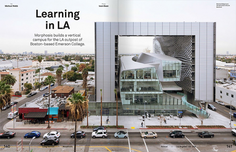
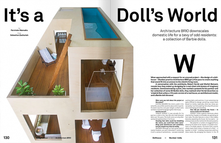
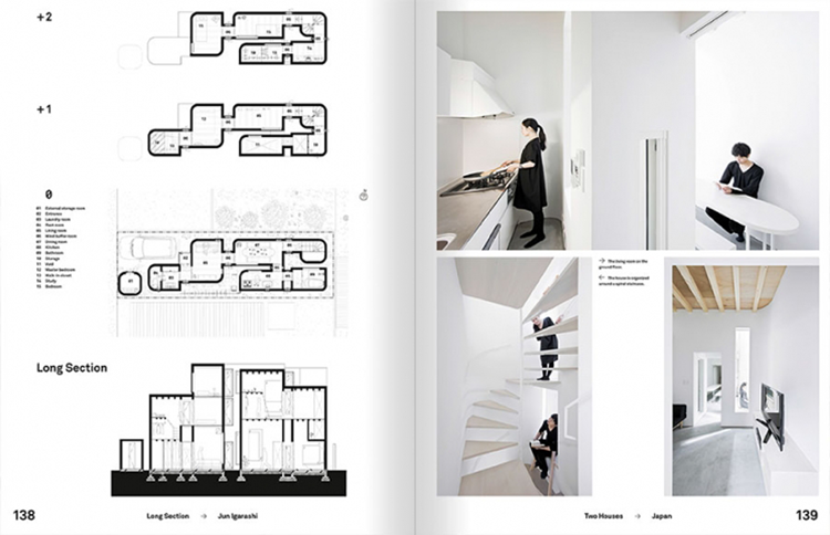
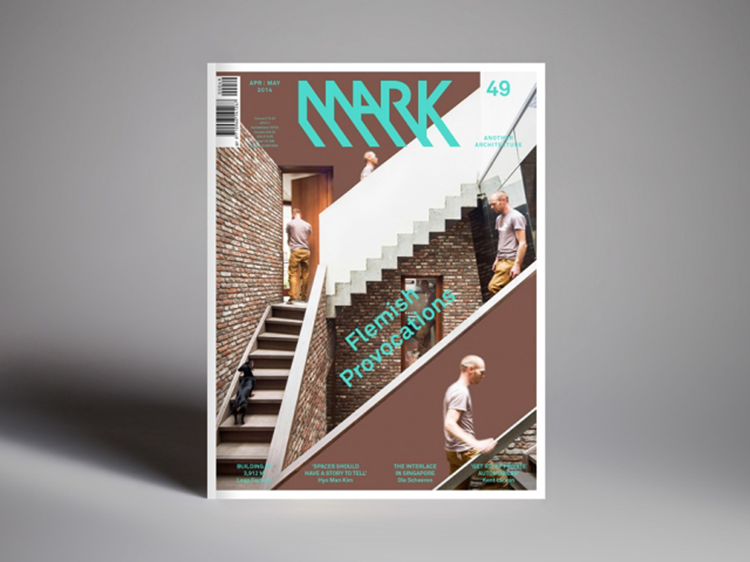
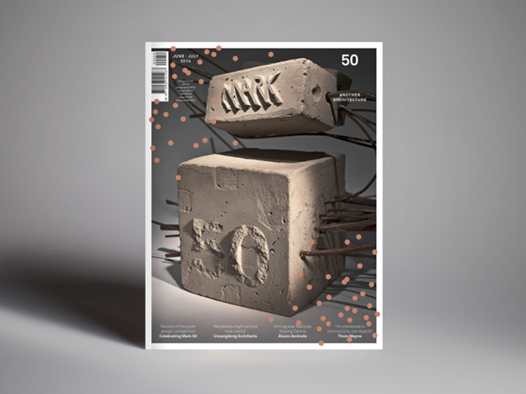
Mark magazine launched its first issue in 2005 with Frame Publishers and prides itself in being a ‘timely, visual, non-academic publication full of first-hand information from creative people.’ Dedicating itself entirely to the practice and perception of architecture Mark magazine brings our 3D structured environment to life on a 2D printed platform. I was lucky enough to catch up with David Keuning, Editor of Mark magazine, to find out about the work which goes into each issue, the challenges faced and how Mark magazine has developed in more detail.
1. What kind of audience is Mark magazine aimed at? Architects/designers, non-designers, or both?
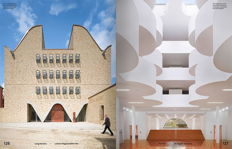
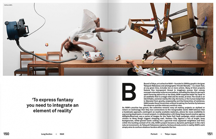
Mark is aimed at both designers and laymen with an interest in architecture. We want to be a timely, visual, non-academic publication full of first-hand information from creative people. The magazine has a radically international perspective, shining the spotlight on starchitects and new talent alike. It explores the boundaries of architecture, which also means covering the work of people outside the realm of the profession.
2. What have been the biggest challenges you have faced in creating and distributing the magazine?
Creating and distributing a magazine are two very different things. The biggest challenge of making the magazine is balancing the cord between surprise and continuity. Each new issue should amaze and astound its readers, but it should also give them what they would expect to find. The biggest challenges of distributing the print version of the magazine are manifold: unreliable postal services, delays at customs and damage are just a few. As for the digital version, the biggest challenge is illegal copying.
3. Can you tell us a little about your process, how do you go about approaching each issue and selecting features?
We don’t work with premeditated themes or editorial calendars. Only after an issue has been sent off to the printer, we start thinking about the content of the next issue. We have a world-wide group of collaborators, including writers, photographers and architects, who keep us up-to-date about what’s happening in their respective cities. They propose articles to us, and whenever we’re interested in them, we think our readers will be too.
4. When looking back to the first issue launched in 2005 how has the magazine developed/changed?
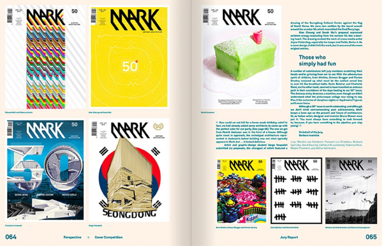
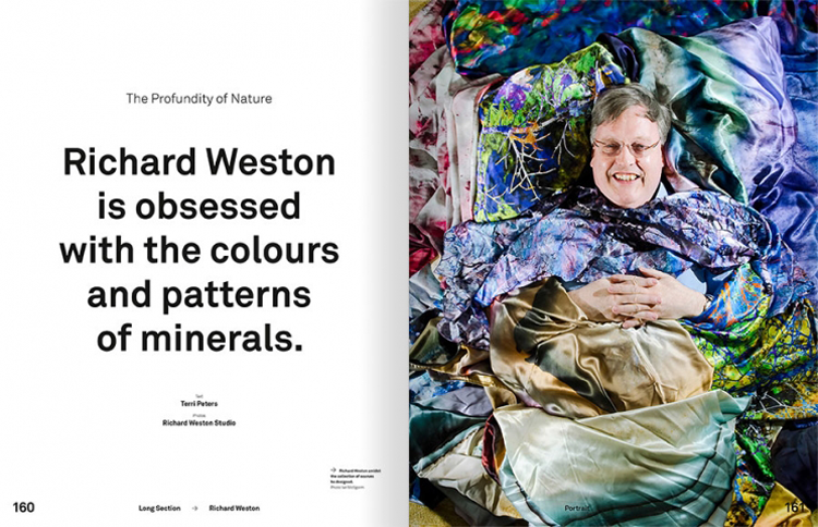
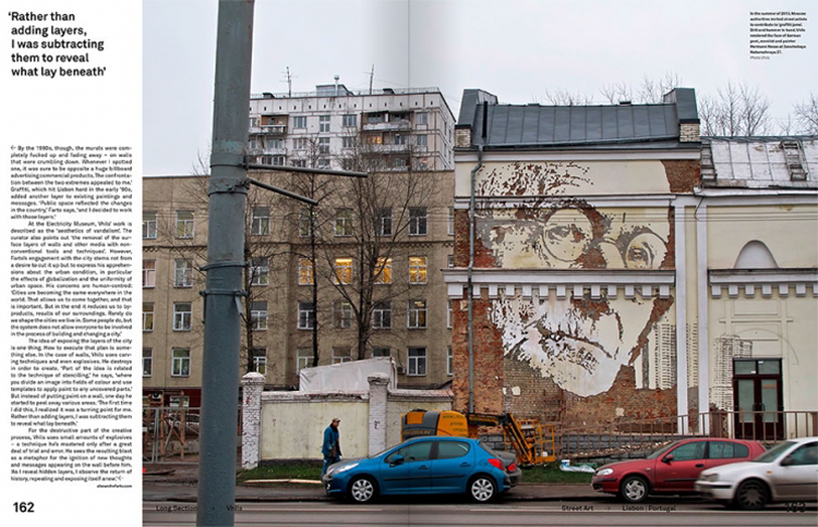
The magazine has developed a great deal, especially in regards to graphic design. The first three issues were designed by Machine. These early issues received a wave of positive reactions, chiefly from other graphic designers, skaters and graffiti artists. The response from architecture circles was more reserved. ‘The form overwhelms the content,’ reported a well-respected architecture historian. Beginning with Mark 4, we modified the formula: less graphic punch, a handier size and weight, more emphasis on recently built projects, and six magazines a year instead of four. Graphic-design studio Lesley Moore (Karin van den Brandt and Alex Clay) came on board. They had a playful approach: for each new issue, they designed a new typeface for instance. The dynamic, light-hearted feel gave way to a more sophisticated, mature quality when Mainstudio (Edwin van Gelder) took over the design in 2008. Four years later, a team of in-house graphic designers from Frame Publishers (Mariëlle van Genderen, Barbara Iwanicka and Cathelijn Kruunenberg) redesigned Mark. They are currently still responsible for the design.
5. How important do you think it is to have a printed platform for architecture?
Journalism is the first rough draft of history. If that’s in print or digital form, is in itself not important; it’s about the content. That said, we wouldn’t make a print magazine if we didn’t have faith in its future. Making a print magazine is a lot of work and demands concentration. In general, the more attention it takes to produce something, the more valuable the product is. Readers recognize and value that as well. The experience of leafing through a magazine is something that still can’t be matched by its digital counterpart.
6. Does architecture have an impact in the design and structure of the magazine?
Not directly, but on a conceptual level writing a text is similar to designing a building. You have to think about structure, accessibility and detailing. Any resemblance in a more direct way would probably end up very cheesy.
7. Are there any side projects or events that you are going to be working on in the near future?
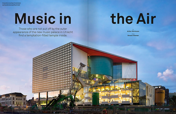
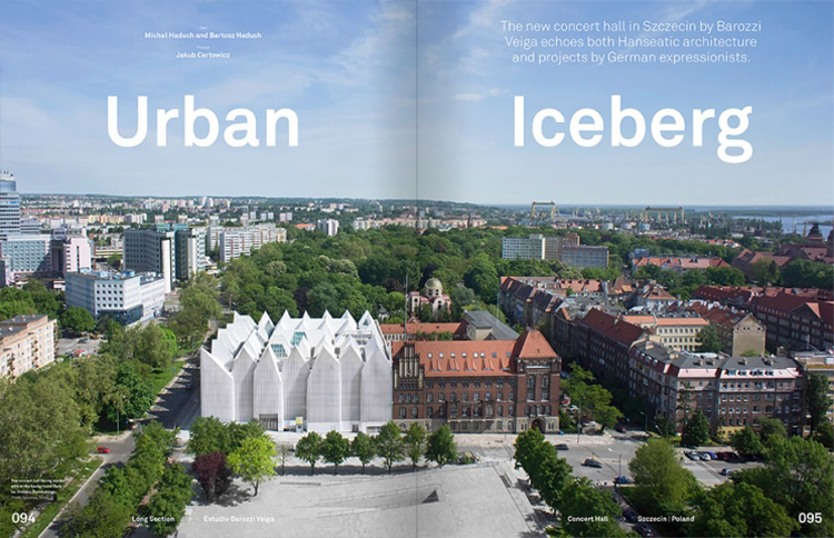
Frame Publishers has just opened its very first store in Felix Meritis, a beautiful and very impressive 18th-century canal house in Amsterdam. Inside the building, visitors find a pop-up shop over two floors, designed by i29. For sale are clothes, books, magazines and design objects. It will be open for six months, and we will regularly organize events in it. The first event was the launch party of Mark’s 50th issue.
www.frameweb.com/magazines/mark
https://twitter.com/markmagazine
https://www.facebook.com/Markmagazine
- Top Picks | 2018 Calendars - November 27, 2017
- Wren Artists | Felicity McCabe - November 1, 2017
- Lennarts & de Bruijn - October 20, 2017

