Kinetic is the name of a new geometric sans typeface family that introduces an organic appearance into this type genre and avoids strict design patterns. Having been released in January 2017, the design is partly inspired by the playful kinetic art of Alexander Calder and has been described as a ‘functional and modern typeface that feels comfortable to read.’ Kinetic adopts the essence of geometric shapes but plays with the proportions of each character. With the stroke endings taking a slightly more curved approach, a trait which is ‘inspired by the bleeding of printed type on paper,’ the typeface has a softer appearance when displayed on both screen and in print. Also, the use of slightly different shaped dots throughout this type family again highlights a more organic feel to the design and structure. This is an element which can also be found in Calder’s iconic kinetic sculptures.


The designers behind this type family, Noel Pretorius from Stockholm, and María Ramos from Santiago de Compostela, have integrated Alexander Calder’s Kinetic mobiles artwork, which Calder created with wire, into the type design. The shape of the italic letterforms convey the movement created by wire material, while the characters are made with a single stroke, as if the wire was bent.


The characters of Kinetic are wide and the counters open, making the typeface legible at small sizes. The wide letterforms also make the typeface more comfortable to read, since the field of view of the human eye is bigger in width than in height. This typeface family has been created with the intention of usability in a wide range of outlets, including advertising, editorial design, and any corporate or art project.


The typeface family includes three weights with italics, small caps, a set of arrows and icons and other OpenType features. Noel and Maria are also introducing a proposal for a new character – an alternative to ‘e.g.’. The new character simplifies the abbreviation, which makes it look more harmonious in text.


Kinetic designers, Noel Pretorius and María Ramos met while studying a master’s degree in Typeface Design at Reading University and from there they started to work together under their own label NM type.


The designers have included an essay which explores the links between ‘art, type and geometry’ as part of the type specimen, taking many examples from type history and exploring how designers have found inspiration from a range of art forms. ‘The essay provides context to better understand the design decisions behind Kinetic.’


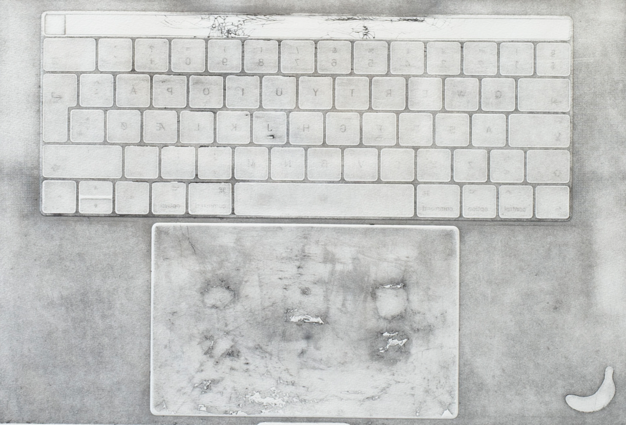
Noel and Maria have collaborated with artists and professionals across creative fields to bring the ideas and the branding of Kinetic to life. They worked with photographer Carl Kleiner to create and capture a custom made kinetic mobile taking the letters from the typeface and shooting them in a still life style in homage to Alexander Calder. Plus, illustrator Beastland contributed with meticulous, graphite illustrations that visualise the key characteristics of the typeface.


Kinetic is available for desktop, web and app use and licences and be purchased via the website. Don’t miss out on Kinetic Notes either which is a free app that allows you to use the typeface family Kinetic on your mobile phone when creating text notes. Three Kinetic styles are available with the app: Regular, Italic and Bold and it also includes a custom keyboard that gives you access to a set of icons. Available to download from the App Store now.


[vimeo 199140896 w=750&h=422]
www.kinetictypeface.com
www.facebook.com/nmtype
www.instagram.com/nm_type
twitter.com/nm_type
- Top Picks | 2018 Calendars - November 27, 2017
- Wren Artists | Felicity McCabe - November 1, 2017
- Lennarts & de Bruijn - October 20, 2017
Discover more from People of Print
Subscribe to get the latest posts sent to your email.


