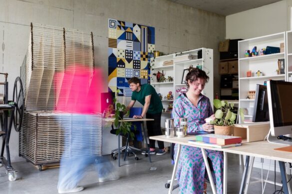
Presenting NM Type, a type foundry based in Sweden and Spain consisting of creative duo Noel Pretorius and María Ramos. They’ve been releasing typefaces since 2017 and already been awarded for their excellent skill with a Certificate of Typographic Excellence by the New York Type Directors Club. Now working with international clients, their approach to projects is experimental topped with an elegant flair of technical excellence.
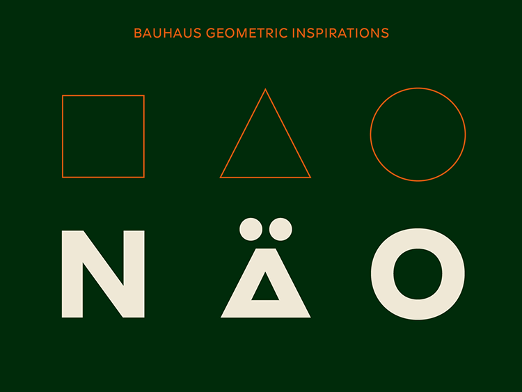
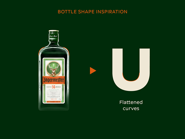
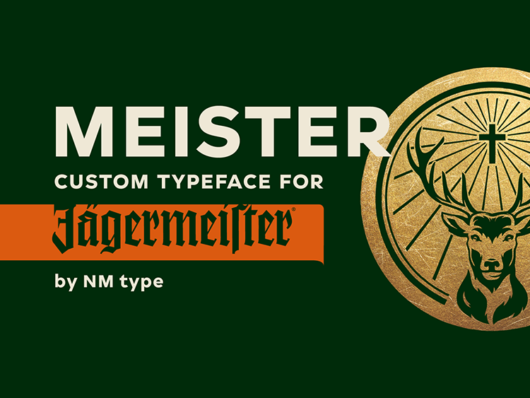
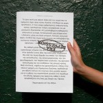
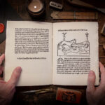
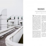
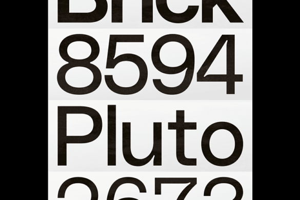
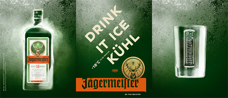
 Their latest project was creating a new custom typeface for Jägermeister. This typeface is part of the brand new global communication and gives Jägermeister a unique voice in all of its media channels. The design of Meister typeface is partly inspired by the bold geometric shapes of the Bauhaus with possible references to swiss geometric type forms.
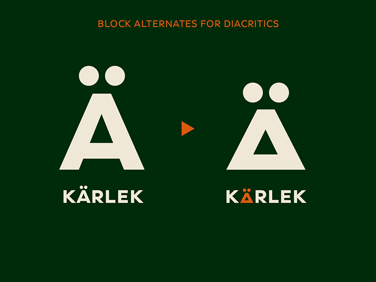
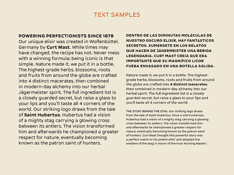
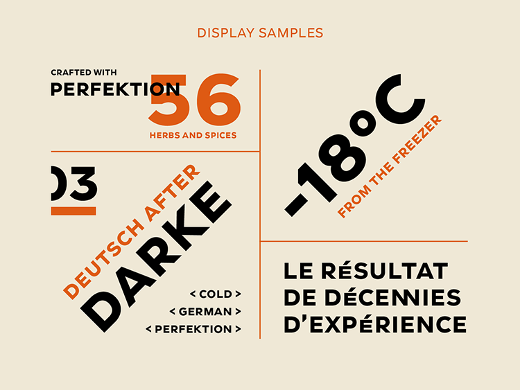
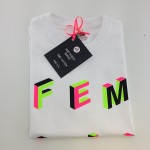
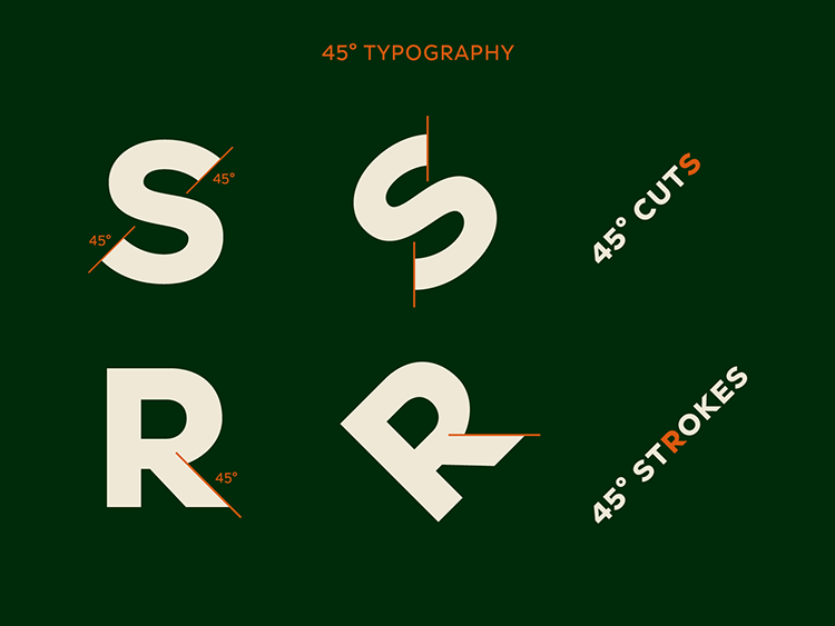
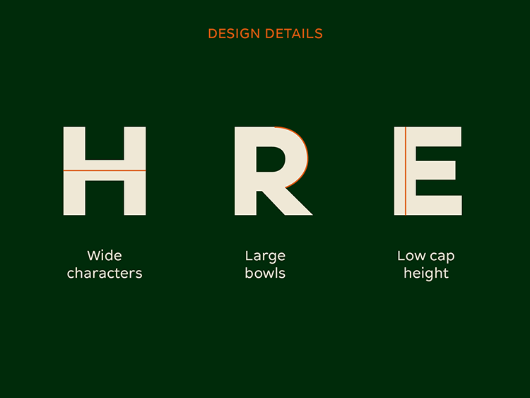
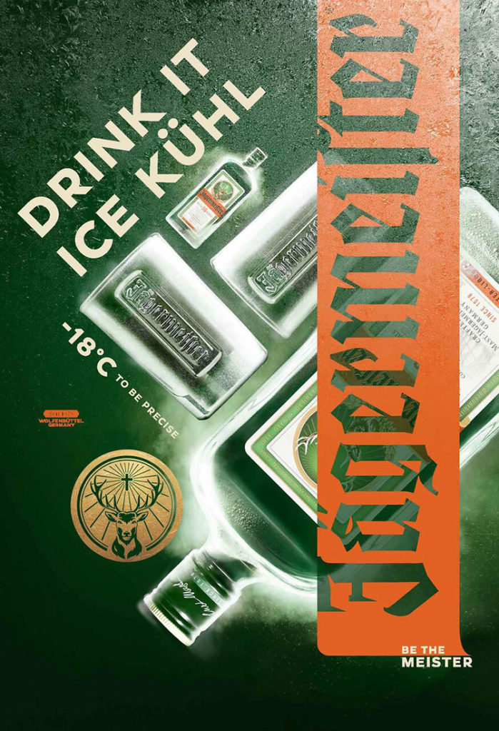
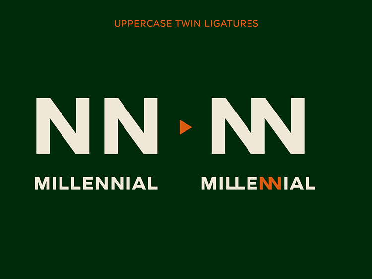 According to NM Type, there are three key design features that make Meister typeface unique: the 45° angle cuts and diagonal strokes, the flattened curves, and the blocky appearance. The typeface fits perfectly in the dynamic design of Jägermeis-ter ’s campaign, where the 45° typesetting is an important feature. Letters like K and R have 45° angle diagonals and the terminal ends of characters like C and S are cut at that same angle. This provides stability when the text is rotated. In addition, NM type have also introduced ‘twin’ ligatures, which combine into two identical letters into a unique shape.
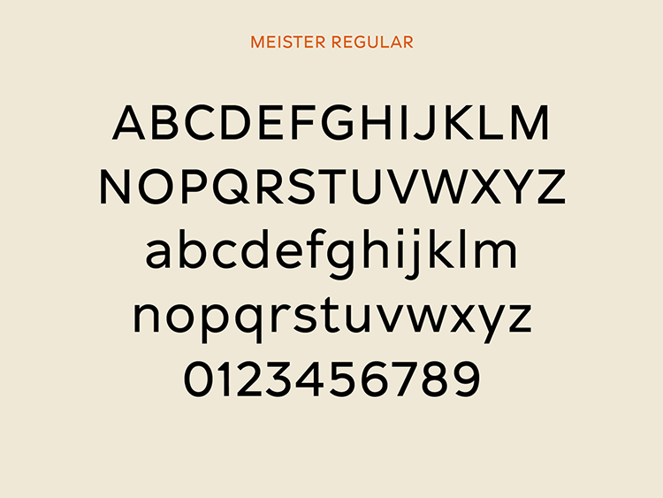
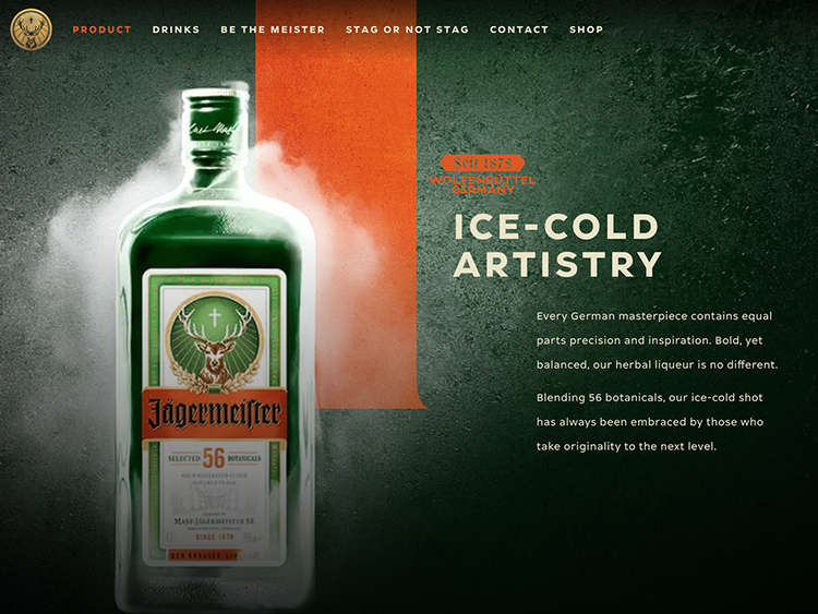
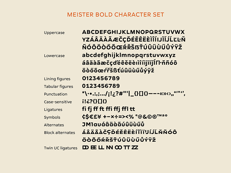 No doubt NM have done a good job spicing up the Jägermeister branding giving the new letterforms an exclusive modern design expression. We’re excited to see what NM has in store for us all next.
// ]]>
You might like...
- Posterzine™ Issue 46 | Marylou Faure - September 16, 2019
- Posterzine™ Issue 45 | Mojoko - September 13, 2019
- Posterzine™ | Karl Grandin - August 21, 2019
