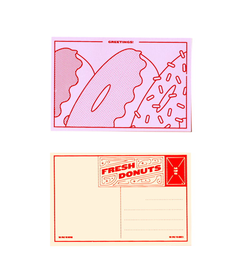
Whilst browsing the internet this week, graphic designer Joe Haddad’s ‘Delicious Postcards’ certainly caught my eye. Based in New York, his good-enough-to-eat doodles were a result of a visit to one of the city’s many food vendors. A simple and playful idea proving design and food are an unmatchable recipe when served together.
“The Delicious Postcards were inspired by a trip I made to Eisenberg’s Sandwich Shop for a classic pastrami sandwich. It was a brutal, snowy New York City day and I was struck by the splendor of the hot sandwich and the old-world stylings of the sandwich shop. I doodled a cross section of my lunch on a napkin and decided that other people should love tasty sandwiches the way I do. What better way to inform others of my appreciation for this humble meal than to literally send them images of my favorite NYC snacks? Thus, the postcard as a medium. Reference for both the illustrations and the typography on the backside of the card was pulled from the rounded plastic type common on deli special boards behind the counter. I envision the Delicious Postcards as a series that can evolve with my palette as I explore the rainbow of cuisines available in NYC.”


- WE-WE For Astropol - August 21, 2015
- Foxtrot Studio For Novum - August 18, 2015
- Nigel Evan Dennis - August 5, 2015
Discover more from People of Print
Subscribe to get the latest posts sent to your email.


