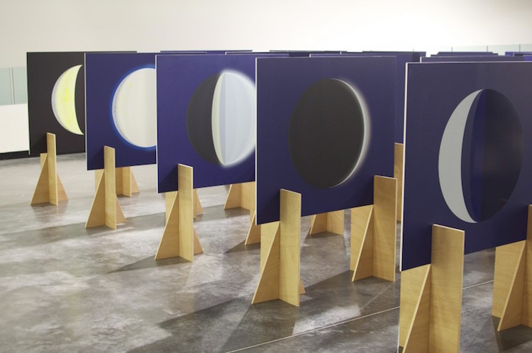
Lune, a typeface by third year LCC student Corin Kennington which is based on the processes and aesthetics of sign painting. The development of the typeface explores the relationship between traditional means of design and digital technology. This set of three posters were designed to showcase the typeface. Risograph printed by Hato Press in Teal Blue, Flat Gold and Burgundy, and the black outlines are letterpressed using bespoke wood blocks. Each of the posters are printed on Munken Pure 240gsm.


www.corinkennington.co.uk
www.corinkennington.bigcartel.com
www.instagram.com/corinkennington

Director at People of Print®
Graphic Design, Illustration and Print Enthusiast.
marcroy@peopleofprint.com
marcroy@peopleofprint.com
Latest posts by Marcroy (see all)
- How Creatives Shut Off From Work - March 4, 2026
- What’s the Biggest Lie the Creative Industry Still Tells Young Designers? - February 28, 2026
- Building Big Ideas: Inside the LEGO Design Student Challenge - February 17, 2026
Discover more from People of Print
Subscribe to get the latest posts sent to your email.