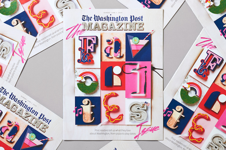
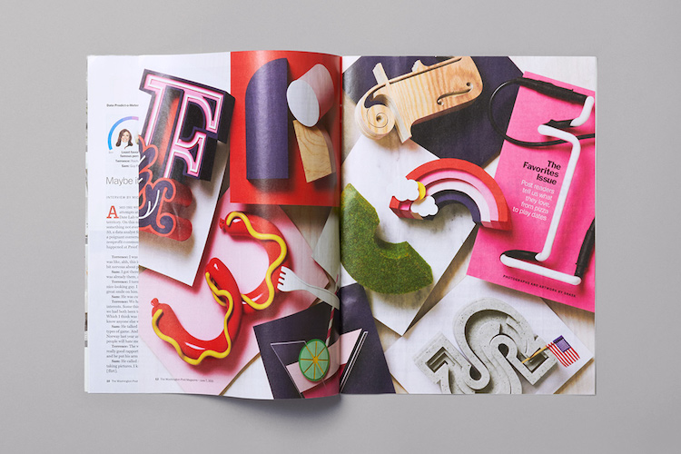
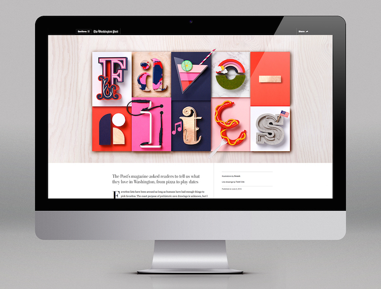
It’s a rare privilege and amazing opportunity to be able to see in-progress shots of any creative project. Recently, Swedish design studio Snask have unveiled the brilliant images of their latest project which is the cover design for one of the biggest newspapers in the US, ‘The Washington Post’.
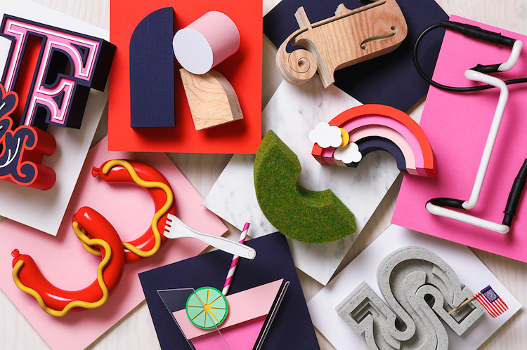
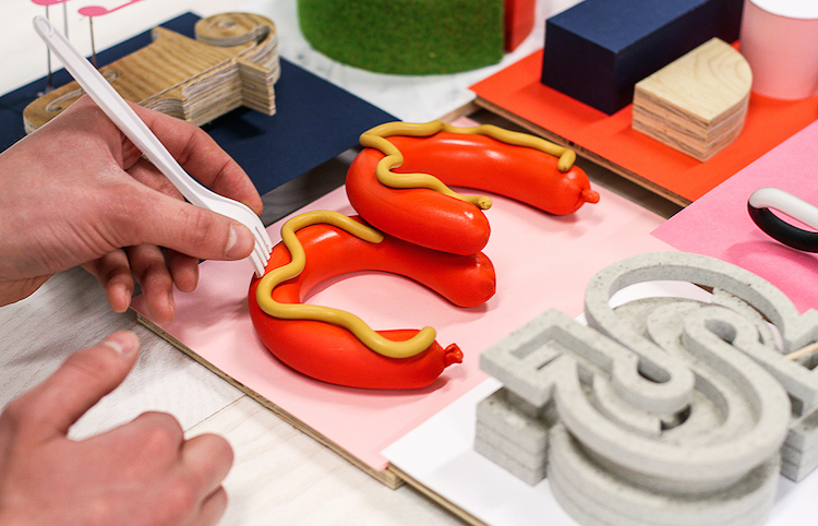
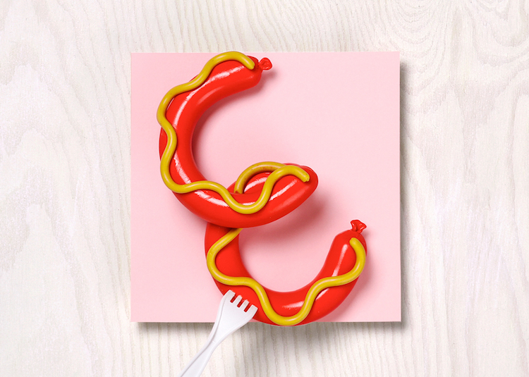
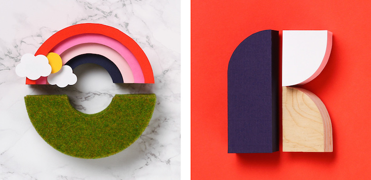
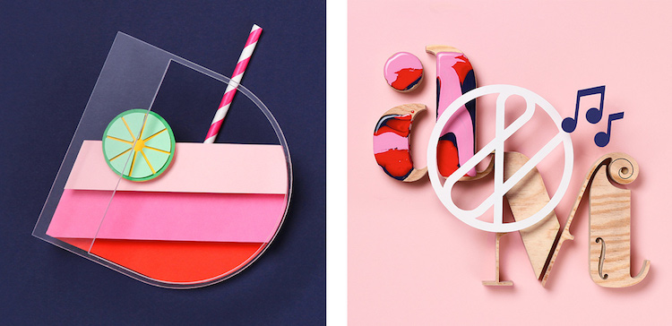
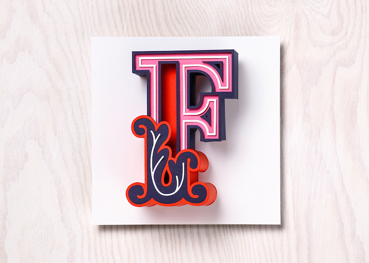
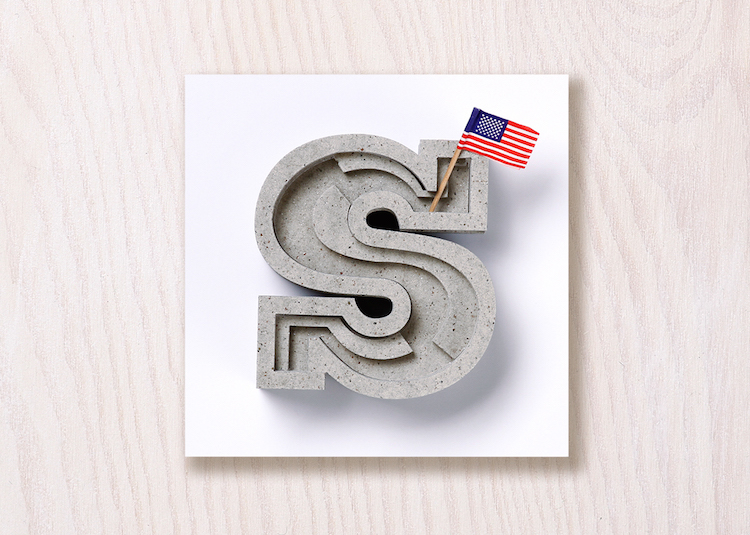
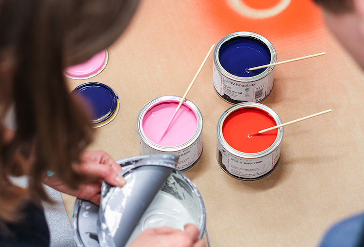
Snask used a tactile approach to tackle the brief. They wanted to capture the essence of every category in the design and illustration of each letter of the word ‘Favorites’ and as a result, they came up with unique and physical icons that perfectly reflect the characteristics of each topic using a range of different materials. The outcome is a powerful, sculpture-y set of letters handcrafted with plywood, paint, clay, concrete, and neon light. We are a big fan of Snask and once again they have got us drooling at their exceptional skills.


You might like...
- Icinori - February 9, 2021
- Sergio Membrillas - December 18, 2020
- La Perruque: Type Magazine - December 8, 2020

