“LEAP Dialogues is a manifestation of the state of the art in design practices through the lens of social innovation. It offers readers a potent cross section of case studies and career trajectories of successful people who are shaping this emergent field. The book demonstrates how design matters in social change and how an education in design allows a professional to move throughout their career making contributions to the world,” said Dr. Mariana Amatullo, lead editor of LEAP Dialogues and co-founder and vice president of ArtCenter’s Designmatters department.
LEAP Dialogues is a first of its kind book that explores the new career pathways in social innovation for designers, with contributions from 84 thought-leaders from across disciplines and sectors. These contributors encompass critical and diverse points of view, stories and experiences about key issues direct from the field, creating a multilayered picture of how this field is being shaped.
The book’s distinctive dialectic framework, presented through a series of informal dialogues interposed with first person essays, “day in the life” entries and case studies, addresses the spectrum of challenges and opportunities for designers building career pathways in social innovation, and for the organizations and institutions looking to support those careers. The interesting and unexpected pairings of perspectives in the dialogues push each other to uncover stimulating insights and debatable ideas that are at times provocative, at times reflective, at times informative but always engaging and accessible.
LEAP Dialogues: Career Pathways for Designers in Social Innovation was edited by Amatullo with Bryan Boyer, co-founder and partner at Dash Marshall; Liz Danzico, creative director, NPR and founding chair of the MFA Interaction Design, School of Visual Arts; and Andrew Shea, founder and principal of MANY.
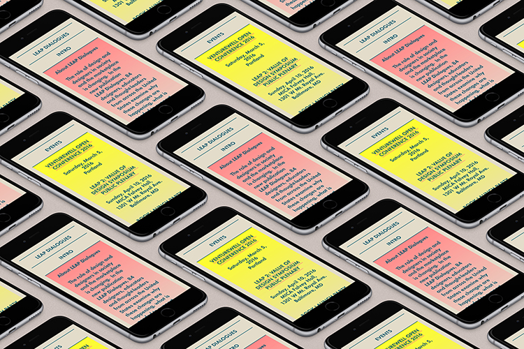
TwoPoints developed a visual identity for the publication and it’s marketing tools, website, poster, postcard, e-flyer and newsletter. The flexible visual identity consists of a simple yet distinctive color scheme (neon red, petrol blue and soft gold) and a custom designed typeface.
The fading of the two very different colors, the bright and shiny neon red and the calm and balanced petrol blue, is a recurrent theme of the visual identity. It represents, on an intuitively perceived layer, the dialogue between two different voices. Rather than being treated as opponents, they stimulate each other and sometimes even fade into each other.
The custom designed typeface avoids closed forms on purpose. It tries to represent, in a subtle way, the open approach the editors have towards the theme of the book. Rather than imposing a “perfect” definition by one author, it allows many actors, including the viewer/reader, to form their own definitions, as the viewer would complete on their own the gaps in the letters of the typeface.
Client: Designmatters at ArtCollege of Design
Year: 2016
- The Virgil Reader Vol. 001: Virgil Abloh’s Legacy as an Open-Source Tool - March 10, 2026
- City Series #002: Amesbury, Massachusetts with Carl Unger of Harsh Realm and Monotype - March 9, 2026
- How Creatives Shut Off From Work - March 4, 2026


