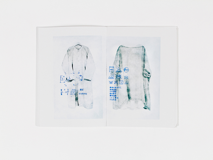
An undeniable beauty unfolds within Shimin Chen’s intriguing exploration regarding the relationship between wash labels and fabrics. In reference to the ever increasing fast pace rhythm of life, Chen injects the realisation of the rush culture in which we subject ourselves, through the method of washing clothes. The overlooking of the care label is a perfect example of the ignorance we apply to the mundane tasks and thus the consequences we face.
The passionate and intensive focus on typography, which surfaced from Shimin Chen’s extensive experience of graphic design, is exquisitely integrated thus becoming the main focus of the zine, along with the integrity of the label icons. The similar shades of blue and grey complete the limited colour palette in attempts to diminish distraction.
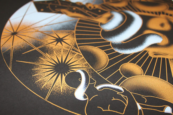
While typography may be the intended focus, the material on which the zine is created contributes immensely to the wash label aesthetic. By using an unconventional waterproof paper the zine is washable at 40 degrees enhancing the uniqueness once more. The content of the zine is printed mostly by risograph while the method of screen-printing is also infused.
Right now and much to our pleasure Shimin Chen is in the midst of establishing a design studio titled ‘rein’, mainly focusing on branding and typography. View Shimin’s online portfolio here.
- Kristina Suvorova - March 27, 2017
- Andrés Gallardo Albajar - March 21, 2017
- Marietta Varga - March 14, 2017


