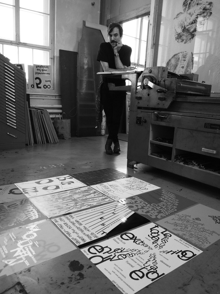
Switzerland is a great place for those who love nature, trekking in the mountains, and chocolate. But if you ask a designer what is the country known for, they will of course mention its rich graphic design heritage! Swiss graphic designer Anastasia Temirkhan has been following the work of fellow designer and letterpress printer Dafi Kuhne for a long time, and became fascinated by his fantastic posters for the Typographic Printing Program; an intense type-focused poster design class. However, it was only after witnessing his posters live at TDC Hangzhou that Anastasia made the decision to attend his 2 week course (June 23–July 6 2024) in Näfels, Switzerland. Below, Anastasia tells us all about her experience of the program, the guidance she received from Dafi, and why you should check out the program too!
 I will say right away that this course is not for the lazy ones: classes start at 9:00 (sharp) and on average finish at around 20:00. The only exception was the day of printing, when we finished at 1:30 am on the next day (but Dafi had informed us in advance)! All in all, I found the course engaging and insightful. I liked that it was well structured, I valued the attention and feedback provided by Dafi during the course, and I found the experience gained with the printing machines fun as well as helpful when working with printing companies.
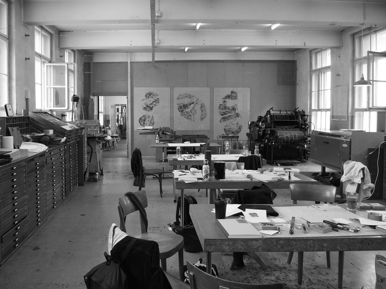
Overall, the course was divided into two parts: the first week was focused on theory and putting it into practice. This included well-balanced material on “Microtypography” theory input, Kerning, tracking, “Macrotypography”, Paragraphs, and larger spacings. Practice included systematic printing experiments with chipboard, hands-on “Kerning wood type”, analogue sketching and layout exercise, Justified paragraph, and analogue sketching for a semantic typographic poster. Each day ended with visits by renowned speaker guests including Isabel Seiffert and Christoph Miler, Milana Herendi and Tiziana Artemisio, and Julia Marti.
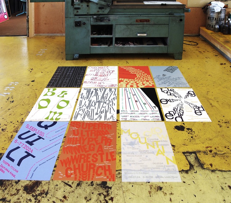
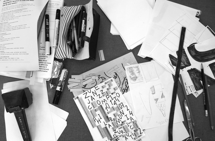
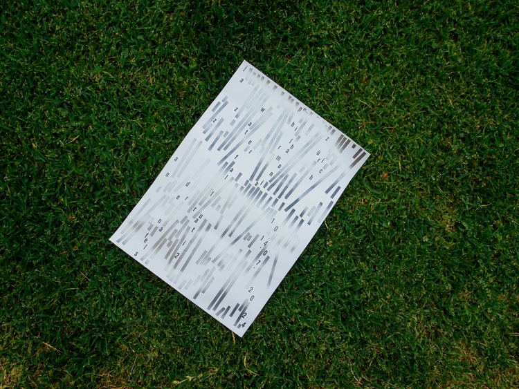
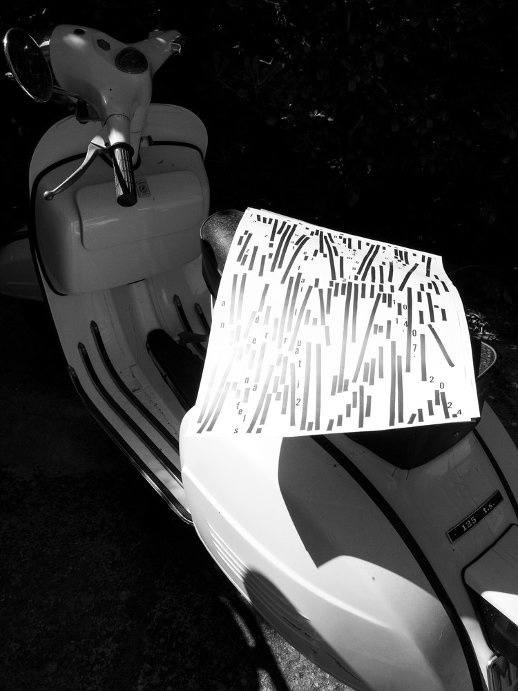
 In the second week, Dafi gave us a specific task to work on: creating a poster for an ideal event to take place in Näfels. So, we studied the town, its geography and what it had to offer, and we each came up with an idea that was developed throughout the week and finally printed. My idea was a poster for a Jazz competition and for several days I made sketches by hand using information I made up about the event, playing with individual words, syllables, and letters. To search for an image, I selected three keywords that would more accurately characterise my project for the Jazz Festival: rhythm, waterfall and flow. These words gave me scope for imagination and helped me define the possible plastic techniques. Having selected the most interesting graphic moves from my sketches, I continued to improve the composition. I really enjoy creating a multi-level image through a simple shape, in this case a “line” that inferred a shape of a waterfall. When I got to that point, I could see how a real rhythm was coming together, the composition conveyed the vibration effect I was looking for. I appreciated the comments and tips Dafi gave throughout the course and while each of us was working on our own poster, he made sure he could spend time with each of us and provide specific feedback to the work everyone was doing.
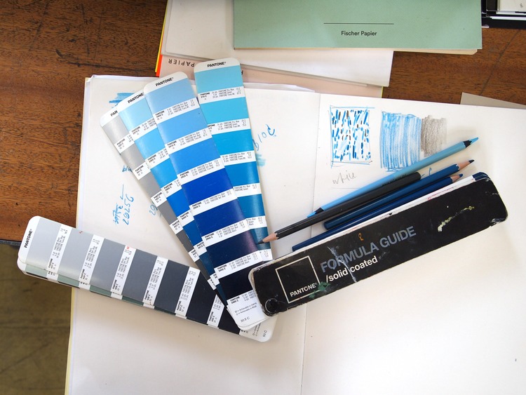
 Among other things, Dafi drew our attention to how important it is at the final stage to decide on a colour palette and type of paper, being careful that the choice also reflects the metaphor of the poster. In my case, the idea of a waterfall and flow was amplified by shades of silver paint that reacted to light, and a thin paper (70gr) that would easily bend under the wind.
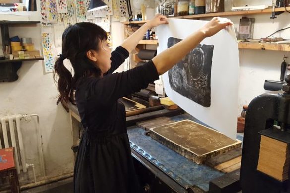
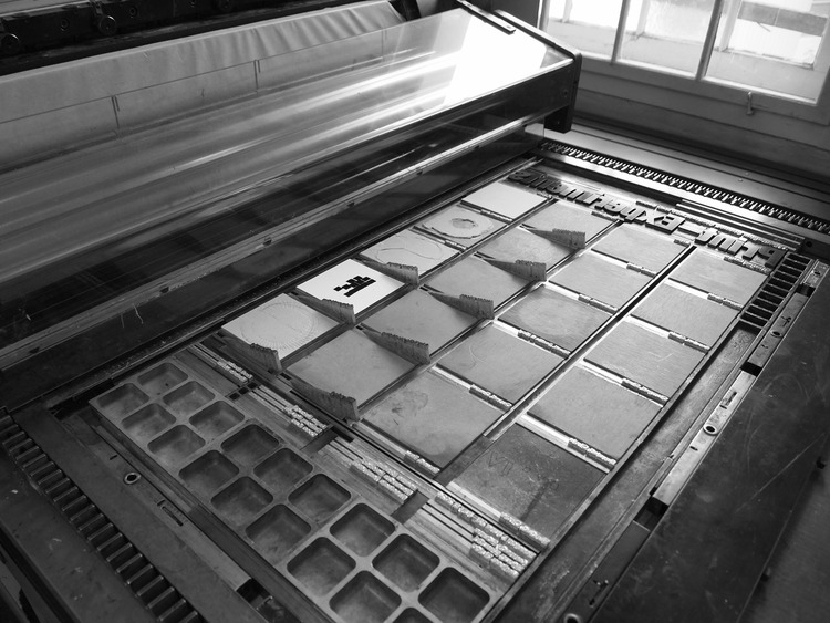
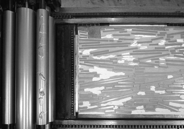
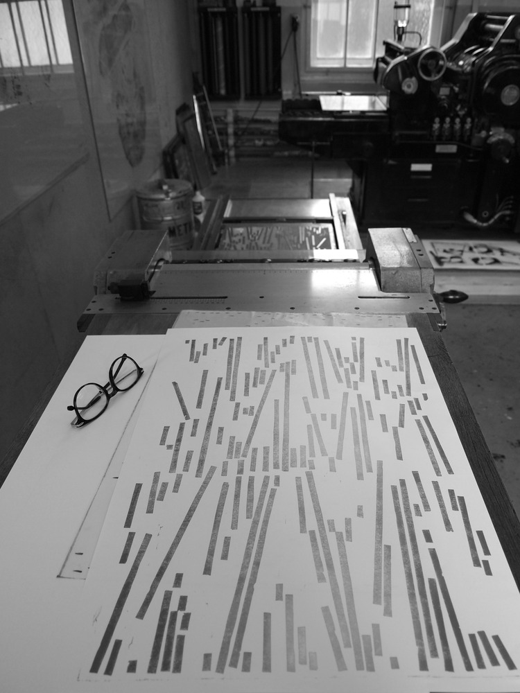
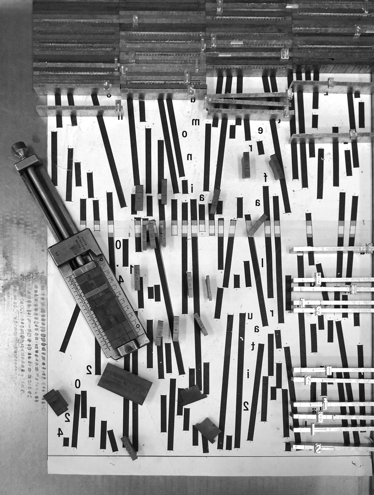
My poster consisted of two printing stages: Linography and Ludlou set. In the first stage, I transferred the printed graphics through tracing paper, but before doing that I flipped the graphics horizontally. The carving stage of the first layer took about 5 hours. Then, I began selecting the desired tone of silver, making different mixes with more or less black: 10%, 25%, 40% (during this mixing process, one needs to make sure to take notes about the proportions of mixing different colours each time!). When the desired colour/shade has been reached, one can mix ink for printing, and in our case, 25 grams was enough. At that point, the press is set up, the alignment is prepared, and the paint is applied on the sheets. Each of us had 25 sheets at our disposal. Once completed, one would clean the machine and wait till the posters dry.
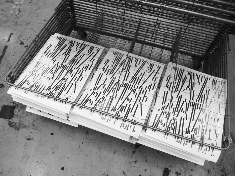
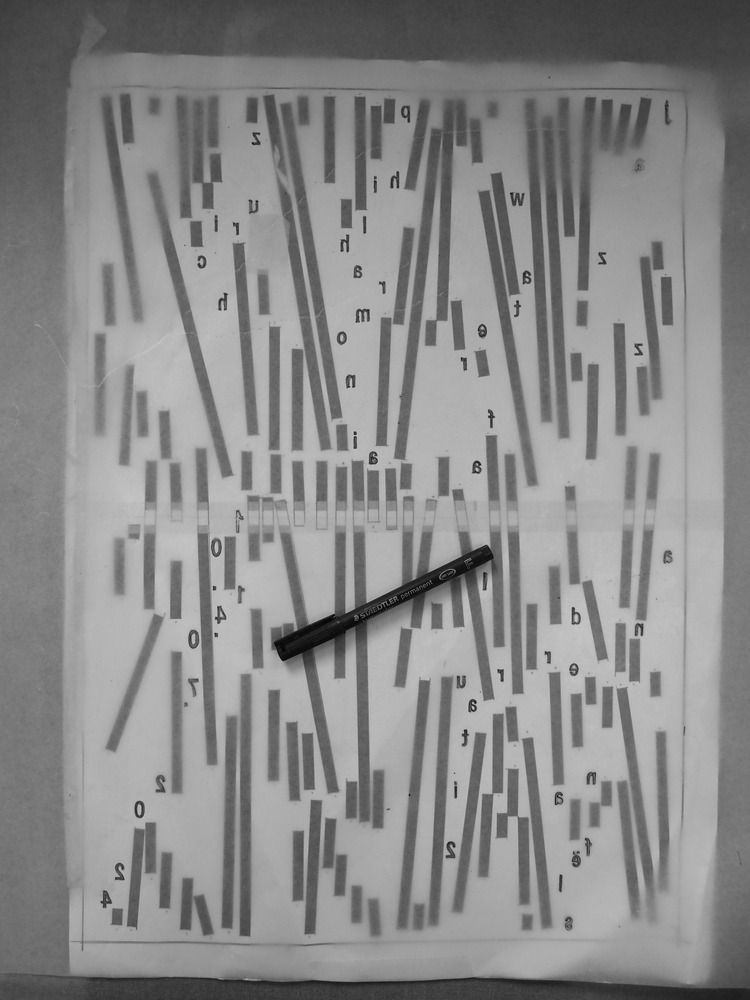
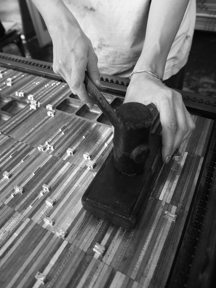
 In the second stage, I flipped the typography horizontally again and took a sheet of tracing paper and transferred the graphics on it. The tracing paper helped to guide us when typing the font composition. The weight of the second layer of printing turned out to be quite impressive! I filled the tray using the Ludlow machine. Having secured the composition on the press with magnets, I tapped the entire surface of the type-setting surface with a hammer which was necessary for levelling. The ink was applied to the surface with a roller and a first pass was made. Sometimes adjustments are required, and type metal must be remelted and retyped. So we printed and adjusted again until the graphics matched the original sketch. In the end, of the 25 sheets, 15 sheets turned out well. I let them dry and trimmed the edges. Work completed!
 The process took time and a lot of focus, particularly when working with the machines, but I really enjoyed the process and the satisfaction to see the final poster after going through all the steps!
Keep track of Typographic Printing Program announcements and next workshops here.
Want to know more about our membership? Give us an email at members@peopleofprint.com.
- Call for Artists: In Limine Artist Residency 2026, Monte Sant’Angelo, Italy - February 10, 2026
- Dream of Venus Examines Material-led Design Through Analogue Printmaking - February 3, 2026
- Words That Sound Like Nothing but Mean Everything - February 1, 2026
Discover more from People of Print
Subscribe to get the latest posts sent to your email.