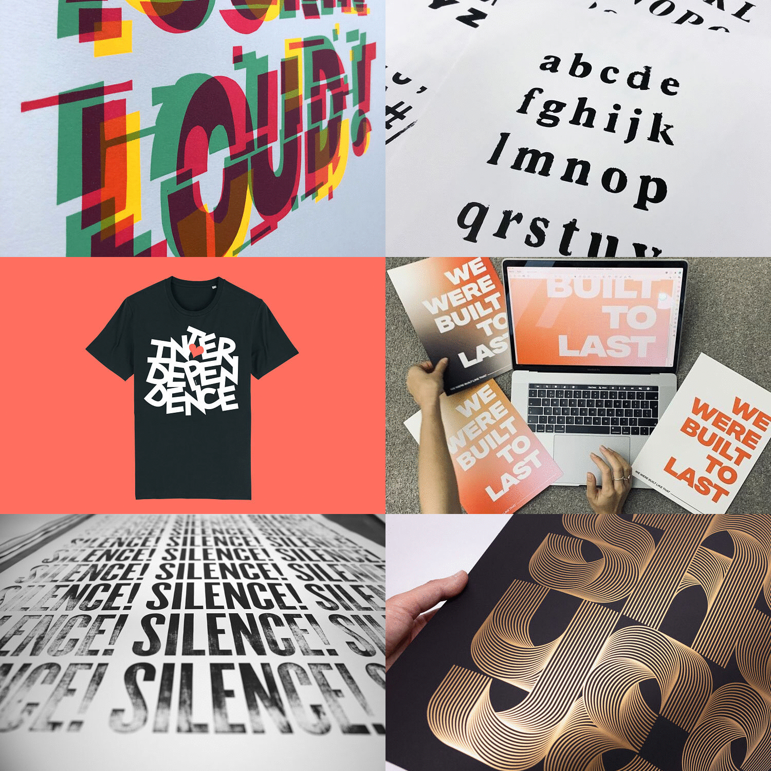
This month POP are proud to present a selection of typographic print projects by some of the talented members of our community. From letterpress prints, to fundraising tees, and gig posters, our members have innovatively used typography to convey a variety of messages.
David Mascha: Say Yes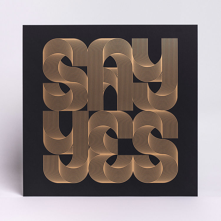
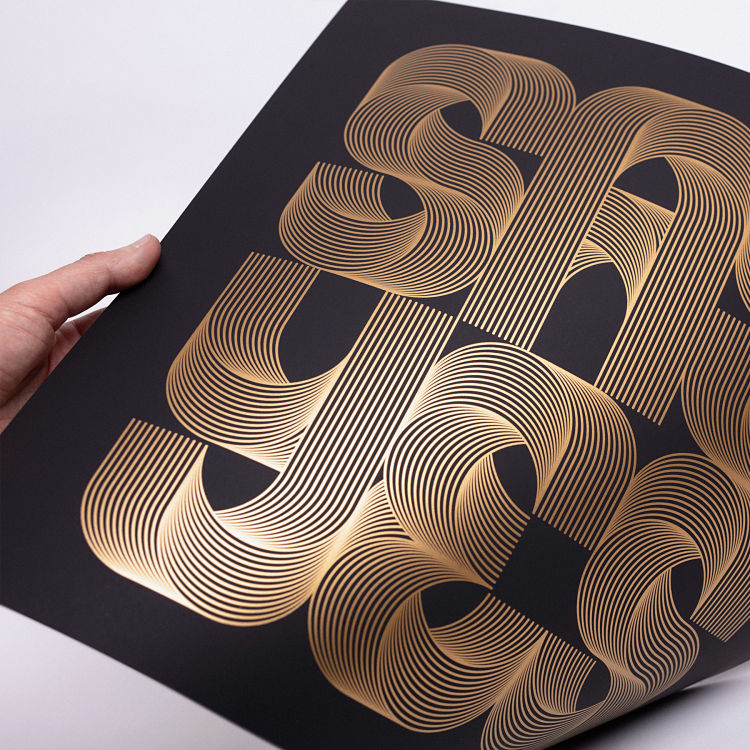
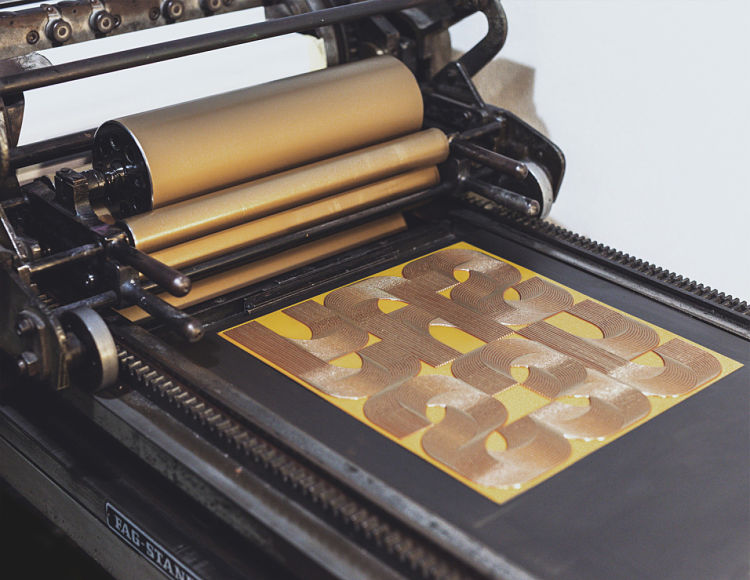 Vienna-based artist and designer, David Mascha, recently teamed up with Pressink, a letterpress studio based in Slovakia, to create a series of high quality handmade letterpress prints. Say Yes is part of an ongoing series of letter-form explorations and was originally created for the Goodtype Tuesday challenge on Instagram. The task was to letter something positive that you have learned or gained from the Covid pandemic. During the first lockdown, David had a lot of time to focus on himself and his work, and taking part in the ’36 Days of type’ challenge helped him to get back into a creative groove producing lots of new artworks. The message behind Say Yes is to challenge and push your boundaries, and get out of your comfort zone. Soon after, the idea was born to make a series of letterpress prints together with Pressink. A small edition was produced with a polymere print plate, printed on 70 year old german FAG Standard proof press. Golden ink was used to create a beautiful contrasting effect on the black non reflective paper.
Studio Turbo: Plotter Type Experiments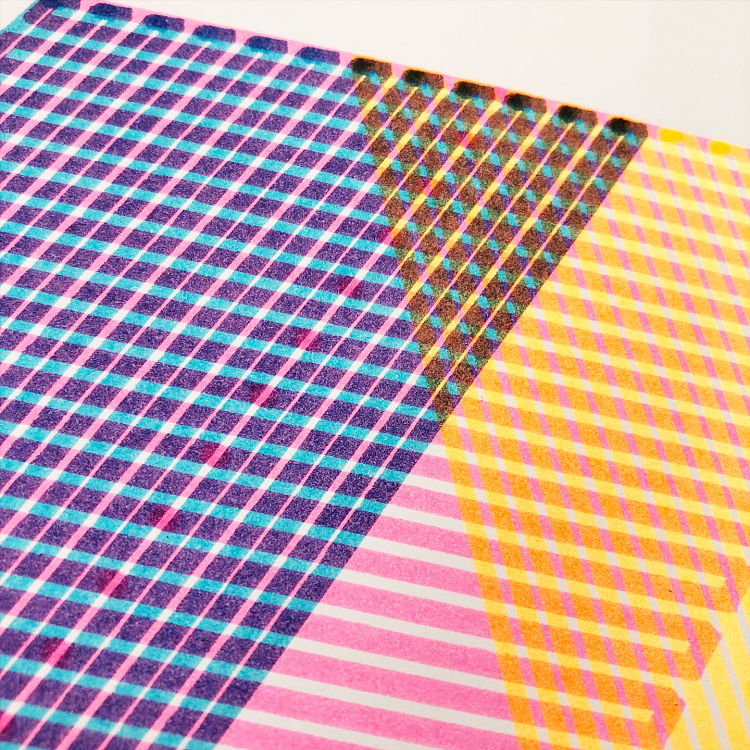
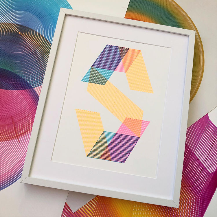
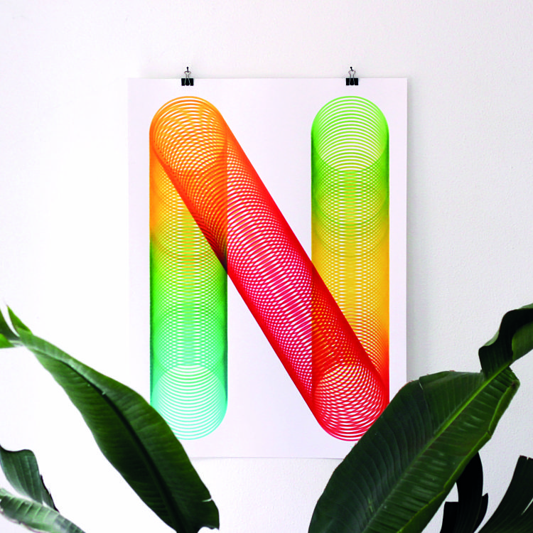 In 2020, Raoul Wilke of Studio Turbo started to experiment with a plotter and DIY marker. Amongst the results were some pretty interesting and colourful typographic prints that show the hidden qualities of transparent inks. “The N print worked out awesome; I tried getting a smooth gradient in there while my plotter was drawing the circles forming the N shape. With a normal marker this is impossible” explains the designer. The S print was made by making use of 3 different highlighting markers. Due to the high transparency of the inks the overlapping lines mix into 3 new colours.
Niamh Curran: A Designer’s Train of Thought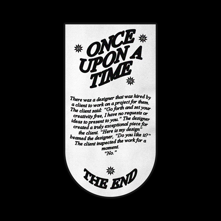
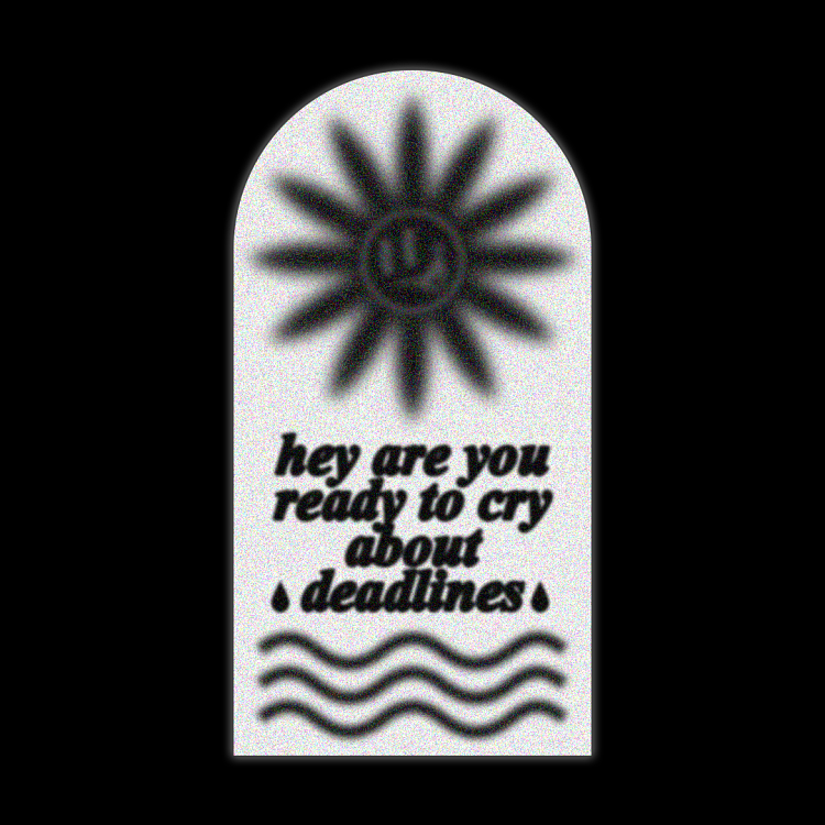
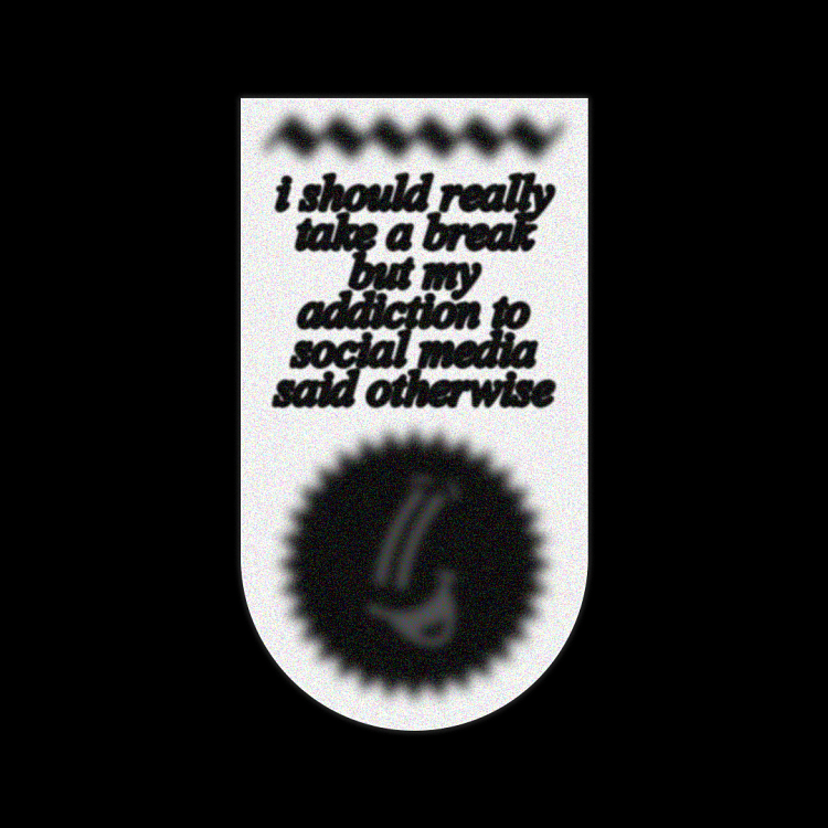 Recently, Niamh Curran has had the pleasure of meeting a number of creatives through social media. “A topic that always sparks a conversation is similar experiences; whether that be about freelancing, university or designing for an online audience” says the graphic designer. Thus, Niamh wanted to create something that reflected this. For the most part she worked in Photoshop, and created the smiley faces in Illustrator. The final result is playful and light-hearted, yet also relatable.
Spiegelsaal: Pulp lettering for Posters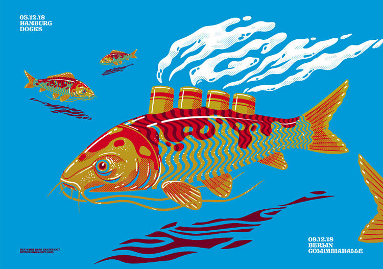
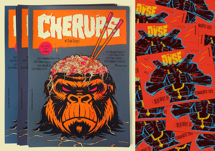
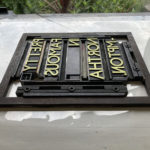
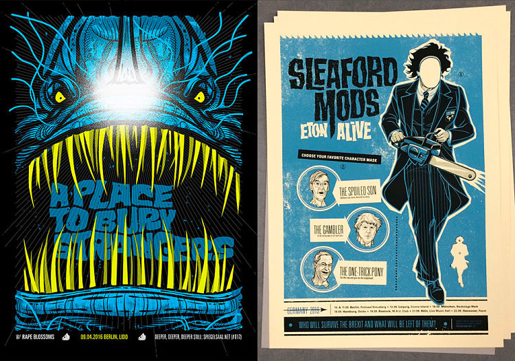 Spiegelsaal (Hall of Mirrors) is a design, illustration, and screen print studio based in Hamburg, Germany, founded by Torsten Jahnke and Jochen Mönig. The duo specialise in the creation of gig posters and branding for bands, musicians and festivals. They design special lettering for many of their gig posters, often using the great expressive lettering of pulp novel covers as reference points.
Patrick Sabbadin: Silence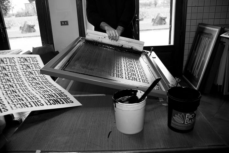
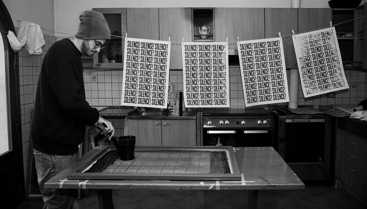
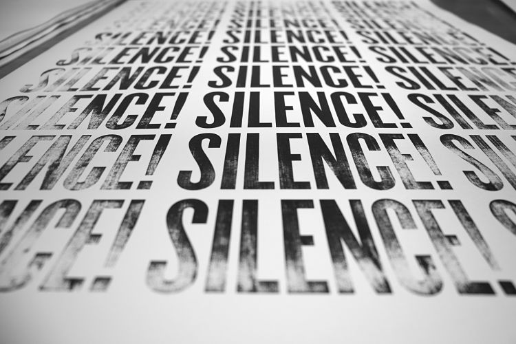 Silence is dedicated to a time in Patrick Sabbadin’s life when he was focusing on his day job, whilst also dealing with a difficult situation at home which meant he was spending a lot of time communicating with family members, lawyers, and banks; “…at the end of the day I’d only look for some silence”. It was only after some time that Patrick realised that the silence he was looking for was never really there, “or maybe, it had become so loud that my own thoughts had turned into silence”.
Angel Design Studio: Built to Last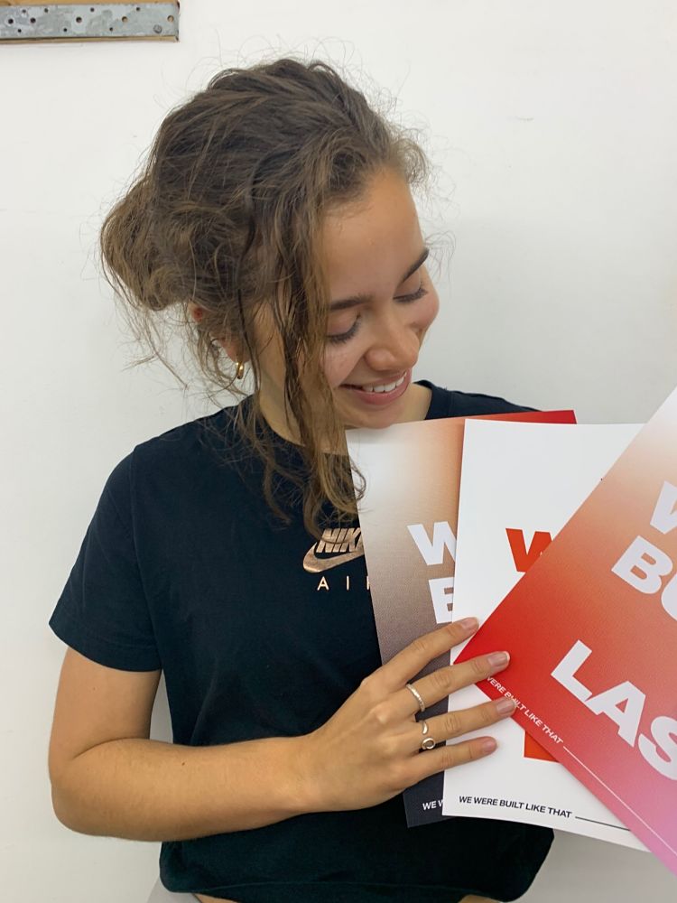
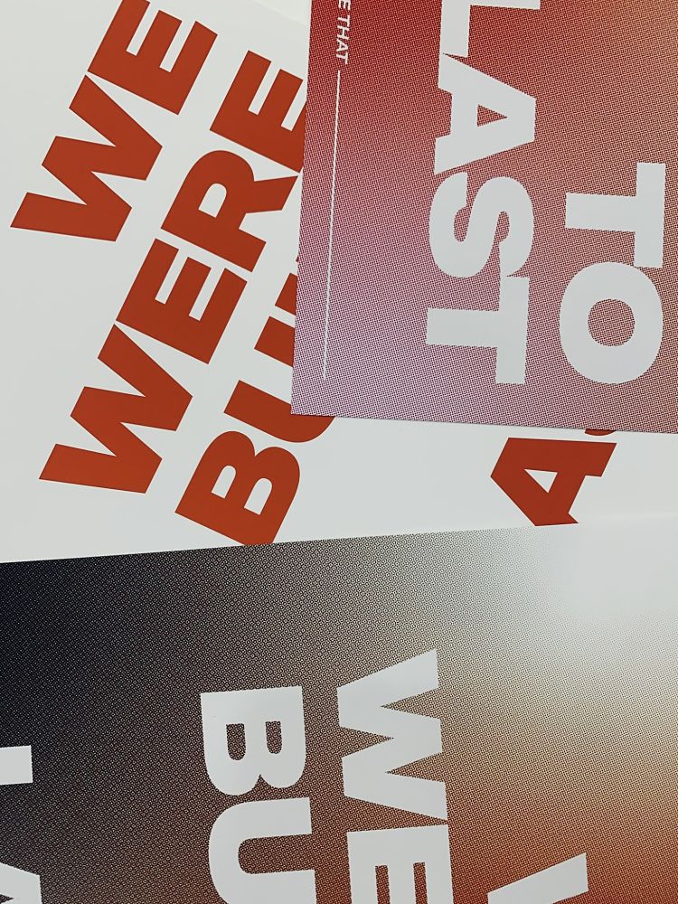
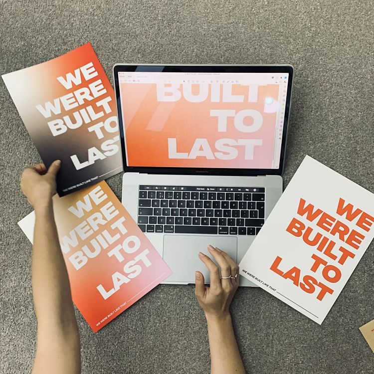
Ella Rankin of Angel Design Studio has always been surrounded by music; “having Jamaican heritage I am greatly influenced by reggae; more the old school classics like John holt. It makes me feel warm inside and I feel everyone has that feeling with some song, genre or lyric”. For Ella, music is a motivator, has helped her get through some low periods, and imparted the strength to change her whole disposition when she felt it really wasn’t possible. Through her prints, Ella harnesses the power of this art form, using the power of words to connect with people and take them to positive, encouraging and precious moments in their lives. “Whenever I put on certain songs it just floods back positive memories and good feelings. Music has so much power so I believe we need to use it wisely” says Ella. It was this sentiment she had in mind when creating this print inspired by Dua Lipa’s Built To last. She concludes; “I think it is such a beautiful sentiment. I believe we all are built to last, created with an inbuilt resilience. Sometimes we just need to be reminded of our power”.
Dotto Studio: Print Social for Crisis UK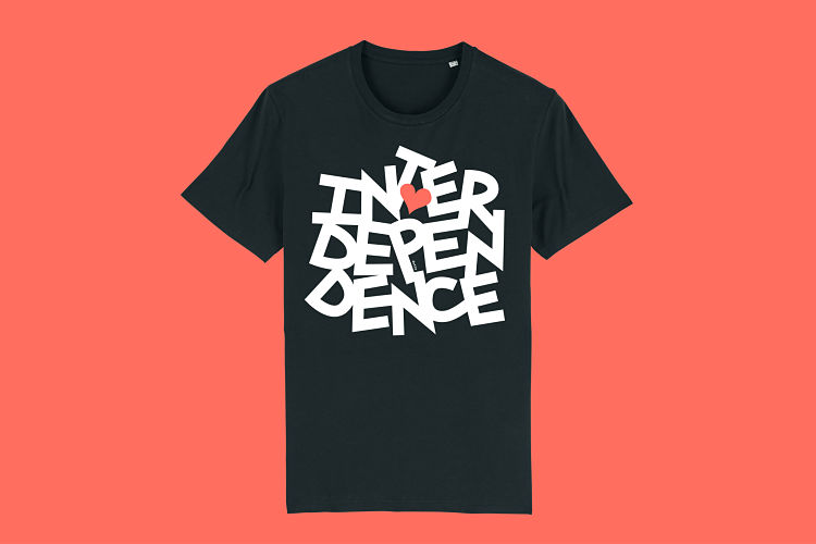
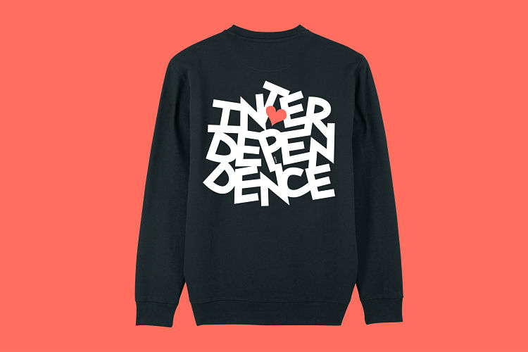
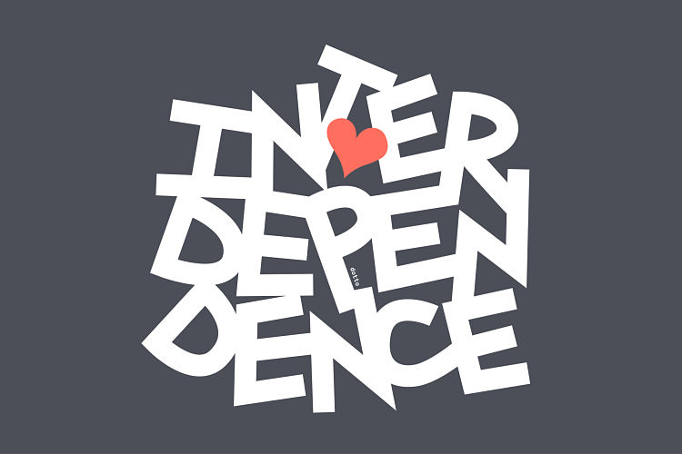 Design studio, Dotto, are working with Print Social to raise money for Crisis UK. “We depend on each other for connection and support in difficult times. 2020 particularly reminded us of this. And the importance of community spirit and shared humanity” says Dani Molyneux, the studio’s founder. Dani chose the word, ‘Interdependence’ (the dependence of two or more people on things on each other) to reflect this idea of connection. The type is set as a tight unit, each letter holding the other one up, reflecting the shared connection and support keeping heart and hope alive.
Support the campaign here.
Boris Rijksen: Distorted Alphabet
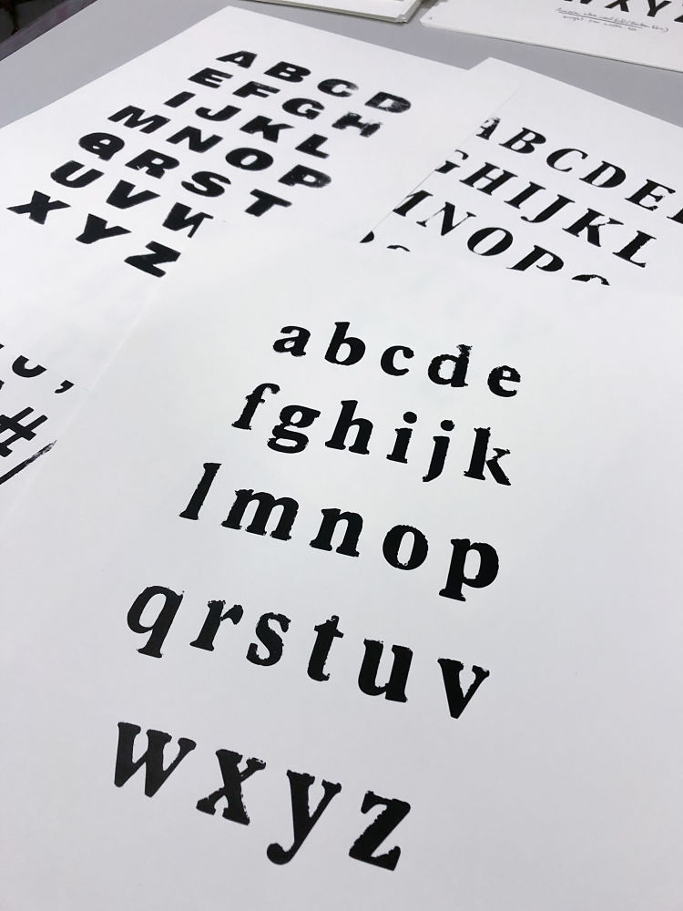
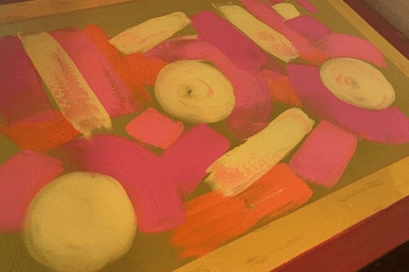
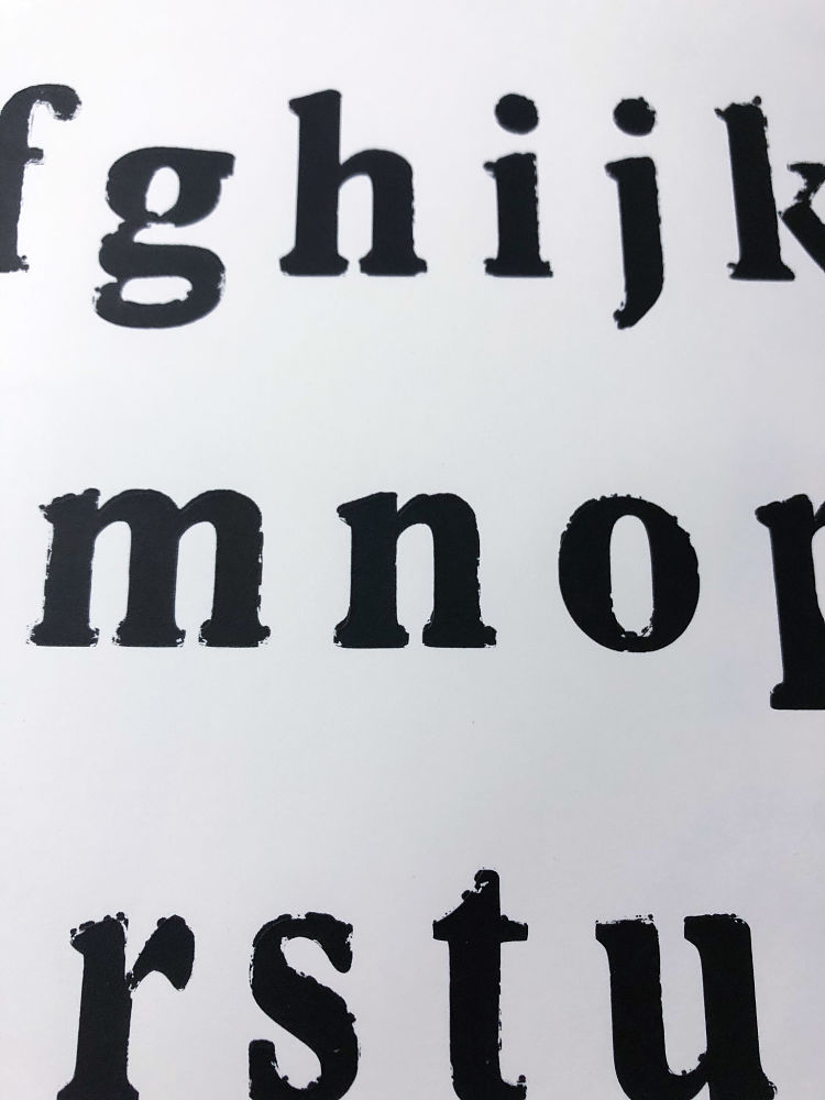 Boris Rijksen is working on building on archive of distorted screen printed typefaces. Every once in a while he screen prints an alphabet in ten different distorted variations that he later uses in animation. Boris makes a stop motion animation where he places scans of these different screen printed letters in frames. This results in an animated alphabet that he can use to write words.
Fresh Lemon Print: Ooh La La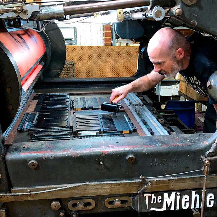
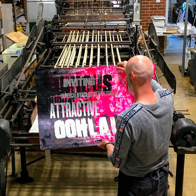
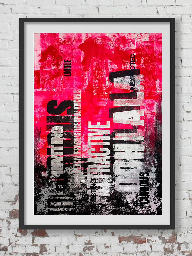 This letterpress print was produced by Phil Gambrill of Fresh Lemon Print using vintage wood block type to build up the layers of typography. Each run overprints the previous to give the effect of the words emerging up the page. The heavily inked print has a unique texture and an almost 3D feel. Due to the size of the creation, Bright Press kindly let Phil use their restored, large format, Quad Crown Miehle press, which formerly printed The West Australia newspaper, before retiring to the heritage print shop.
One Strong Arm: Play it Fuckin Loud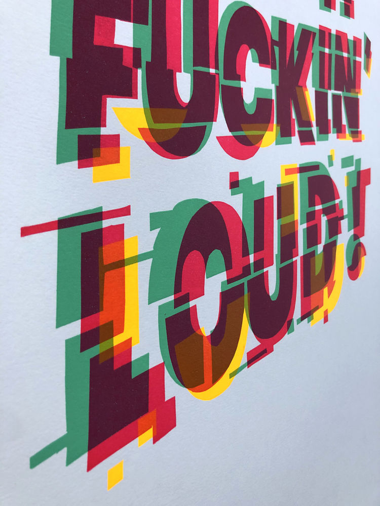
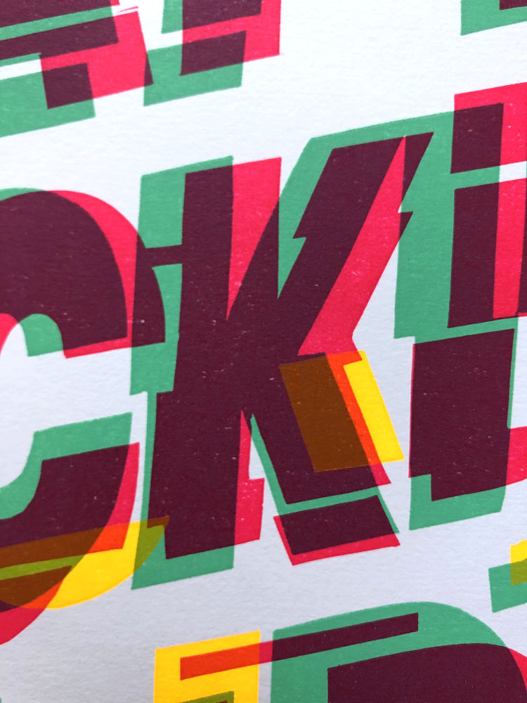
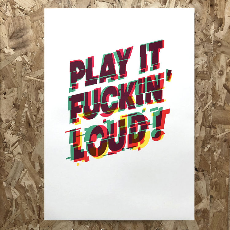 Letterpress studio, One Strong Arm, created this typographic print inspired by one of the most famous exchanges in Rock ‘n’ Roll history. In 1966, during a Bob Dylan concert at Free Trade Hall in Manchester, a disgruntled fan shouted ‘Judas’. After some back-and-forth Dylan turned to his band and told them to ‘PLAY IT FUCKIN’ LOUD’, before launching into a blistering version of Like a Rolling Stone. Thus, in a sense, it was Dylan protesting a fan’s protest about him not playing protest songs… protest cubed. The piece was produced using three colours and a combination of linocut and letterpress techniques.
You can browse our membership directory in full at www.members.peopleofprint.com. Want to become a Verified POP Member and benefit from a heap of perks all aimed at supporting your practice? APPLY HERE.
You might like...
- Amelia Bown - November 20, 2024
- Gilfalo Art Design | The Journey So Far - November 19, 2024
- Printed by Us: Printing Positive Change - November 18, 2024

