
Chaukor is a pixelated Devanagari typeface by Shivanshi Gupta, developed as part of a type design course at MIT Institute of Design Pune. Built entirely from four-sided rectilinear shapes, the name reflects both the visual construction and the conceptual intent behind the font: a simplified, bitmap-inspired system that combines playfulness with a retro, mechanical edge.
The project explores how Devanagari letterforms can be reinterpreted through strict geometric constraints. Each glyph is constructed from square and rectangular units, creating a grid-based logic that feels digital while remaining legible and expressive. By embracing limitation as a design driver, Chaukor highlights how reduction and modularity can open up new visual possibilities within a historically rich script.
Its gamified, mechanical character makes the typeface particularly suited to digital environments such as video game interfaces, desktop websites, and digital watch displays. At the same time, the bold geometry and high-impact forms translate well into print contexts including posters, zines, and promotional material. The font’s visual language also aligns naturally with contemporary music culture, finding relevance in techno, EDM, and desi hip-hop artwork, album covers, music videos, and tour graphics.
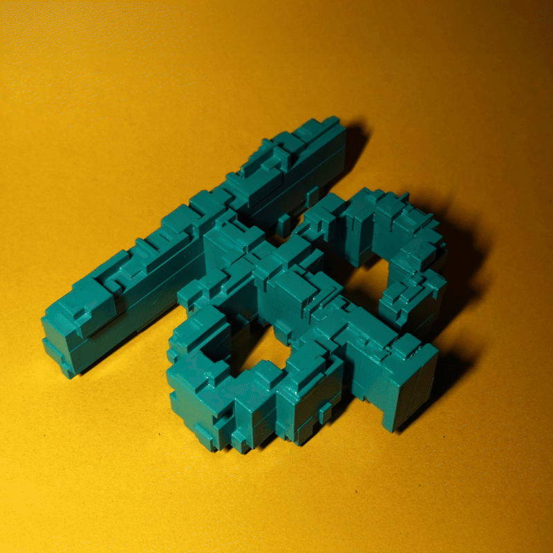
The project extends beyond the screen through physical experimentation. Selected letterforms were translated into three-dimensional objects, including a 3D-printed and spray-painted version of the Devanagari character ‘क’. This shift from digital to physical reinforces the modular construction of the font and highlights its sculptural qualities, grounding the typeface in material form.

Throughout the process, curiosity and making remained central. As Gupta notes, “I feel that the best creations are fueled by curiosity, passion, and the love for and towards the craft.” Developed within an academic context, Chaukor demonstrates how structured learning environments can support playful experimentation, resulting in a typeface that is both conceptually rigorous and visually bold.
Designer links
Behance
Instagram
Discover more from People of Print
Subscribe to get the latest posts sent to your email.