
We’re excited to once again present a selection of projects from our Official Membership community. This month, we’re highlighting screen printing; a process where ink is forced through a mesh screen, except in areas made impermeable to the ink by a blocking stencil. From prints onto wood, to mini books and tour posters, are members have used this renowned technique to bring tangibility to a range of ideas. Check out the screen printers below:
Melissa North: Mirage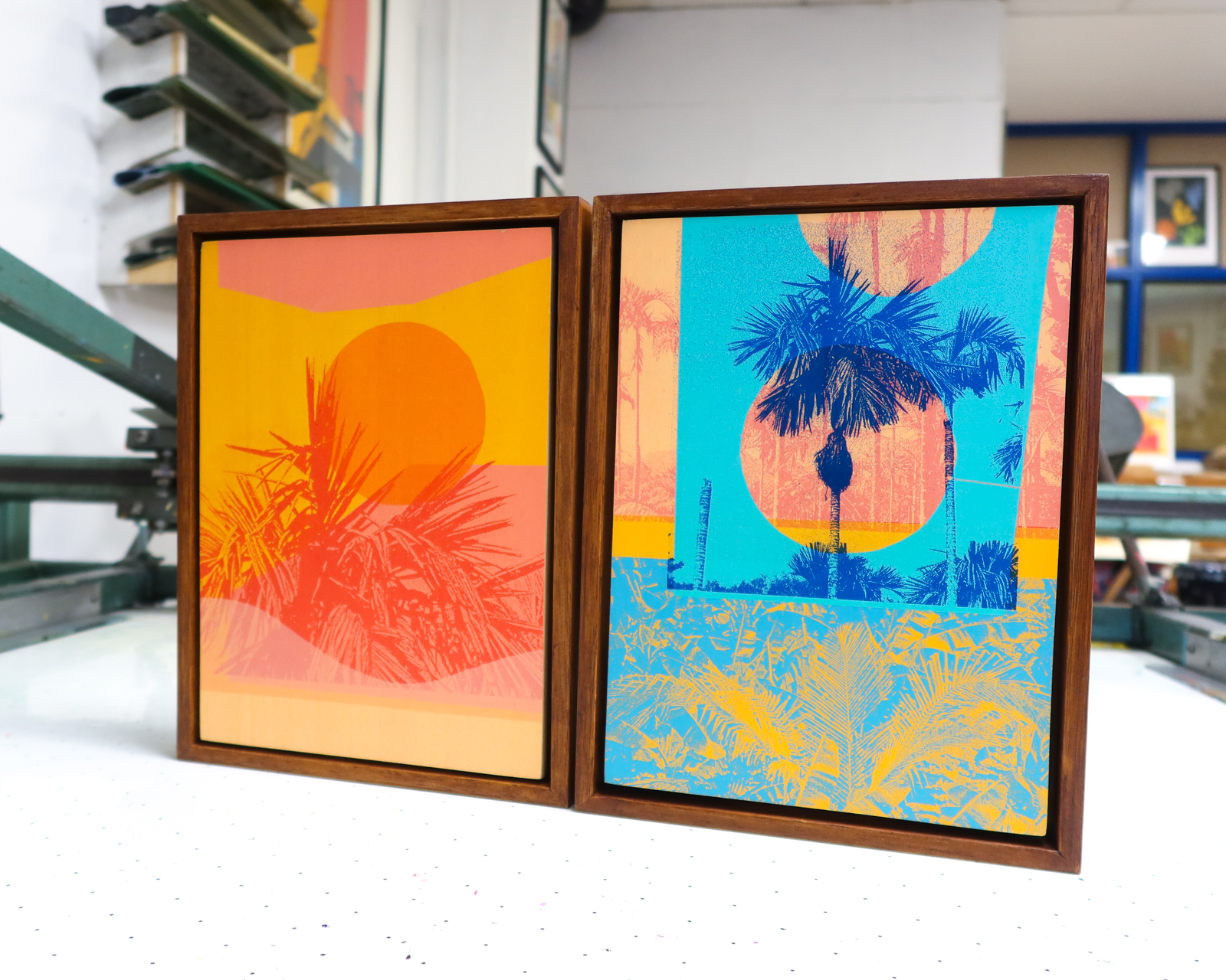
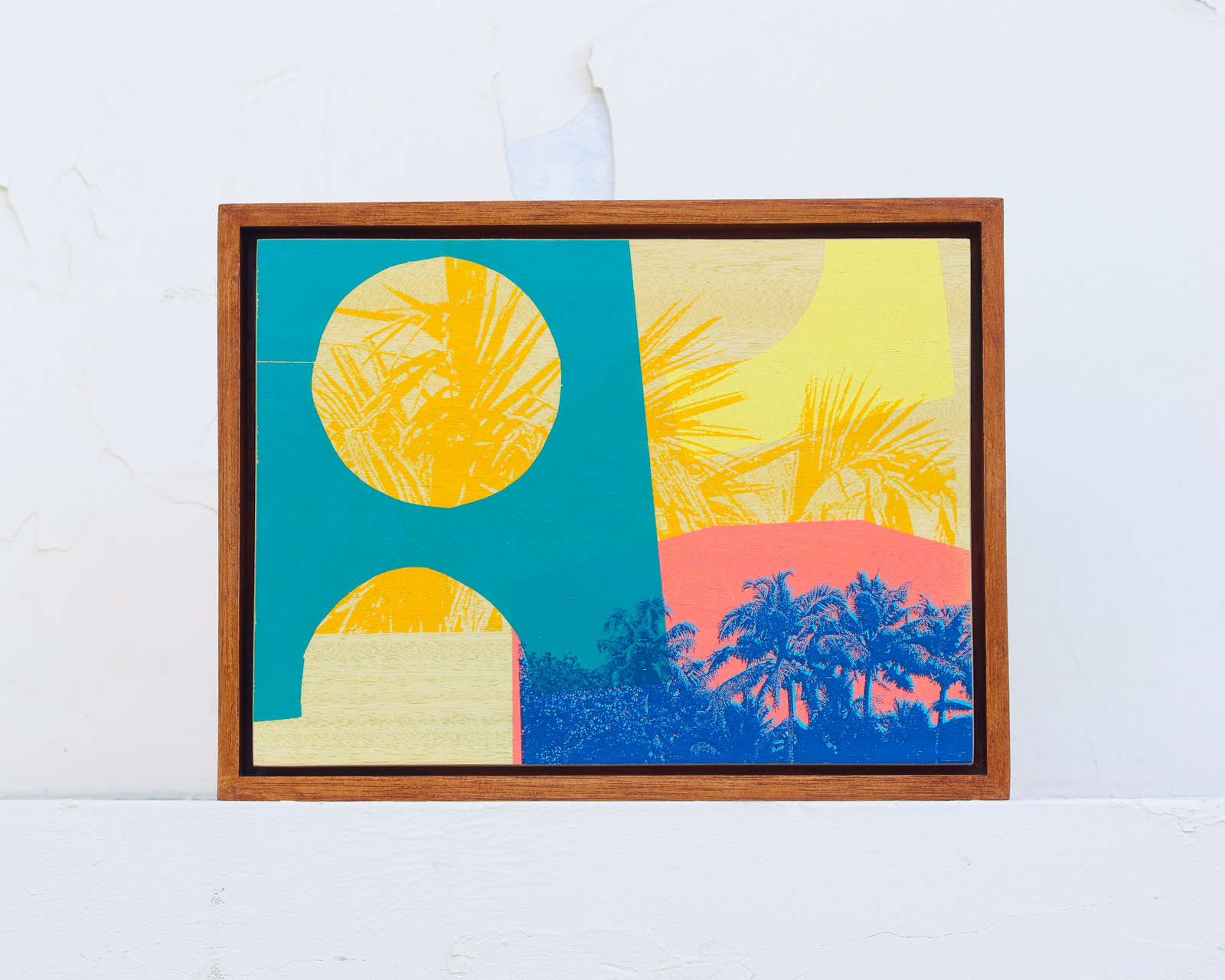
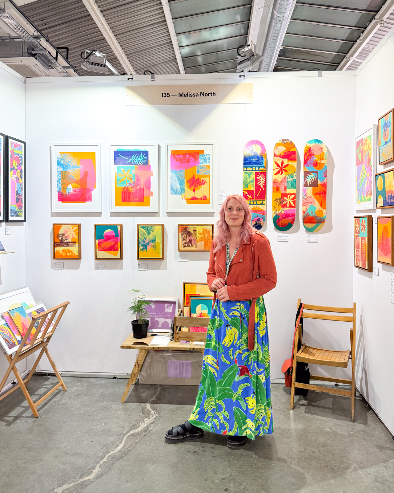 At the beginning of the year, Melissa created a new body of original silk-screen prints on plywood inspired by sunny locations around the world. The Mirage series is an ode to the process itself, in which Melissa lifted crops of photographs from her travels out of her sketchbook, exposed these onto screens, and worked intuitively layering the images up with bold splashes of colour created from hand cut paper stencils. She comments; “Approaching each piece much like a painting, it was a joy to get lost both in the possibilities and limitations that analogue working offers“. Melissa launched this collection of work at the Spring edition of The Other Art Fair in March.
Diego Miranda: The Eyes
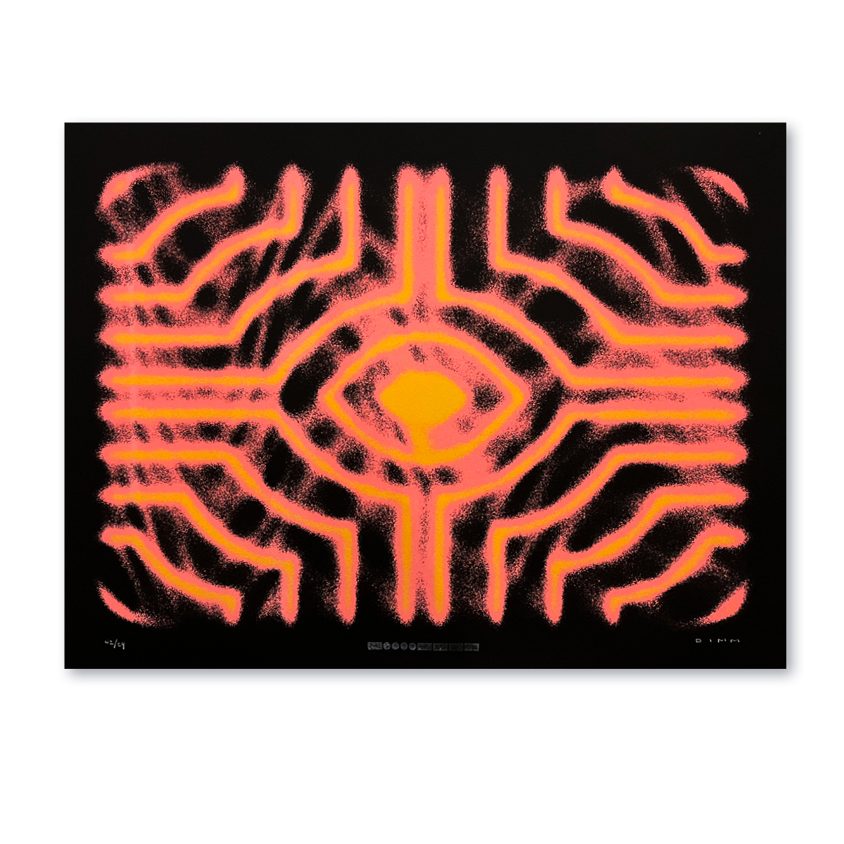
 Diego Miranda’s The Eyes series explores, through geometry, intense colours, and unconventional patterns, a subconscious world that is ready to awaken. The hypnotic shapes propose a journey into the unknown inner self we all possess; a fearless journey, a provocative invitation. Diego describes; “I’ve tried to explore new ways to get halftones using lines and grains effects, and also innovate using fluor inks to give an extra punch and contrast to the graphics”.
Ink Lounge: 303 Day Concert
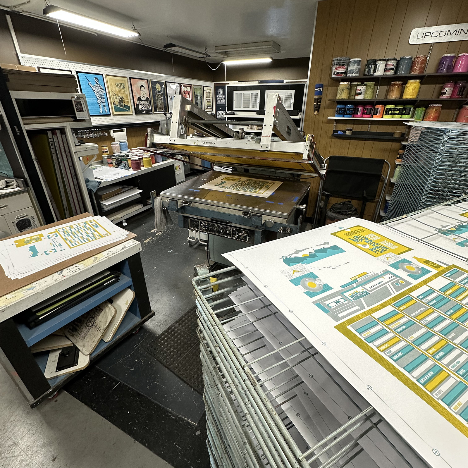
 Indie 102.3, a nonprofit independent music radio station part of Colorado Public Radio, asked Stuart Alden of Ink Lounge to create and donate a poster to celebrate their 303 Day concert. They selected 3 bands to feature from the past years local playlist, and Stuart came up with the idea of a giant cassette tape cabinet that allowed him to list all of the 2024 bands – around 120! 303 is the date, and also refers to the phone area code. The 4-layer piece includes little hints to things that are unique to Colorado. Printed in an edition of 50.
Natalya Balnova: Fortune Favours the Brave

 Fortune Favours the Brave is a two-colour silkscreen book devised and created by Natalya Balnova in a limited edition of 17. The 7×9″ book delves into the enchanting and mysterious world of sideshow magic, exploring the awe-inspiring performances that blur the lines between reality and illusion.
Tintamuda Studio: HO-ME
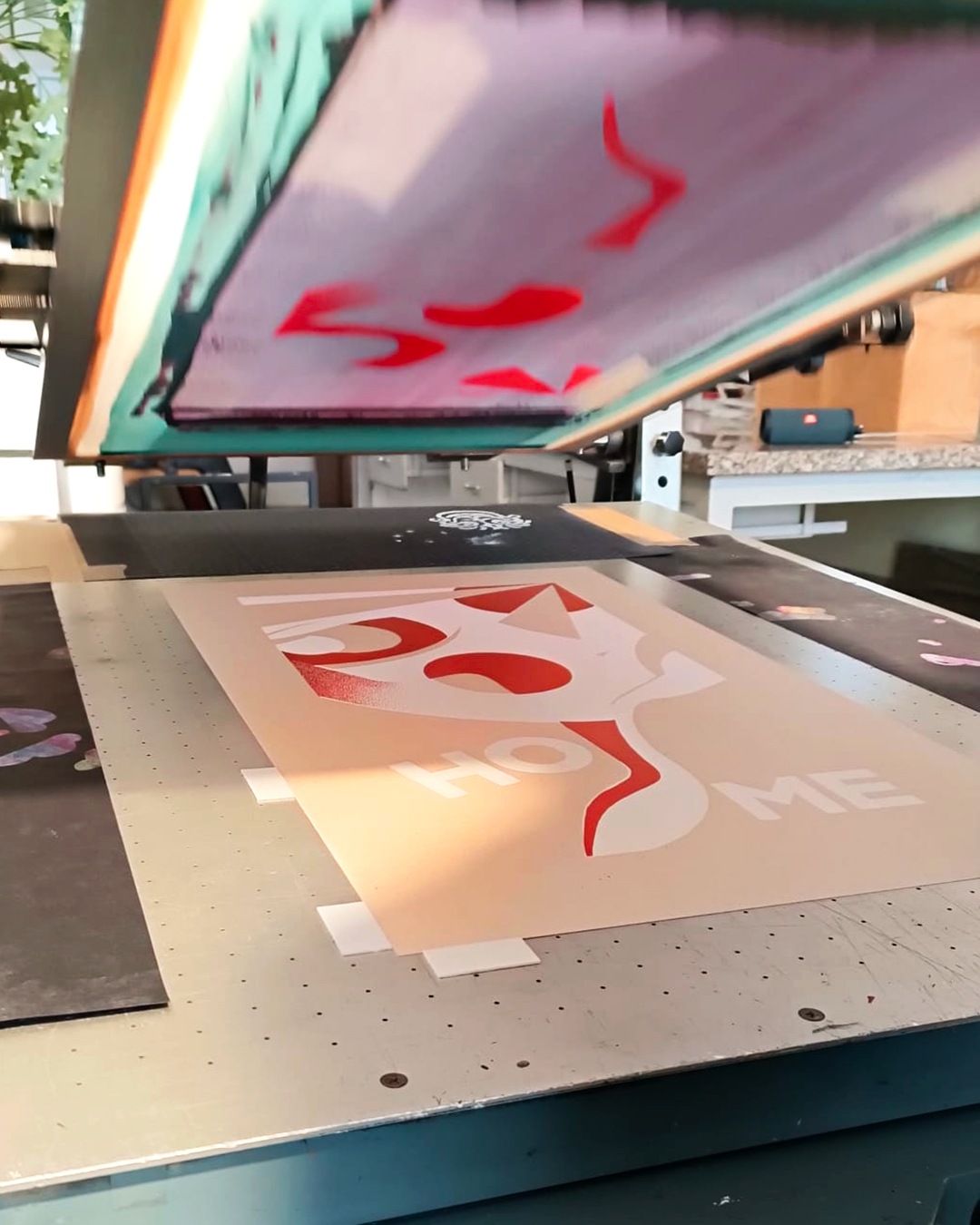
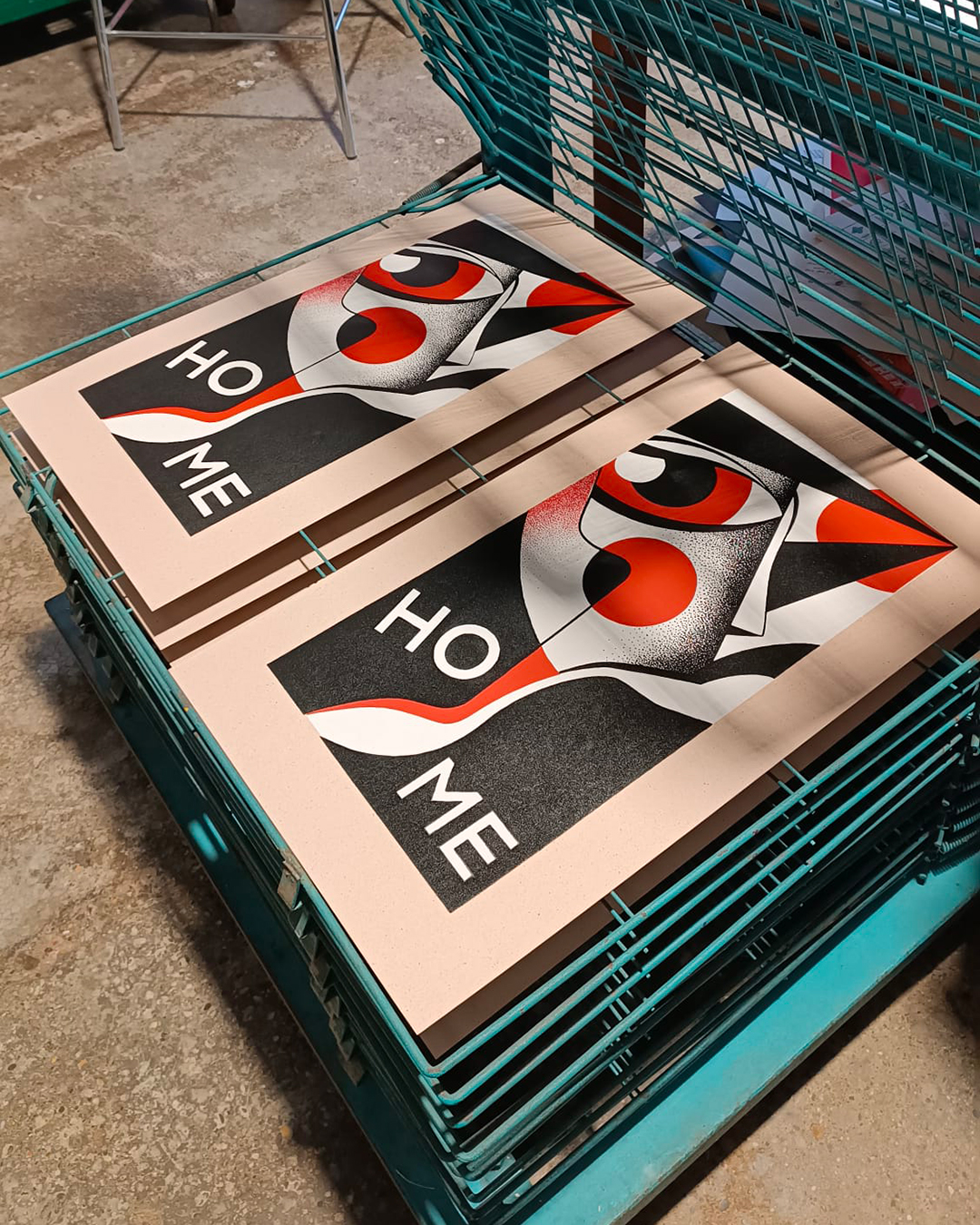 One of the latest projects that Tintamuda Studio have been working on is a project with Davide Riva from WIP Tattoo Studio. In the three colour screen print, each layer was hand painted on acetate and combined on a 35×66 cm Cacao Crush Favini paper 350gr. Davide comments; “There are two possible meanings for HO-ME. “Home” is the place to be, but if you read it in Italian, it becomes “I HAVE ME” This reveals unity, integrity, protection and peace. It’s like having an inner compass that’s always there, you know, like the eye always represents that. So, are you feeling a bit lost in a maze? That look sees the labyrinth from above and guides you without saying a word.”
Holyhead Studios Printmakers: Rainbow Powers: Rays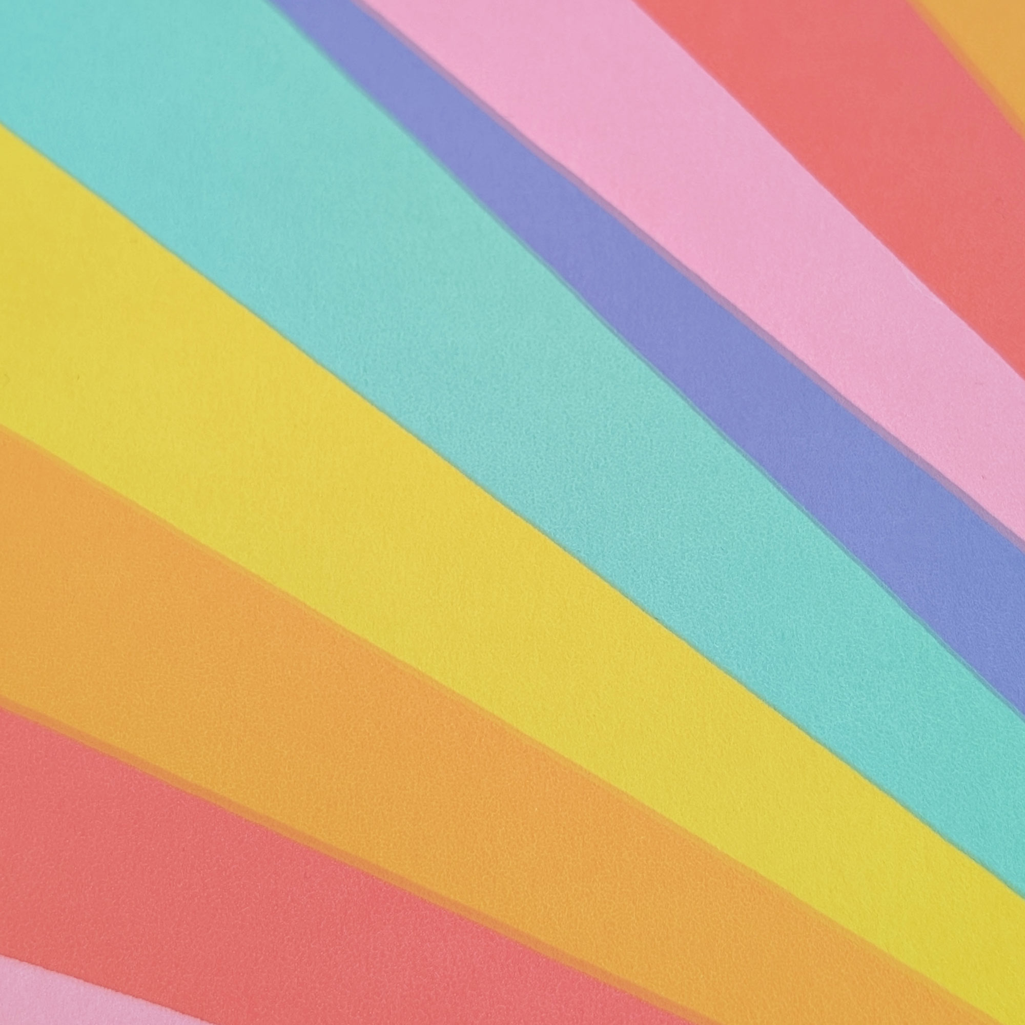
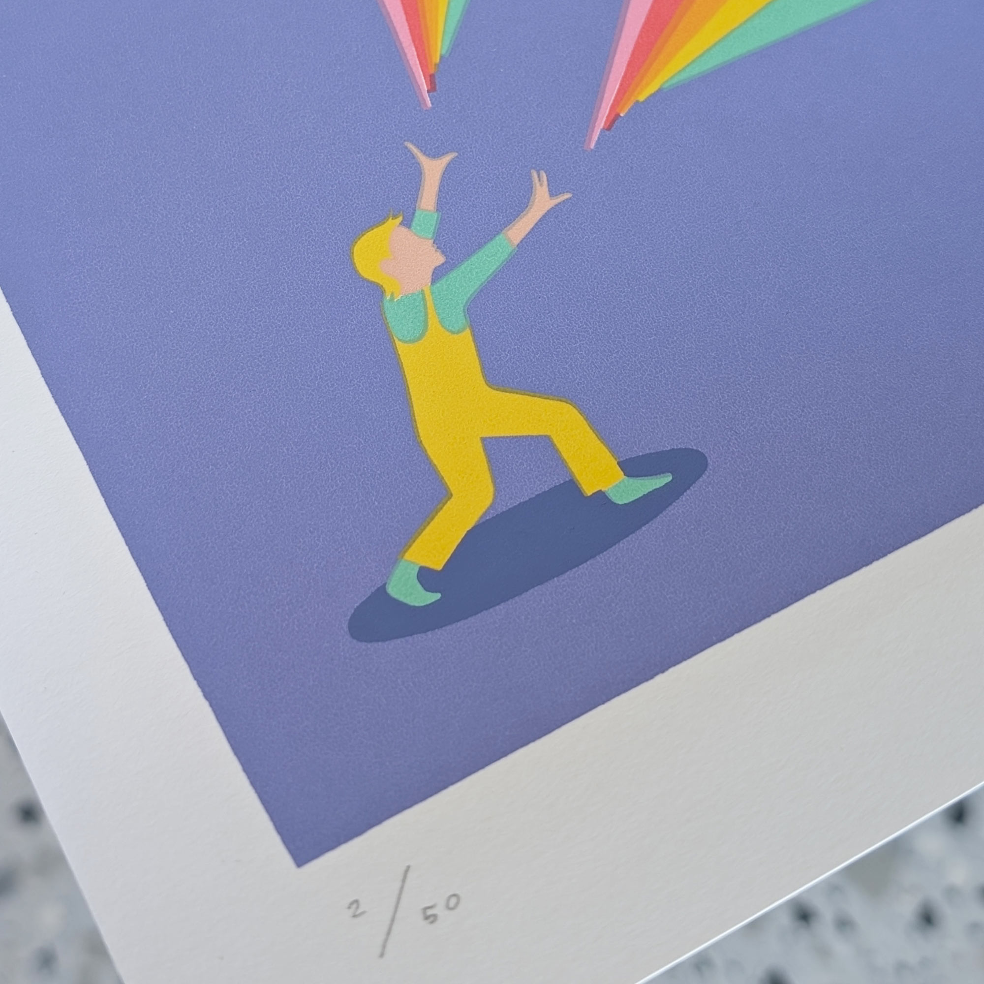
 Rainbow Powers: RAYS is a limited edition silkscreen by Laurie Hastings about wild imagination, joy, and spontaneity. The seven layers of delicious colour were hand printed by Laurie at Holyhead Studios Printmakers in Coventry. Laurie is a Screen Print Artist and Illustrator based in Nottingham, creating colourful, illustrative and emotive screen prints. Passionate about the screen printing process, she is always experimenting creatively with the medium to express ideas and produce visually vibrant work. Recently, she has started to explore scaling her work up, to create a greater visual impact.
Berkshire Printmakers: Fairground Fonts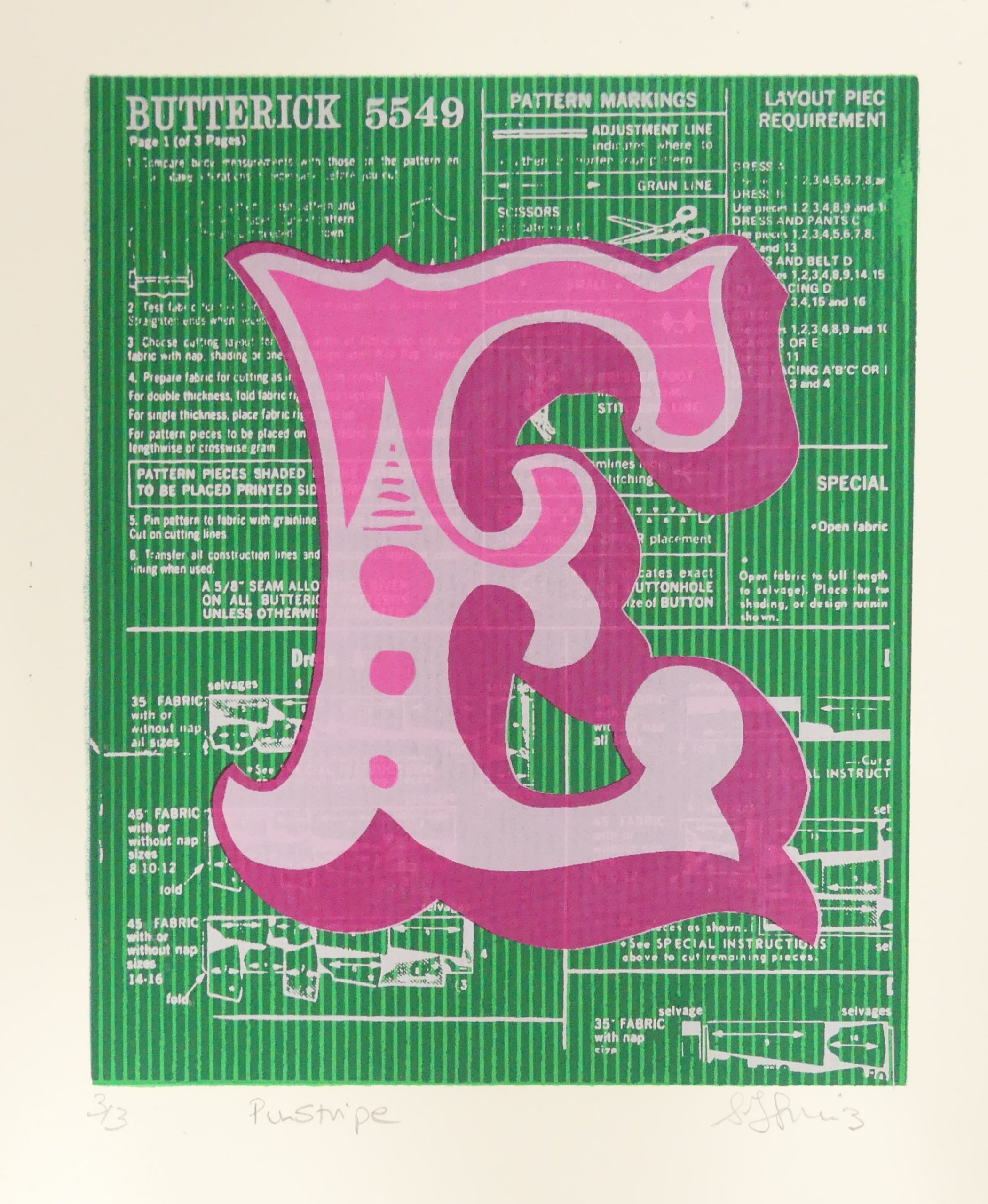
 Sarah Martinez of Berkshire Printmakers created this series of screen prints last year for West Berkshire’s Open studios scheme. Inspired by fairground fonts and ghost signs, and with an average of seven layers, the collection includes some of the most complex prints she has ever made. She tells us; “I learnt so much about the silkscreen process, working with both translucent and opaque inks to build up the layers and saturation of colour”. This is just the start of a large series of work, and Sarah has began adding more personal backgrounds, such as vintage sewing patterns to the works.
Isabelle Lin: Through the Leaves

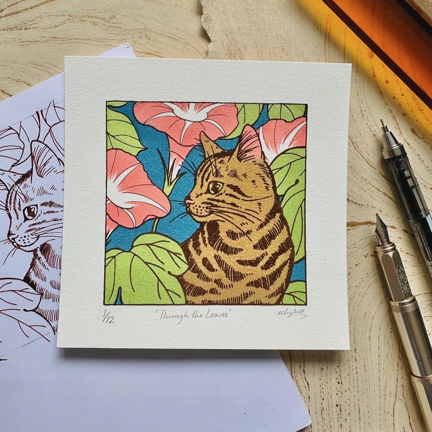 Isabelle Lin first drew the design for this print in 2024 for the wonderful Print Palooza print exchange organised by Australian printmaker Sally Caston. The theme that year was My backyard, so she went with a kitty on its daily adventure! Isabelle experimented with colour mixing on this design – the light brown of the cat is achieved by superposing the light green of the leaves and the pink of the flowers. She also made a different colour way with a golden background later.
Barry D Bulsara: The West Wing Campaign Poster

 This two-colour screen print is a tribute to one of Barry D Bulsara’s all-time favourite TV drama series and, in his opinion, “one of the most brilliant (though admittedly unrealistic) portrayals of an American president”. As with all of his print projects, Barry began with a series of thumbnail sketches in his notebook before moving on to Adobe Illustrator and Photoshop to finalise the artwork. For inspiration, he looked to classic American political campaign posters from the 1960s, particularly those from John F. Kennedy’s campaign. “I felt Kennedy embodied a persona that closely aligned with the fictional character of Josiah Bartlet,” says Barry.
SPIEGELSAAL: Tour Posters
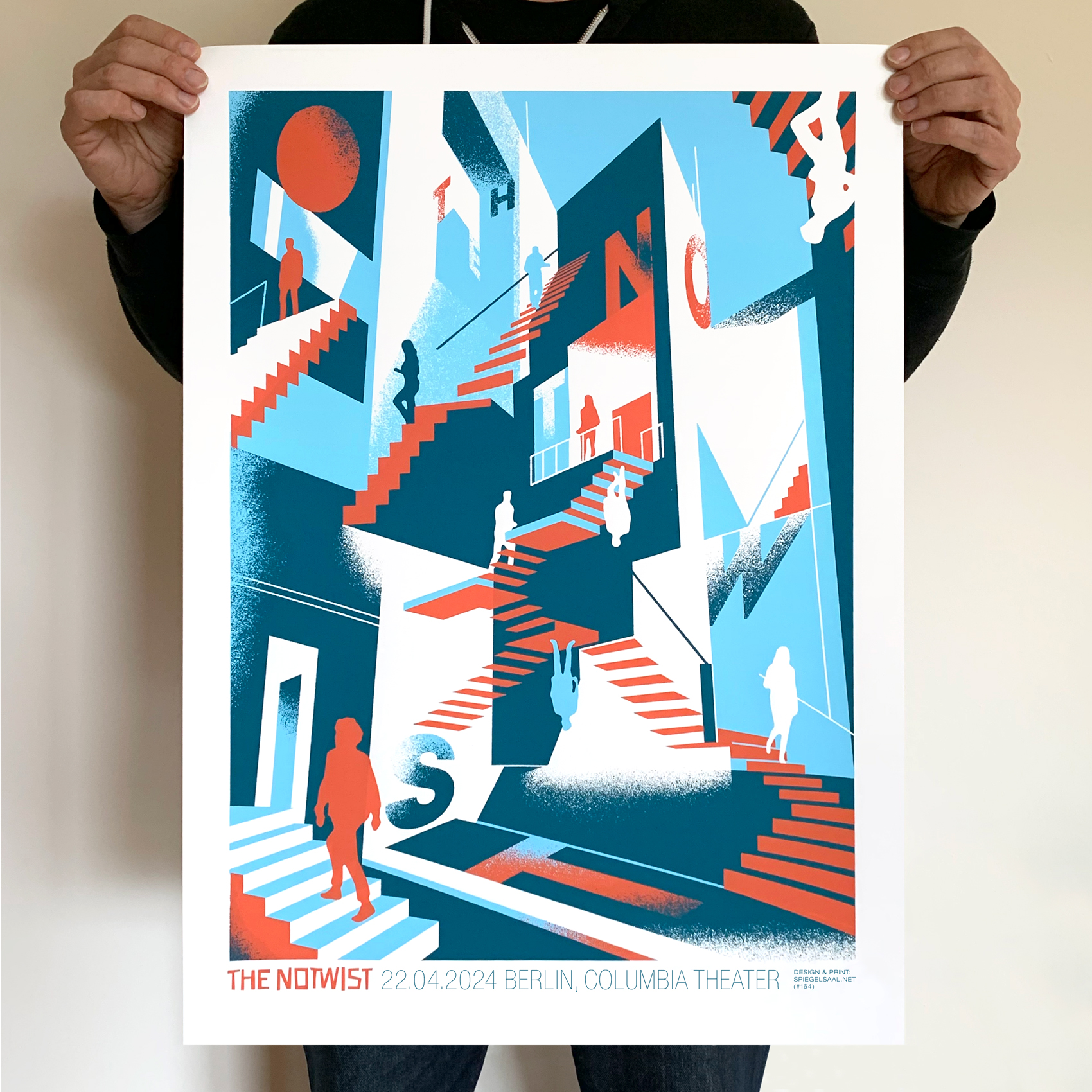
 German print/design power house SPIEGELSAAL continue to churn out strong screen printed posters for musical heavy weights. Here are some of their favourites from 2024, including posters for the shows of Iggy Pop & Warpaint at the Corona Capital Festival in Mexico City, a poster for Yo La Tengo’s show at Primavera Sound in Barcelona, and a poster for The Notwist’s show in Berlin.
Sarah Sanford: done and dusted…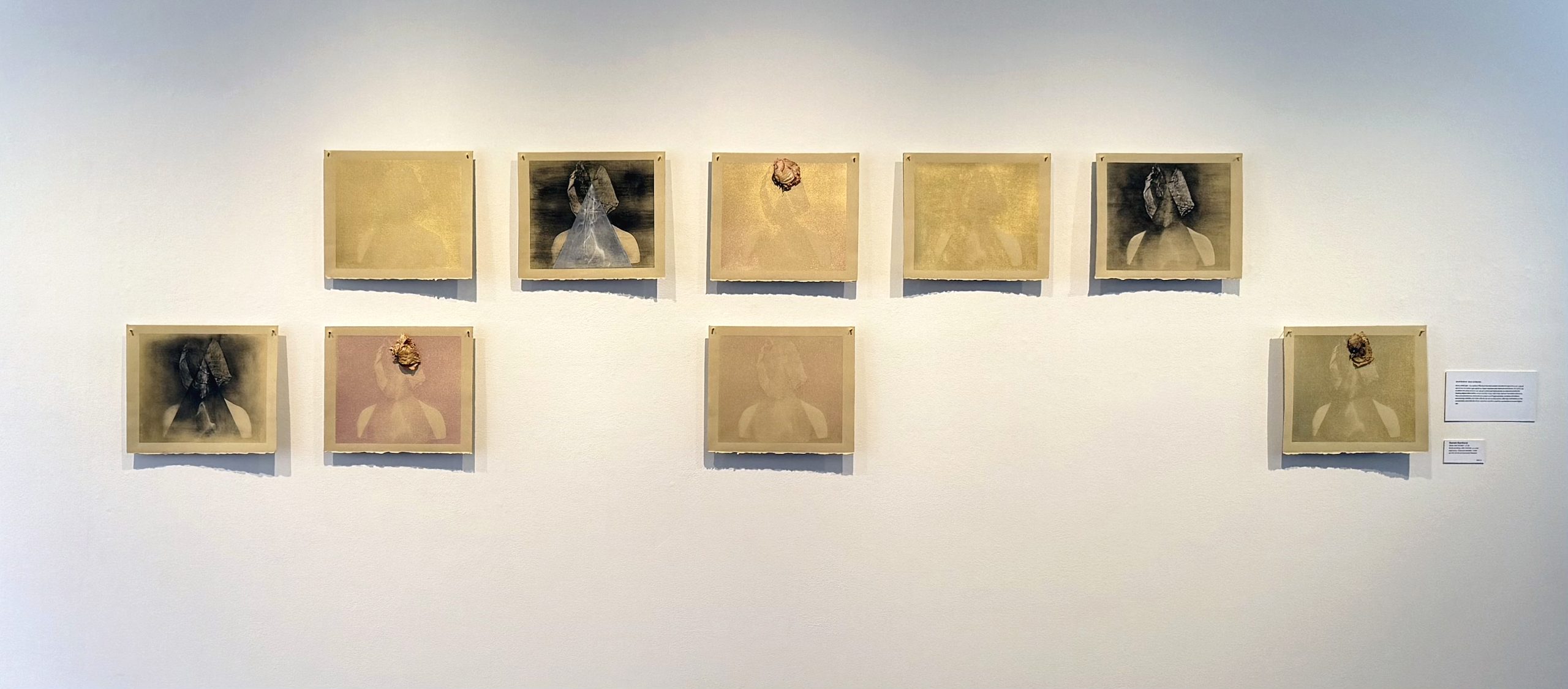
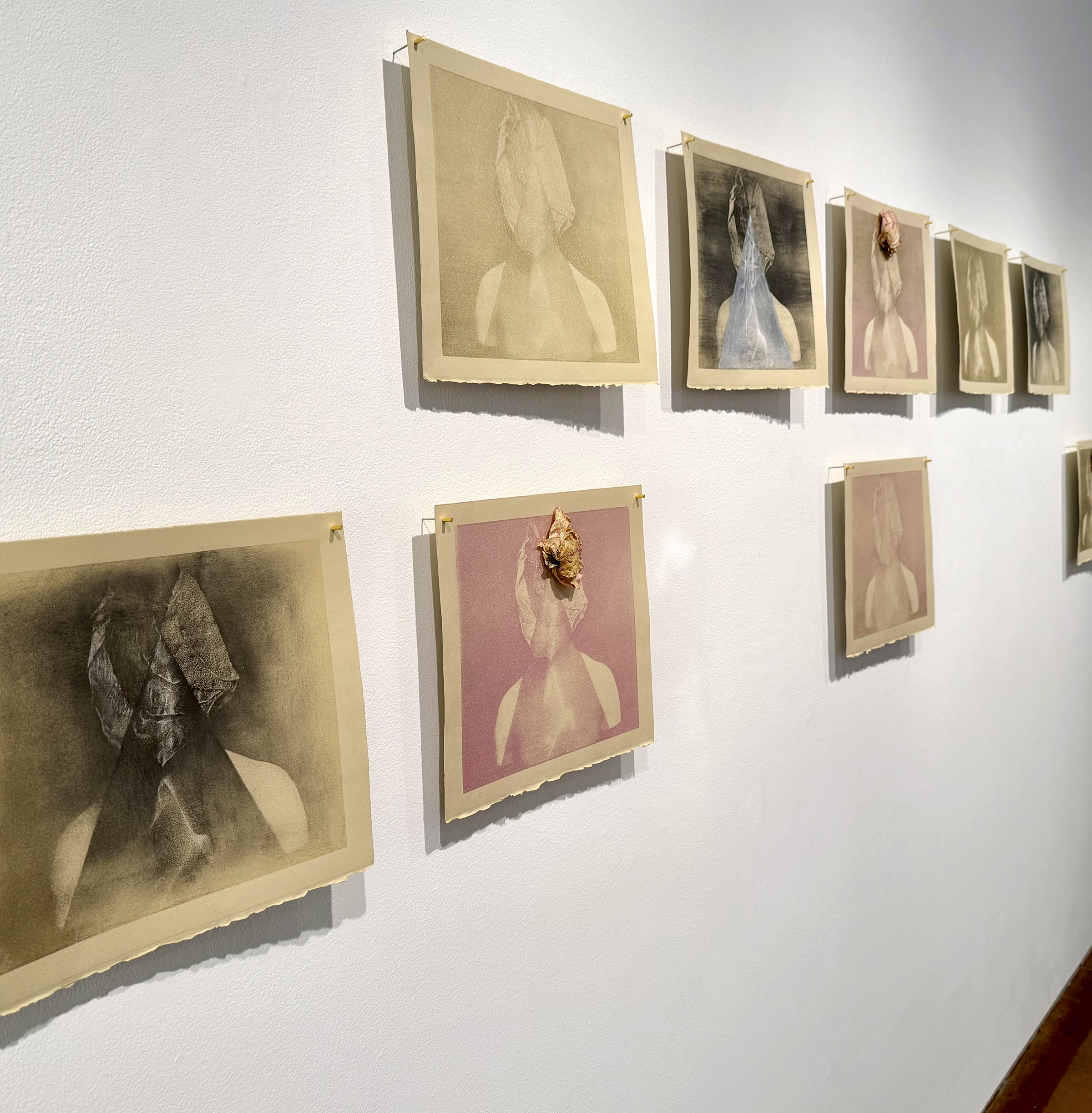
 done and dusted… is a series of flock screen prints that employ powdered pigments and natural ephemera to explore perceptions, impermanence and interconnectedness. A nod to the tradition of memento mori, the use of printed particles serves as context to both the fleeting digital information we encounter in our daily lives and our transient existence. The contrast between moments of erasure and fragmentation, to those of brilliant, shimmering visibility, are held collectively across this series offering rumination on the complexities and finitude of our existence, and need for connection in a post-digital age. This series was exhibited for the first time in the recent two-person exhibition, Light Gets In: Ann Resnick & Sarah Sanford at the Cabrillo Gallery in Aptos, CA from February 3- March 7, 2024. For this series, Sarah’s process involved screen printing a digital halftone stencil from a 305 mesh screen onto Rives BFK tan paper using a mixture of transparent base and acrylic medium. The water-based mixture acts as a slow drying adhesive. She then used a wide, soft bristle brush to dust the surface with fine metallic powdered pigments and charcoal powder.
Edie Woolf: Kind Cat, Love Dog, Gentle Seal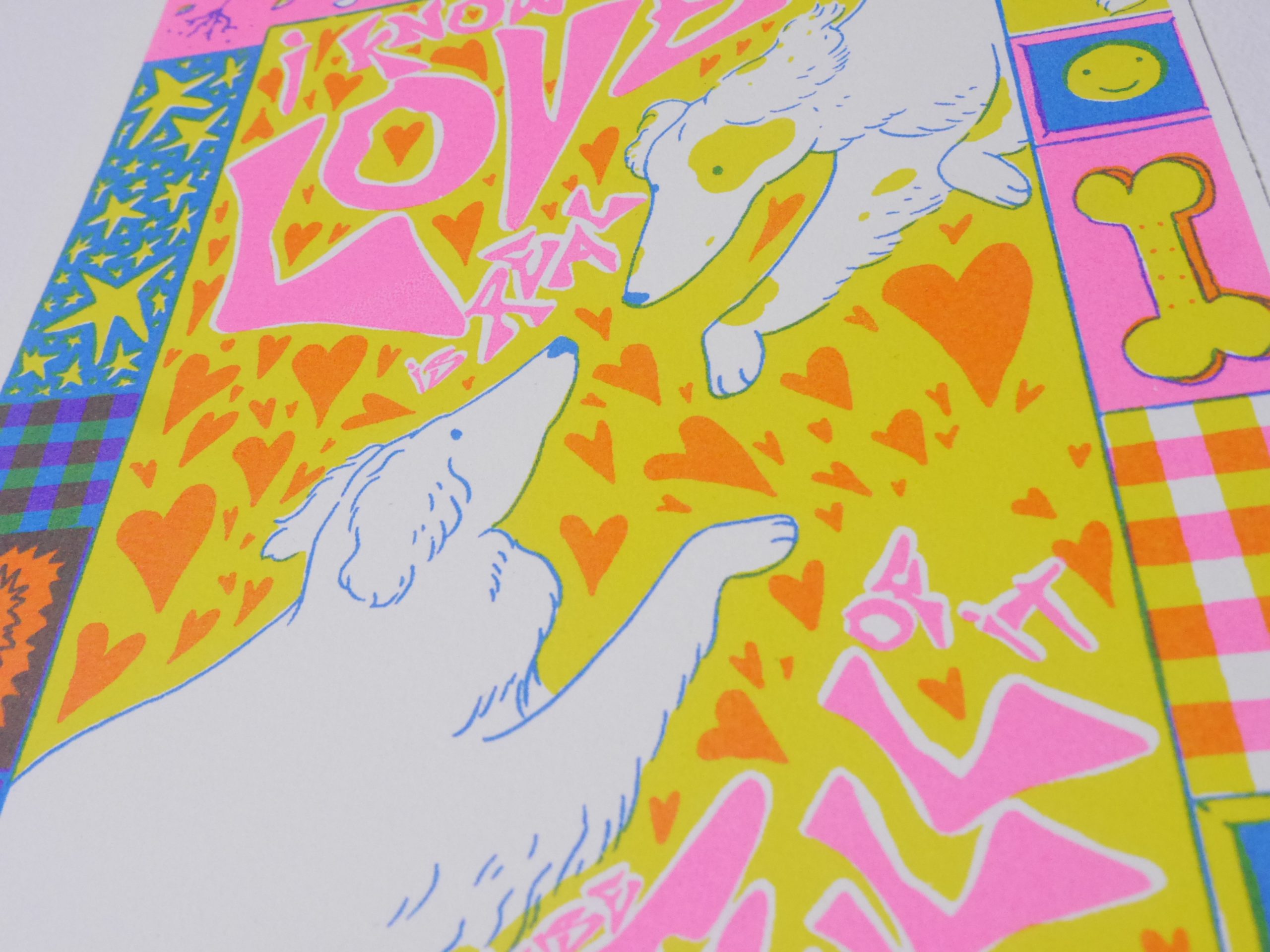

 This series of screen prints by Edie Woolf was made to highlight the power of gentleness. “The courage to be vulnerable is often underestimated, and needs to be celebrated in a world that feels harsher every day,” says the printmaker. Each print composes three colours printed on Somerset satin. A high ratio of print medium was used to create a Riso-style colour layering effect.
www.ediewoolfillustration.co.uk
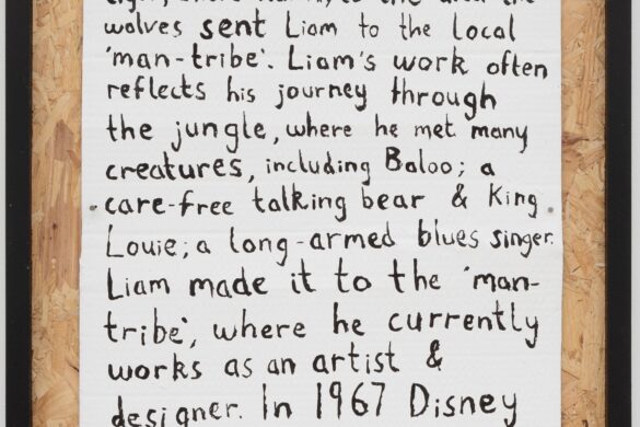
Federico Blu di Prussia: Monstrorum Historia
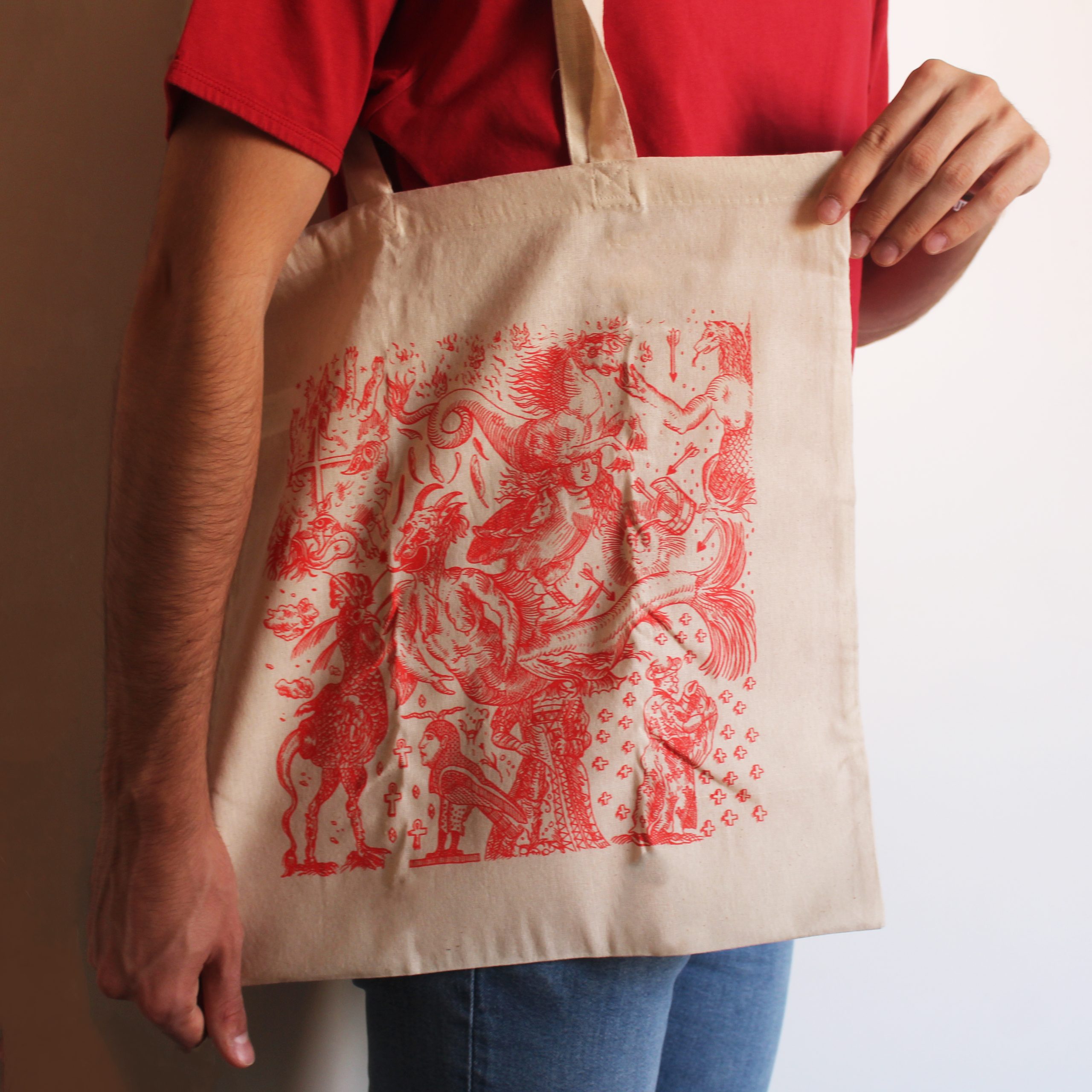
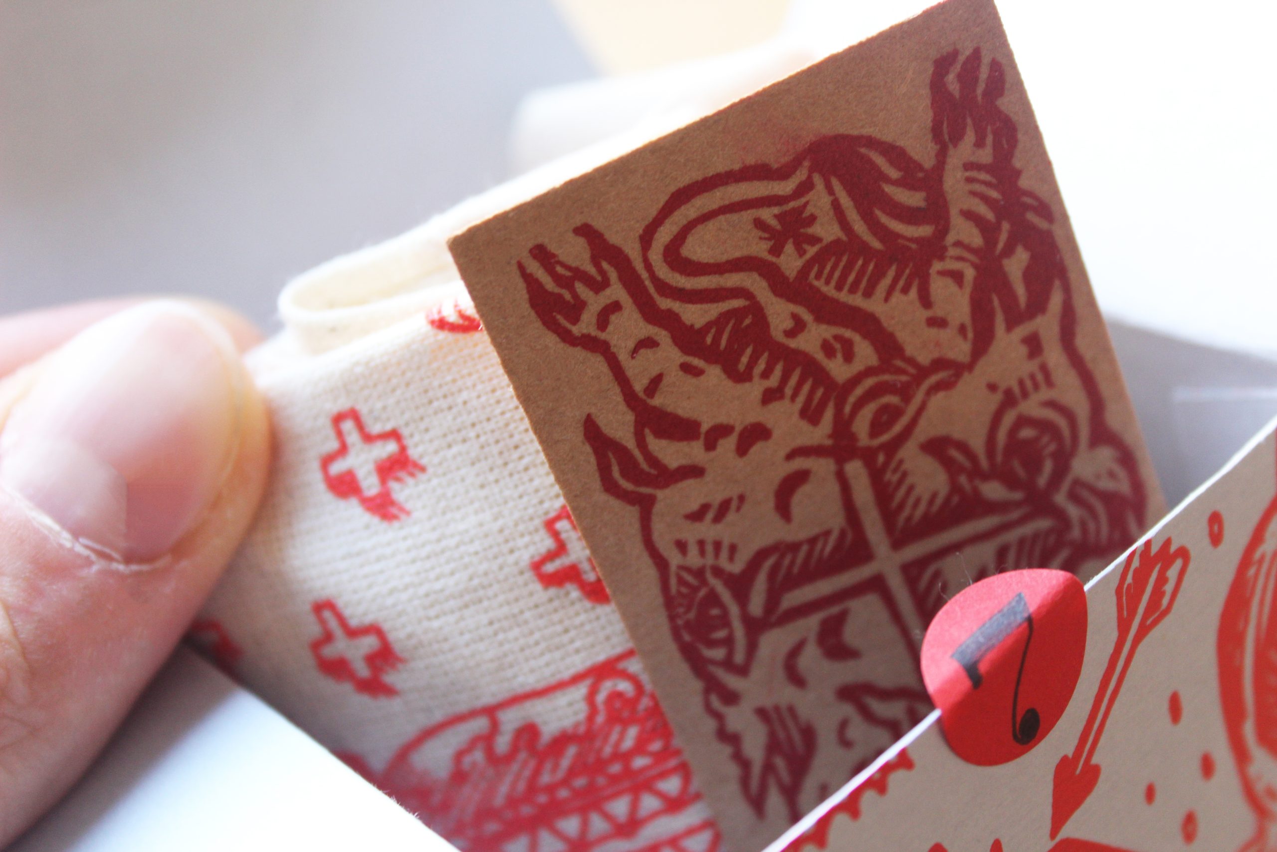 MONSTRORUM HISTORIA is a multidisciplinary project that has combined different silkscreen and relief printing approaches to form a collection of works that offer a wide overview of fantastic and mythical creatures. The featured depictions of the creatures were created during a course at Tecniche dei materiali per la Grafica held by Prof. Giuseppe Di Giangirolamo, and the Design per l’Editoria course held by Prof. Gian Luca Proietti. The title is an explicit reference to the work of Ulisse Aldrovandi, published posthumously in 1642 with an extended name of Monstrorum historia cum Paralipomenis historiae omnium animalium.
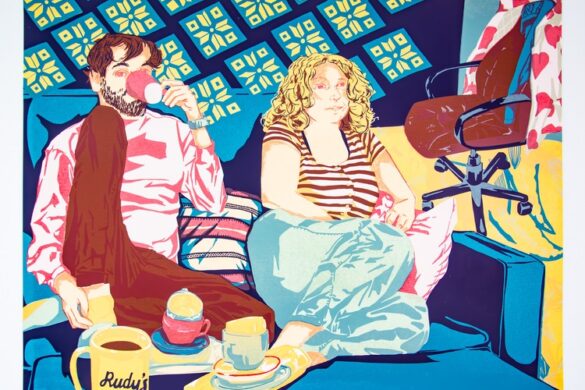
Wen Ching Yiu: The Universe I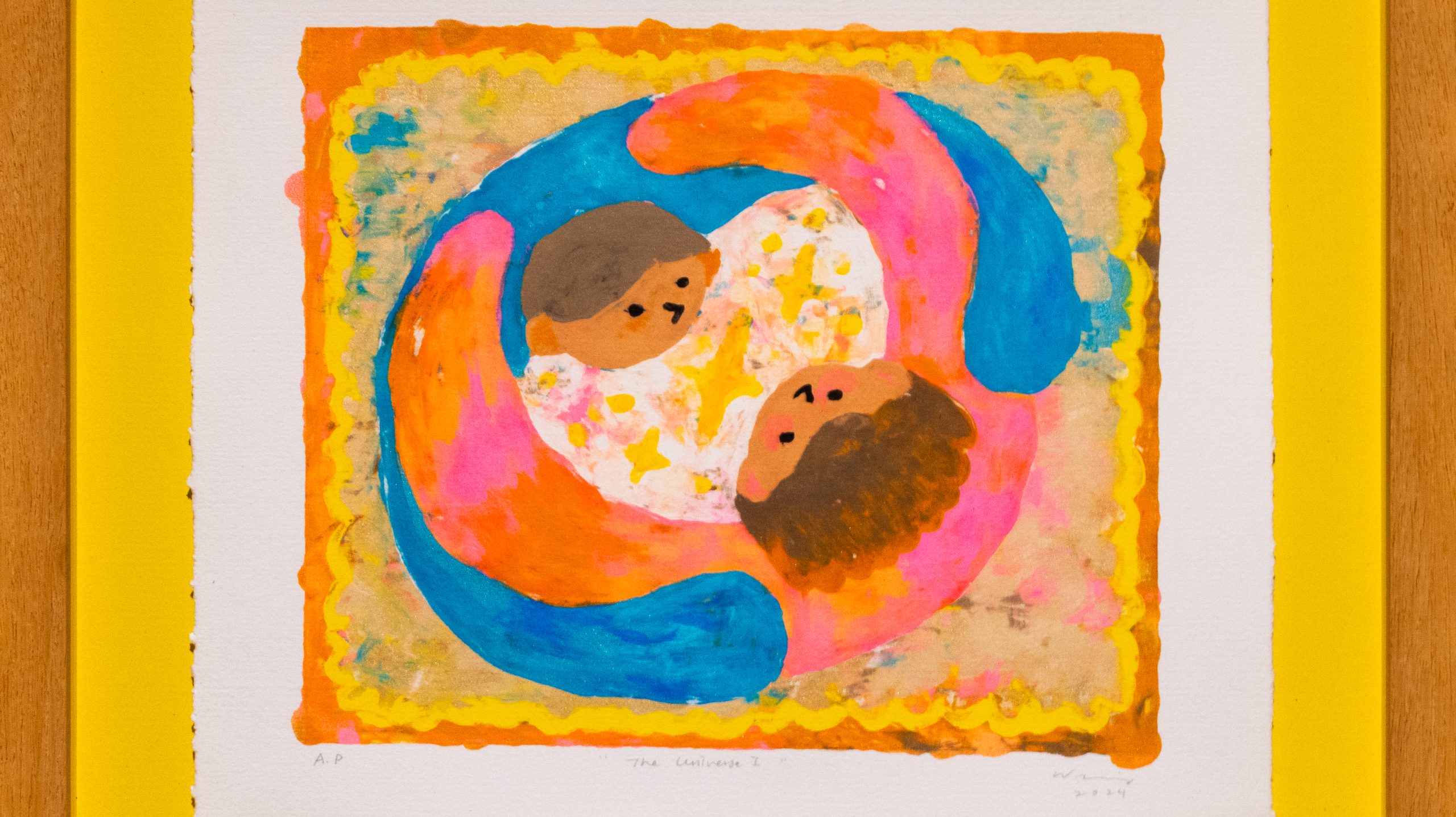
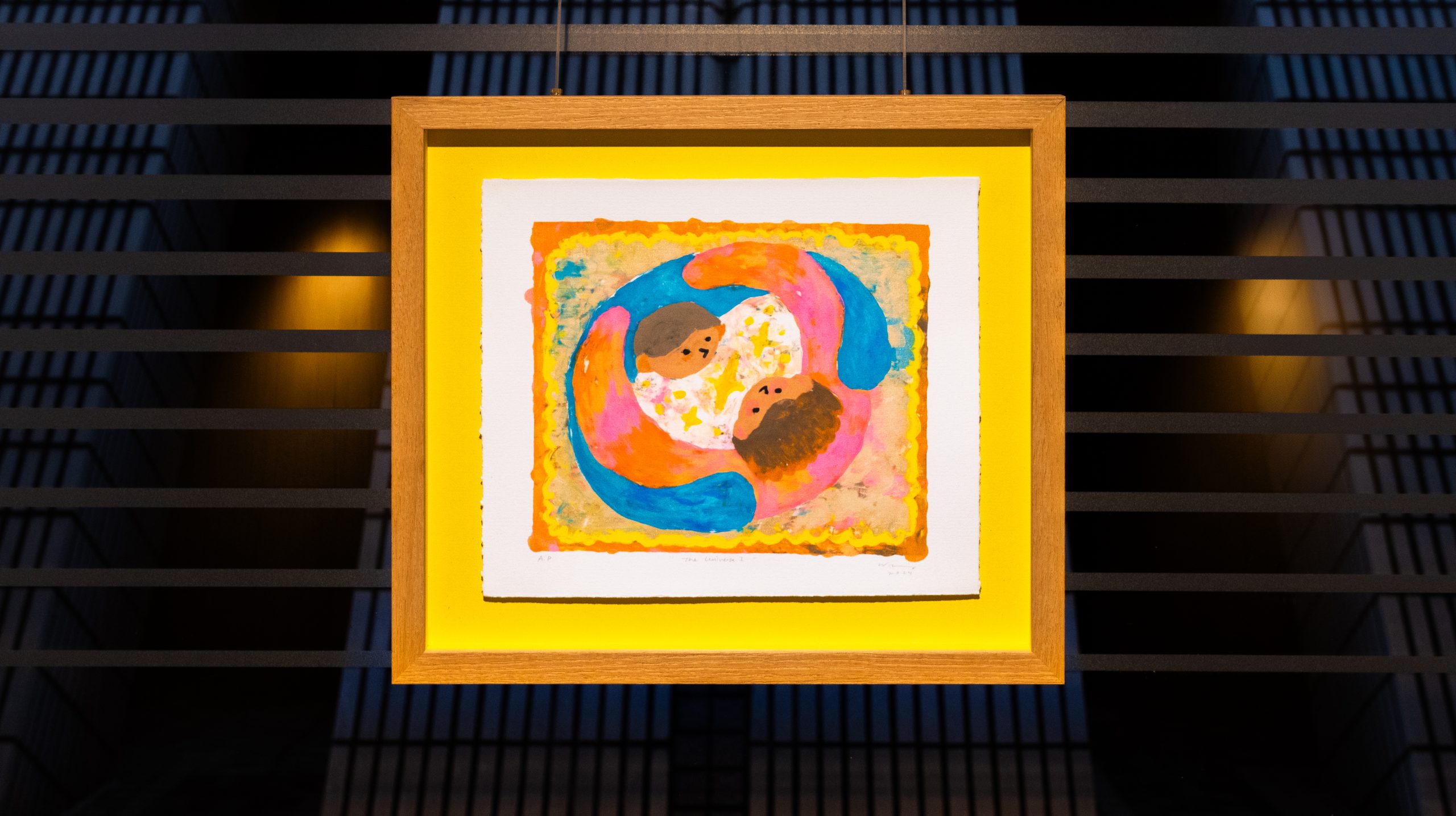 The Universe I is one of the selected works from Wen Ching Yiu’s previous solo exhibition, Elixir to Induce Euphoria, which explores the concepts of love and imagination. Inspired by a dream and the romantic relationship, it depicts how couples deeply in love create their own universe, living happily in their love bubble, undisturbed by the outside world. Using the medium of mono screen print, she directly painted on the screen to capture her memories and emotions, creating experimental and raw textures to illustrate the dream, along with painterly brushstrokes to convey a sense of authenticity.
Benefit from a heap of perks and join our leading community of creatives and printmakers at members.peopleofprint.com.
Want to know more about our membership? Give us an email at members@peopleofprint.com.
- Call for Artists: In Limine Artist Residency 2026, Monte Sant’Angelo, Italy - February 10, 2026
- Dream of Venus Examines Material-led Design Through Analogue Printmaking - February 3, 2026
- Words That Sound Like Nothing but Mean Everything - February 1, 2026
Discover more from People of Print
Subscribe to get the latest posts sent to your email.