
We’re excited to present a variety of Risograph prints from some of the members of our ever-growing POP Membership community. Known for its creation of vivid colours and unique textures, the Risograph printer has been used by our members to bring a range of innovative ideas to life; from animated patterns, to informative zines. Check out the projects below:
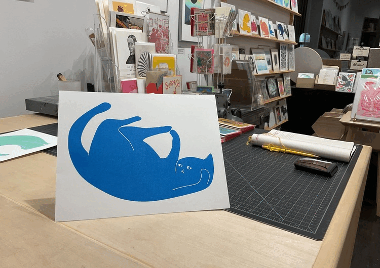
Archie’s Press: Risograph Cats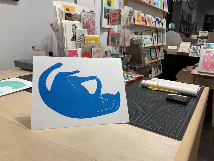
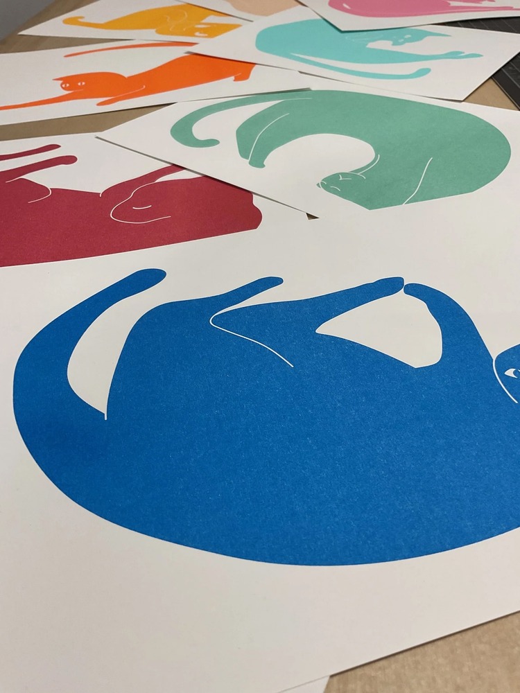
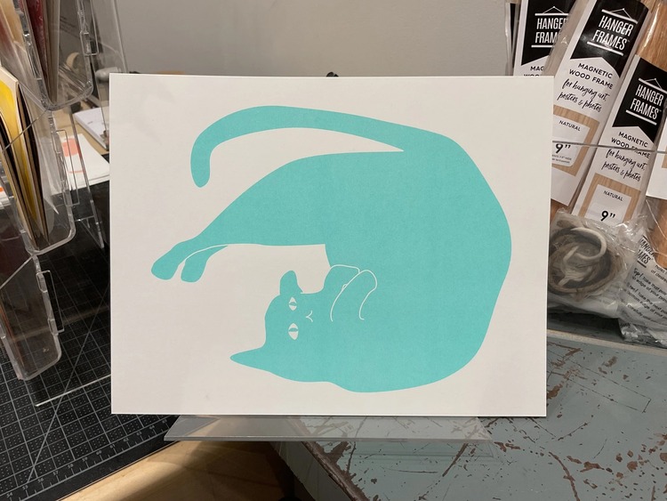 “It turns out you can make big beautiful floods with a Riso machine,” says Archie Archambault of Archie’s Press. Normally working with the medium of letterpress, Archie drew these cats and tried really hard to get letterpress printing to work for his design. However, it came out “very salty and inconsistent”, so instead he went with Risograph. The resulting prints look gorgeous, with very dense ink. The cats are in fantastical and realistic positions, sometimes sinister but always adorable.
Hannah Brown: Fantasy 45’s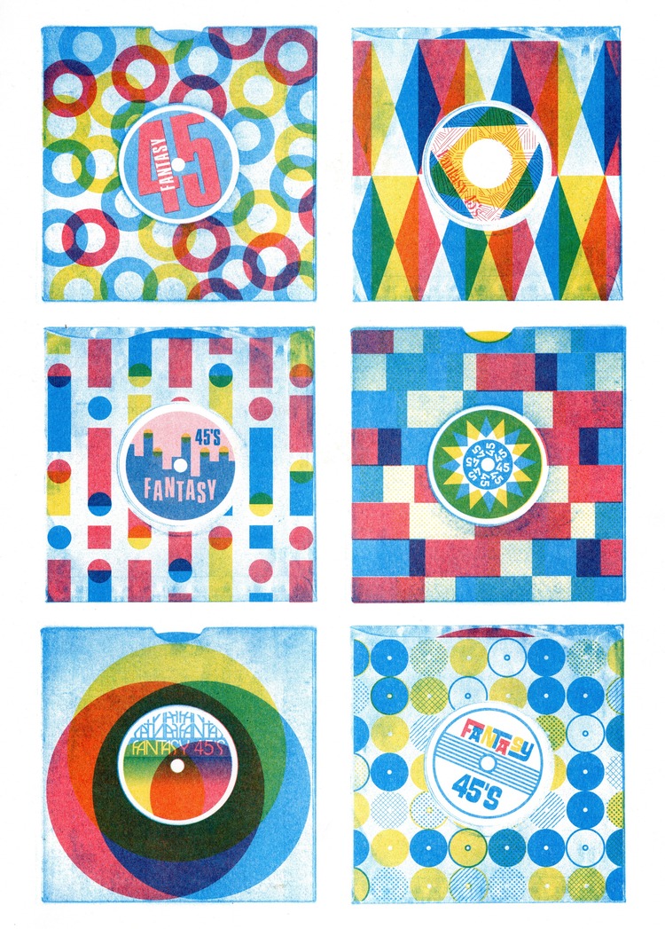
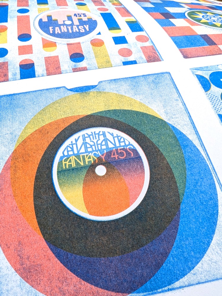
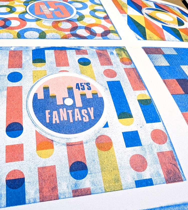 Hannah Brown has been collecting 7″ records for almost 25 years, and is always on the look out for an interesting cover or sleeve. She decided to make a series of her own 7″ covers inspired by old charity shop finds and record label sleeves from around the world. Hannah comments; “The is a good way for me incorporate some of my patterns design and to start introducing text into my work for the first time.” She was so pleased with the results of this Risograph that she’s going to keep exploring and making new Fantasy 45 designs.
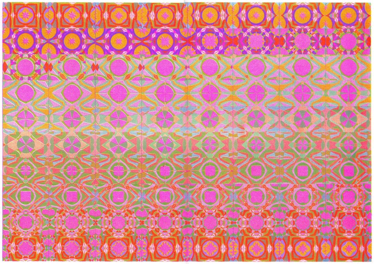
Isabelle Lin: A Thousand and One Leaves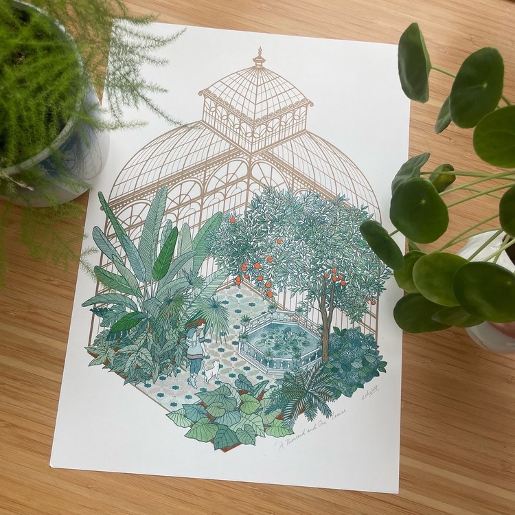
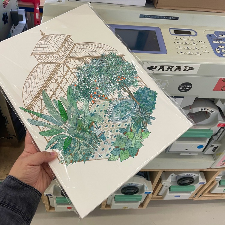
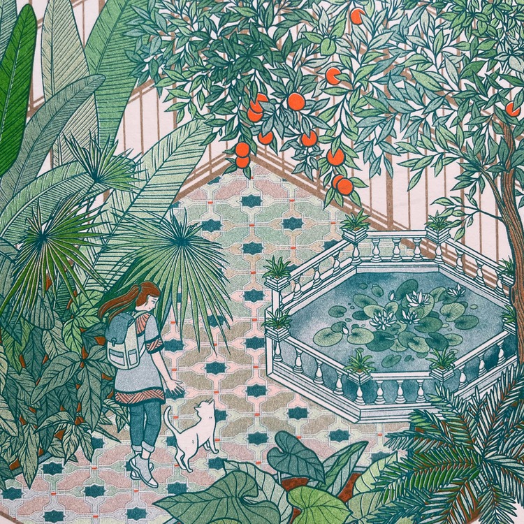 This is the third print in Isabelle Lin’s Dream Places series. After testing primary colour combinations in her previous pieces, Isabelle wanted to see what she could achieve with a palette of Kelly Green, Teal, and Fluorescent Orange (she used Metallic Gold for the greenhouse structure, but not in the colour mixes). “This took forever to draw and plan, but I’m so glad I did,” says the printmaker. The print of a winter garden offers greenery even in the heart of the cold season.
Federico Blu di Prussia: Micorri-Zine – Appunti visivi di simbiosi mutualistica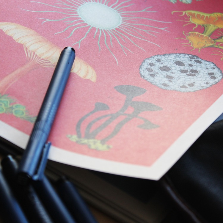
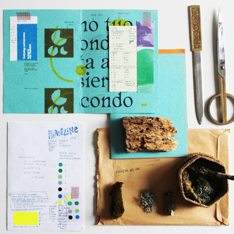
 Micorri-Zine – Appunti visivi di simbiosi mutualistica is a zine project curated by Francesca Habe and created as number 14 in the FranZine_Milano series, designed in the summer of 2023. The zine, which celebrates the world of lichen, was created using numerous techniques that enhanced the tactile and physical aspect of the paper, combining the materiality of the editorial product with the living beings it evokes. This included xerography and silkscreen, as well as a three-colour Risograph print on water-blue straw paper 180g. The layout was hand-bound with orange thread.
Ellis Tolsma: Risograph Animation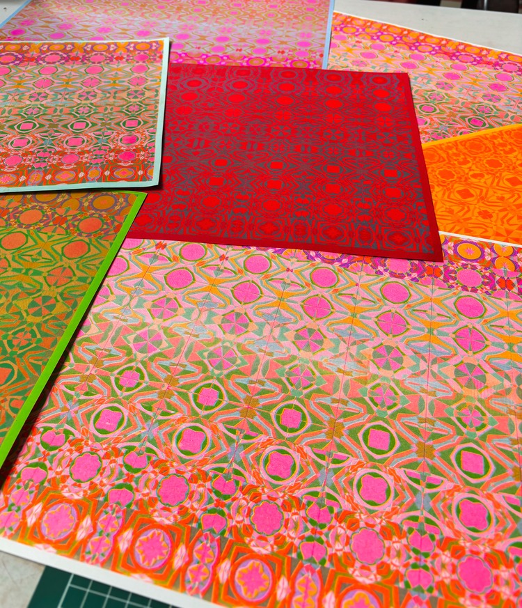
Recently, illustrator Ellis Tolsma has been experimenting with combining her animation work with her Riso work. She describes; “It’s a really interesting combination, where you can really see the Riso half-tone grid very clearly. I love how the colours and shapes interact with one another with this method.” While animating, Ellis often makes abstract patterns that blend over into one another, which is very suitable for the texture of the Risograph. The resulting animation feels and looks super unique and hand-made.
VrijFormaat: Mammals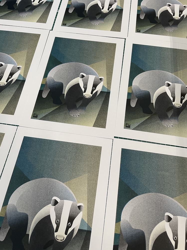
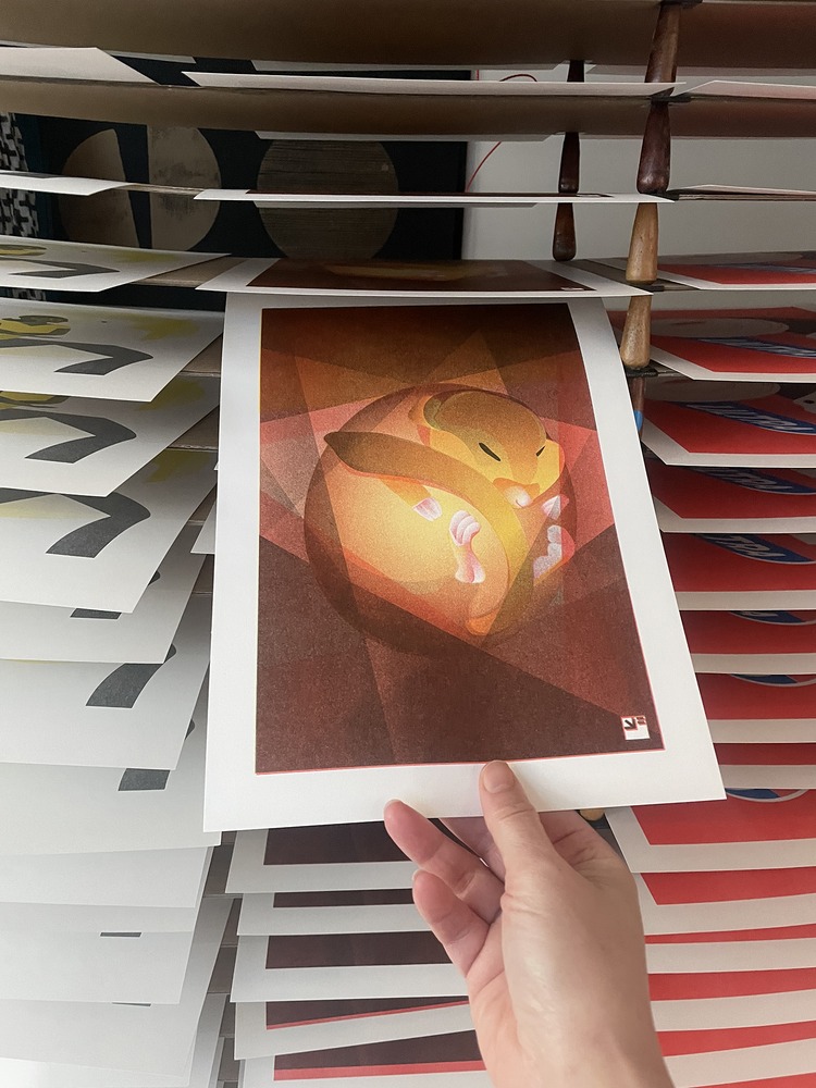
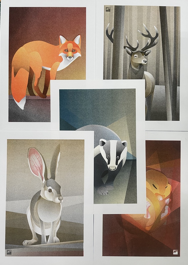 This year, VrijFormaat started a new series of Risograph illustrations, titled Mammals. As with their previous Bird series, they started with the (wild) animals they know and love in their own country (the Netherlands). This included the fox, the deer, the badger and the hare. They also decided to create the little dormouse, although this tiny animal is only found in a few places in the southern part of the country. “Unfortunately, its numbers are declining, but we wanted to include them anyway because they look so cute,” say the printmakers. More animals will surely follow.
Diego Miranda: The Tower | La Torre

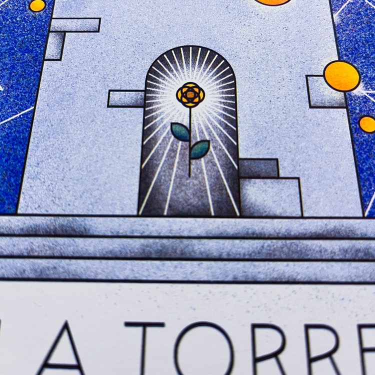 This Risograph print by Diego Miranda was created after his friend who reads tarot requested a poster of The Tower, a very powerful and decisive card. Diego comments; “I knew I wanted to geometrically abstract the shapes and symbols present in the card’s illustration. So, to do it properly, I deepened my knowledge of the card and its meanings.” With that, he was able to decrypt and then re-encrypt certain symbolisms, such as rebirth after disaster. After several iterations of the illustration, Diego achieved the final result, to which he added a border of shapes that repeats ‘The Tower’ in a reinterpretation of Morse code. The piece was printed in a limited edition of 50 by Jumbo Press.
Check out more work by our POP Members and apply to join our community at members.peopleofprint.com.
Want to know more about our membership? Give us an email at members@peopleofprint.com.
- Call for Artists: In Limine Artist Residency 2026, Monte Sant’Angelo, Italy - February 10, 2026
- Dream of Venus Examines Material-led Design Through Analogue Printmaking - February 3, 2026
- Words That Sound Like Nothing but Mean Everything - February 1, 2026
Discover more from People of Print
Subscribe to get the latest posts sent to your email.


