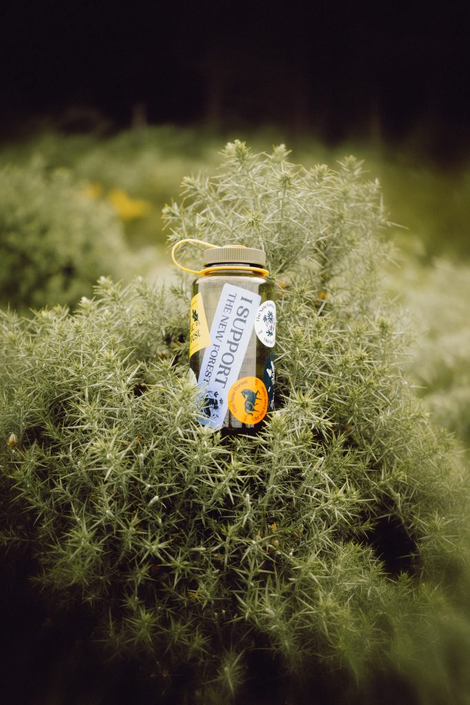
There’s something magical about The New Forest, an ancient landscape where ponies roam freely, legends whisper through the trees, and history feels very much alive. So when Studio Glass was tasked with rebranding the area’s tourism identity, they didn’t just design a logo, they unearthed an entire folklore-driven narrative that reconnects locals and visitors to the soul of the place.
The result? A brand that’s “Old, Yet Ever New”. Timeless, layered, and alive with meaning.
The Challenge: From Confusion to Clarity
Before Studio Glass stepped in, The New Forest was operating under two fragmented brands, “Go New Forest” for businesses, and “Visit The New Forest” for consumers. This split diluted impact and left people unsure who was talking to whom.
Studio Glass was brought on board to bring everything under one cohesive identity. But they didn’t stop at design systems, they wanted to make people feel something. Their goal: turn tourists into custodians of this living, breathing landscape.
“Many tourism destinations overlook authentic experiences in favour of superficial attractions,” says Chris Johnson, co-founder of Studio Glass. “We wanted to make sure this brand felt like it belonged to the forest itself, rooted in its history, its folklore, and its people.”

The Discovery: “Old, Yet Ever New”
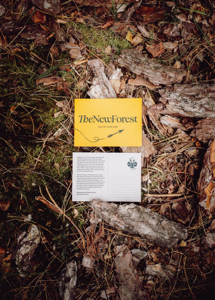
During their deep dive into local archives, Studio Glass stumbled across a forgotten gem, the phrase “Old, Yet Ever New,” printed on a 1970s postcard and traced back to the New Forest District Council’s 1976 coat of arms.
It was one of those goosebump design moments.
The phrase perfectly captured the forest’s spirit, ancient yet constantly evolving.
“That line poetically encapsulated everything the New Forest represents,” says co-founder Sammy Murphy. “It became the heartbeat of the brand.”
Rooted in Folklore: From Kings to the Green Man
To understand The New Forest, you have to understand its stories, and there are plenty. Studio Glass collaborated with local historian Brice Stratford, author of New Forest Myths and Folklore, to bring these legends to life.
There’s the death of King William II (Rufus the Red), struck by a mysterious arrow in 1100, an act some say was divine retribution after his father, William the Conqueror, claimed the forest as royal hunting ground. There’s the Green Man, the ancient symbol of life, death, and rebirth, who finds new form in the studio’s illustration system.
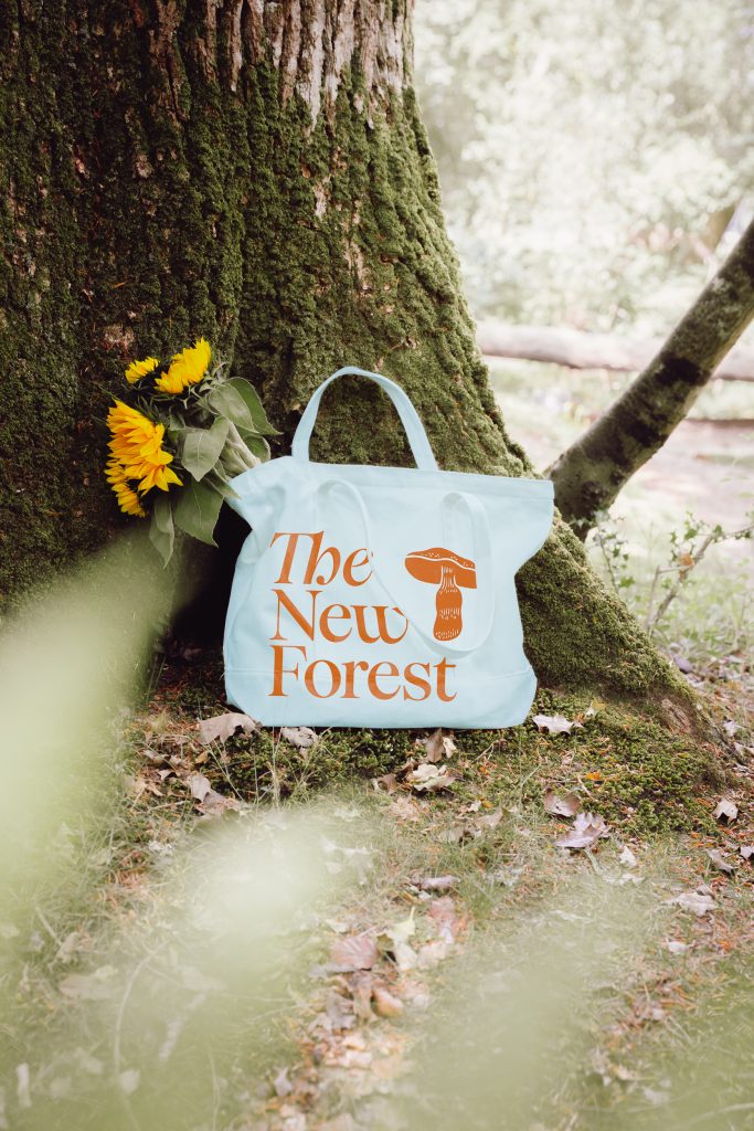
Even the typography plays its part. Headlines use Woodland by Pangram Pangram — its organic, Art Nouveau-inspired curves nod to nature and the Arts & Crafts movement, whose philosophy of craftsmanship and community echoes through the New Forest. Supporting text is set in Mori, balancing clarity with warmth.
“The wordmark and typefaces act as a quiet tribute to the Arts and Crafts movement,” says Murphy. “That movement celebrated the handmade and the power of nature, ideas we wanted to weave into every touchpoint.”
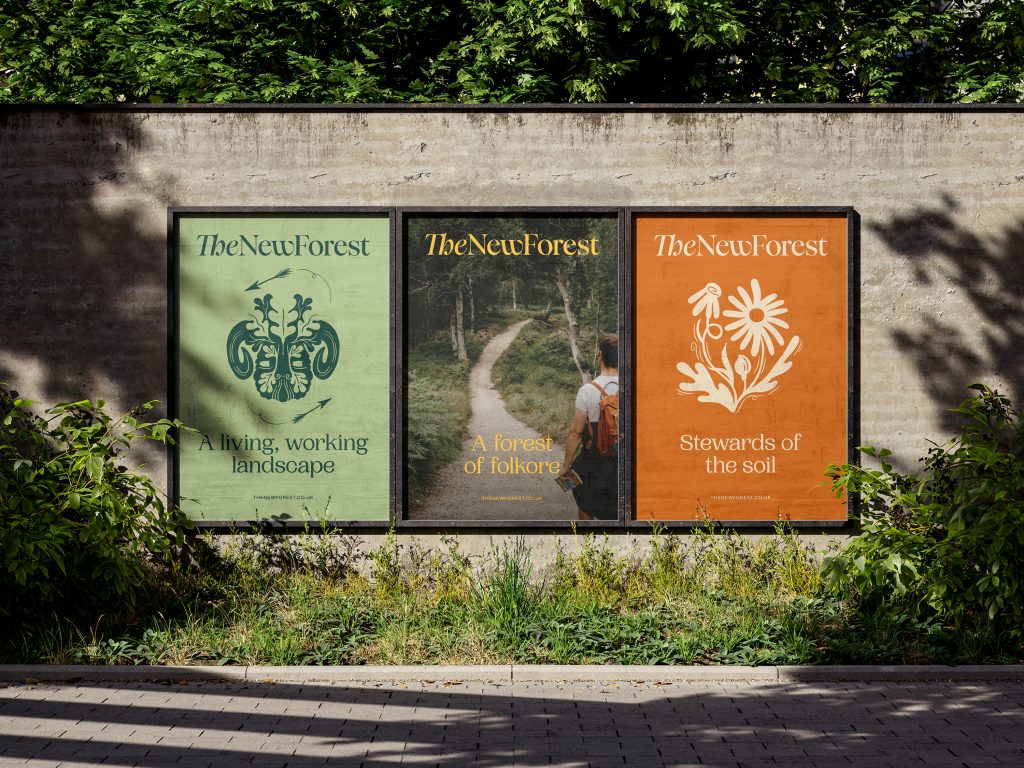
Illustration as Storytelling: Bringing the Forest to Life
To visually capture these stories, Studio Glass teamed up with illustrator Lauren Marina, a New Forest local whose work embodies that tactile connection to nature. Each illustration celebrates a different “content pillar”. From folklore to food, wildlife to local culture.
Heritage & Culture: Ricocheting arrows and oak leaves recall the legend of Rufus the Red.
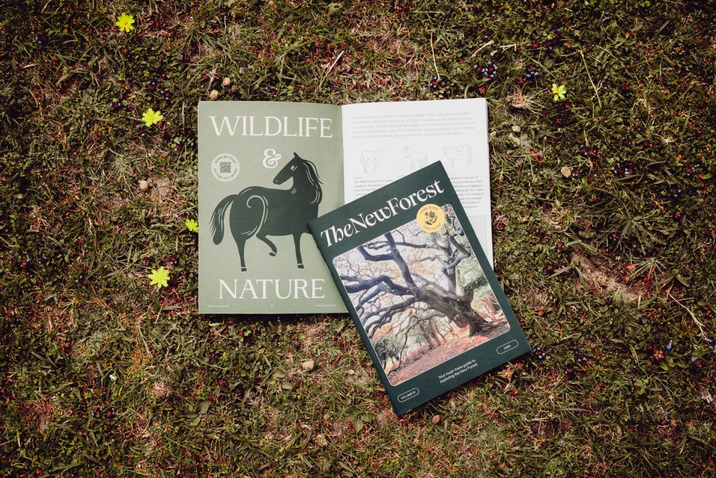
Wildlife & Nature: The iconic New Forest pony takes centre stage.
Things To Do: A walking boot surrounded by flora, wood sorrel, honey fungus, and ferns. Invites visitors to explore gently.
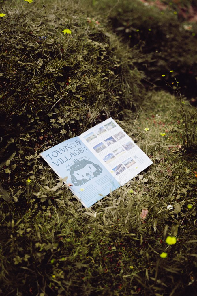
Towns & Villages: Traditional cob cottages that dot the landscape.
Love Local: A beehive, acorns, apples, and cider, a nod to local craftsmanship and produce.
Marina’s illustrations, paired with a colour palette inspired by the forest’s shifting seasons, heather purples, beech greens, fungi creams, form a visual language that feels both handcrafted and modern.
Collaboration and Consultation: A Community Effort
What makes this project truly special is its foundation in listening. Studio Glass held workshops with everyone from local farmers to park rangers, historians, and business owners.
“A shared theme that emerged was the importance of storytelling and heritage in protecting and promoting the area’s identity,” says Johnson. “We didn’t want to impose a brand; we wanted to help the community tell its own story.”
This approach not only led to a more authentic outcome, it also created local pride. The new identity isn’t just for visitors; it’s something the community can champion.
The New Forest Guide: Where Print Meets Place
At the heart of the new brand is The New Forest Guide, a beautifully produced editorial publication that embodies Studio Glass’s print-first design sensibility.
The guide is more than a brochure, it’s a love letter to the landscape. Long-form articles, local voices, and advertorials sit alongside stunning photography and illustration, inviting readers to slow down and learn.
“We wanted the guide to feel like something you’d want to keep,” says Murphy. “A tangible piece of storytelling that gives value back to the community.”
Tourism as Stewardship
Ultimately, this rebrand is about more than tourism. It’s about reframing how we relate to place. By intertwining design, folklore, and ecology, Studio Glass has created a system that encourages visitors to respect the forest rather than consume it.
As the new tagline suggests, The New Forest is indeed “Old, Yet Ever New”, and this brand makes sure it stays that way.
About Studio Glass
Founded by Chris Johnson and Sammy Murphy, Studio Glass is an independent creative agency based in Dorset, designing brands with clarity and purpose. The studio’s name is inspired by Beatrice Warde’s 1932 essay The Crystal Goblet, reflecting their belief that design should act as a transparent vessel for communication.
Beyond client work, they also publish Pier Journal, a quarterly creative magazine celebrating local culture, now nine issues strong, with the tenth on the way.
Visit studioglass.design for more.
Credits:
Client – The New Forest
Agency – Studio Glass
Creative Direction – Chris Johnson & Sammy Murphy
Illustration – Lauren Marina
Typography – Woodland (Pangram Pangram) & Mori
Photography – The New Forest
- Building Big Ideas: Inside the LEGO Design Student Challenge - February 17, 2026
- Penguin Random House Launches Support for Independent Bookshops - February 10, 2026
- Open Call: Indiecon International Travel Grant 2026 - February 9, 2026
Discover more from People of Print
Subscribe to get the latest posts sent to your email.


