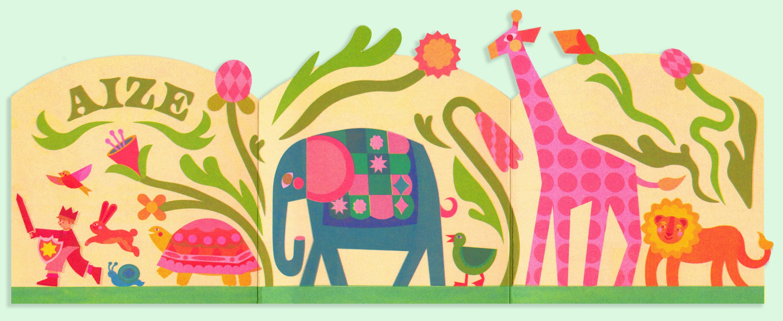
Big, bold and beautiful. We have long been fans of the talented multidisciplinary Design Studio Lennarts & de Bruijn, and they have recently launched their brilliant new look website showcasing their vast array of bold and adventurous projects. Based in The Hague and founded by Max Lennarts and Menno de Bruijn back in 2015, Lennarts & de Bruijn’s work crosses over a multitude of creative platforms covering identities, campaigns, concepts, copywriting, websites, books, posters, branding, exhibitions, illustrations, flyers, and more.


Lennarts & de Bruijn continue to take on projects which allow them to delve into the context and create a clever and strong response. An energetic use of typography is a regular focal point within their designs, driven by the projects content. It’s also clear to see that when it comes to producing artwork they are certainly not afraid to experiment, or add a splash of humour along the way.


We recommend you set some time aside to browse their website and explore the variety of projects on display.


www.lennartsendebruijn.com
www.instagram.com/studio_lennartsendebruijn
www.facebook.com/studiolennartsendebruijn
- Top Picks | 2018 Calendars - November 27, 2017
- Wren Artists | Felicity McCabe - November 1, 2017
- Lennarts & de Bruijn - October 20, 2017
Discover more from People of Print
Subscribe to get the latest posts sent to your email.


