Toronto-based artist Heather J. A. Thomson’s practice is an amalgamation of her passion for history and her desire to create visual art. By looking at and reflecting upon the past, Heather aims to inspire the present and question our values.
The artist received a BA from the University of Guelph Ontario in 2017, and was awarded the 2017-2018 Don Phillips Scholarship at Open Studio, Toronto. After writing one too many history papers during her undergrad, Heather realised that although she wanted to continue exploring historical themes, she did not want to do it in writing. Her art courses offered a visual alternative, and ever since her art practice has incorporated a combination of historical research and visual expression.
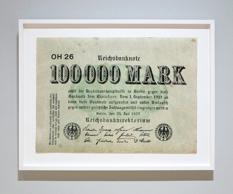
 Heather’s current body of work focuses on Papiermarks, the hyperinflated currency of post WWI Germany. She states; “I feel discussions on hyperinflation Germany focus on statistics and disregard the physicality of currency. For me, the banknotes embody complexities and are objects with stories to tell.”
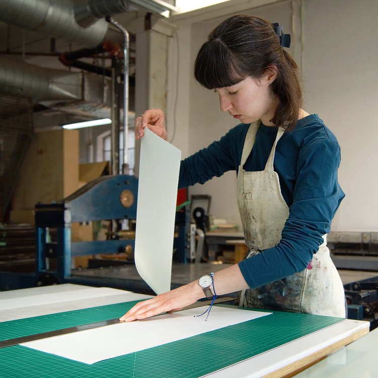
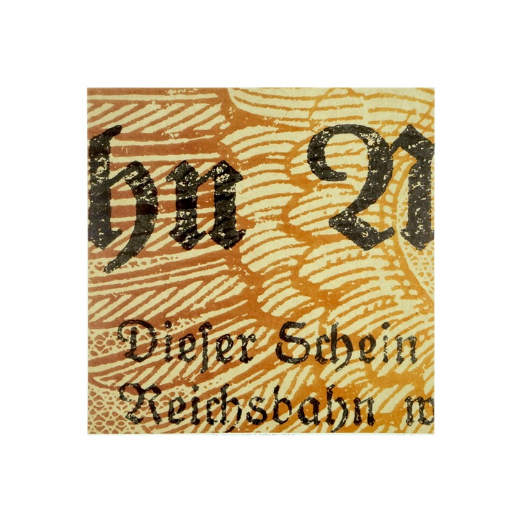
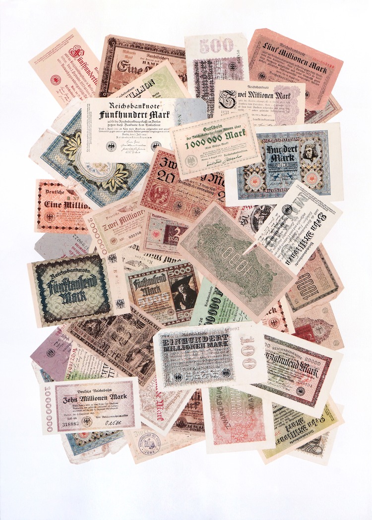
Within the series, Heather uses multilayering to highlight the notes’ physicality, with each piece typically having between 7-10 layers. The collection includes magnified square selections, banknote collages, and single note prints. Each work has been created using a combination of photolithography, chine colle, and screen print. Last year, Heather completed her largest project yet, Papiermark Composition 4, a screen print with an incredible 96 layers!

 All of the works in her Papiermark series started with high resolution scans she took from banknotes in her personal collection. After making countless digital mock ups, Heather decided on a final composition and began the long process of creating film outputs. Each piece is comprised of paper texture layers and design layers that she creates manually though a combination of colour channel manipulation and tracing. Every design element (text and patterns) is digitally traced by Heather using a drawing tablet, and she even recreates pattern elements hidden under text so that she can replicate banknotes in their entirety, layer by layer. Colours are mixed as she goes, matching to the original banknote, using test strips of previous layers. These colours are transparent in order to increase colour mixing and decrease the prominence of halftones.
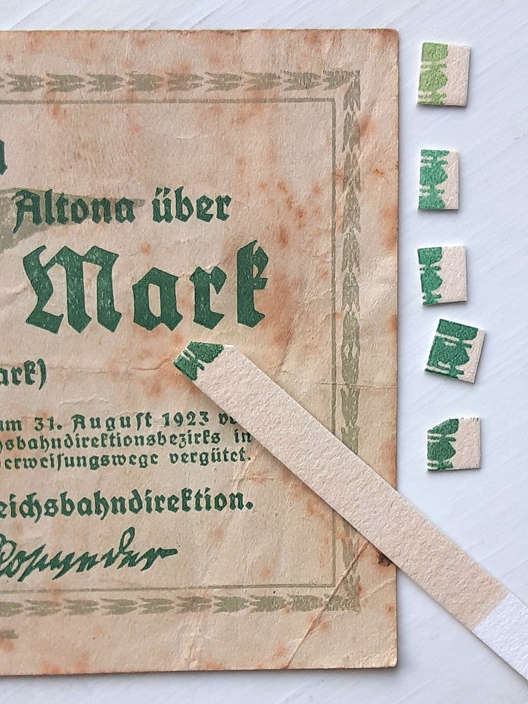
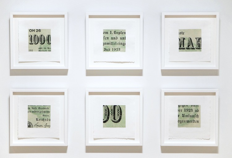 Looking to the future, Heather wants to take what she learnt from the creation of Papiermark Composition 4, and apply it to photolithography. “Photolithography has a higher capacity for detail and fine lines, but takes significantly longer and is more costly, so it wasn’t feasible for my last few projects,” says the artist. She hopes to exhibit the piece very soon, sharing it in person “because the nuances do not come though digital documentation”.
@thomson.ht
www.heatherthomsonart.ca
- 2027: A Year in Review by Tommy Evans - December 23, 2025
- Layers of Life: Chiara Mensa’s Habitat Series - December 23, 2025
- Zanmulgyeol (ripples) | The Living and Ghost Birds of Seoul - December 8, 2025

