What happens when a luxury cognac brand, a global sports powerhouse, and a typographic visionary join forces? You get a collaboration that fuses heritage, hustle, and handcraft in one striking visual statement.
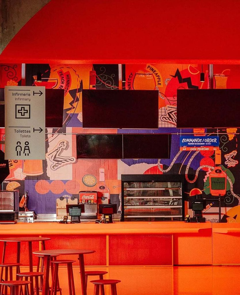
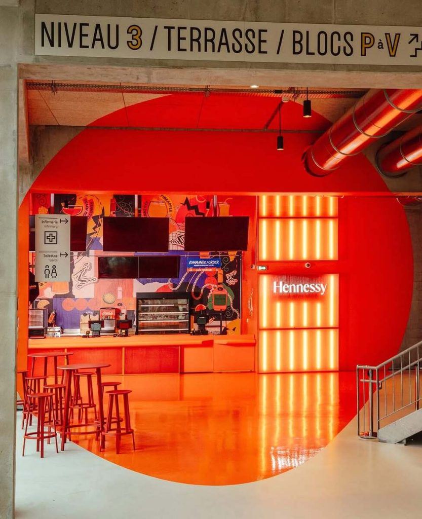
For the Hennessy x Adidas Arena campaign in Paris, South African designer Andrew Footit was tasked with bringing two icons of culture together on the walls of a space built for performance. Known for his bold, character-driven type and textured graphic compositions, Footit translated that same expressive energy into a mural that celebrates movement, connection, and urban culture.
The result… A kinetic collision of sport and spirit, where graffiti-inspired letterforms meet luxury heritage, and Parisian street culture meets the precision of design.
We caught up with Andrew to talk about his process: balancing legibility and expression, navigating creative constraints, and finding flow between the energy of the court and the craft of the bottle.
The Hennessy x Adidas Arena campaign merges two iconic brands with rich legacies. How did you approach blending your own bold typographic style with their distinct brand identities while still keeping the final visuals cohesive?
For this project, typography took a more supporting role. Initially, we had explored a more bold and rigid type with depth, but we moved away from that as the mural needed type that was more fluid and complemented the overall mural illustrations.
Typography plays a central role in your work. For this campaign, how did you use type to communicate themes of energy, performance, and heritage, particularly in a sports arena context?
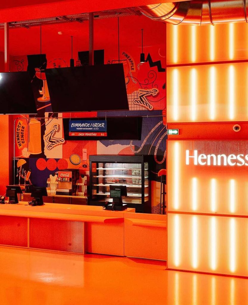
Hennessy wanted to explore more urban culture-related illustrations for this mural. We explored a variety of type including a graffiti style for the type, but legibility needed to be key and a more simplified hand painted type worked well, it does bring in the graffiti aspect but in a more simpler form.

The campaign visuals are bold, expressive, and kinetic. Were there any specific challenges in designing for large-scale, high-impact installations like those featured in the arena?
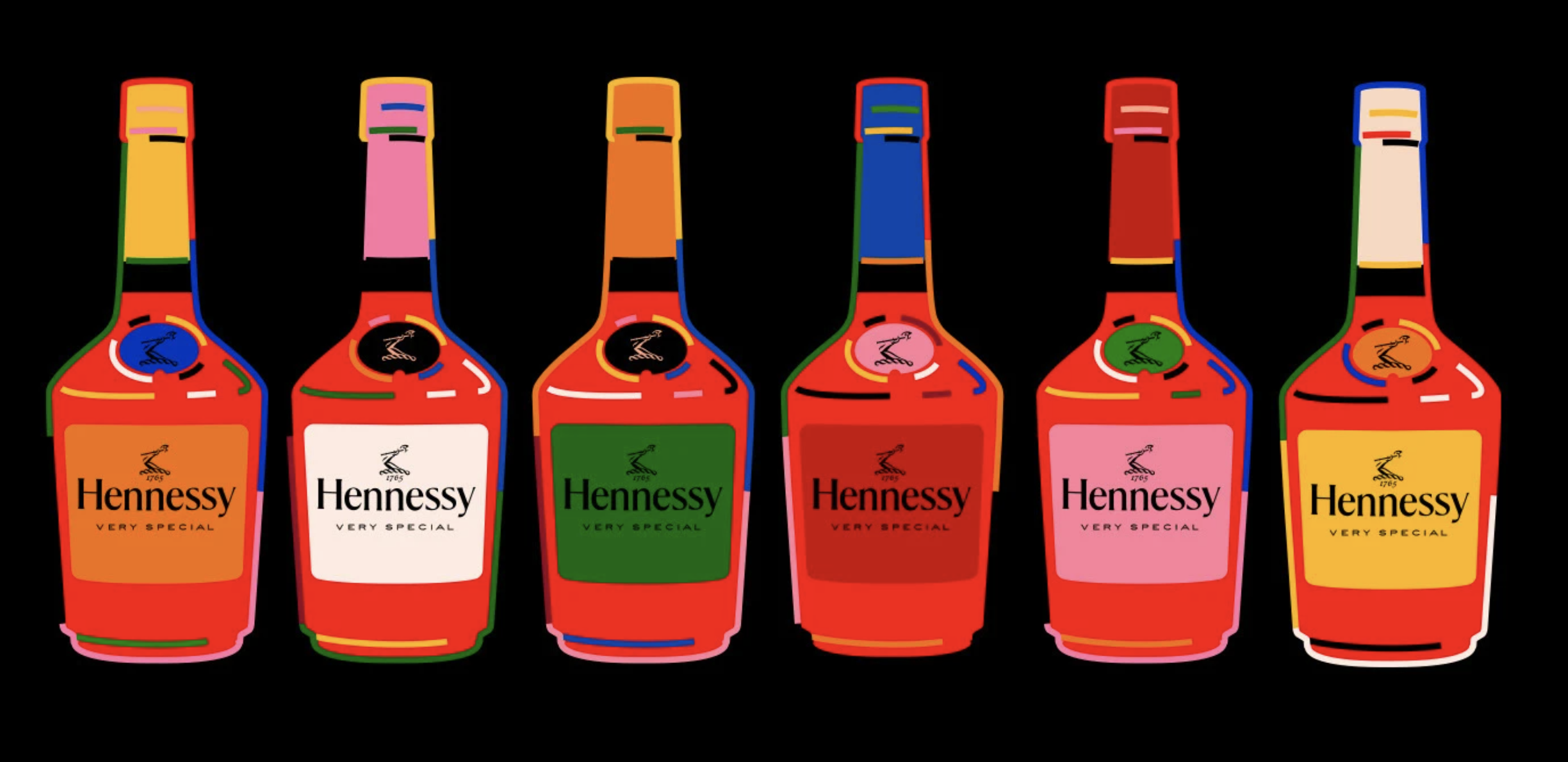
There are very strict guidelines between alcohol brands and Sports in Europe / France; therefore, Hennessy-related branding like the Hennessy Very Special Bottle, Logo, and Bras Arme graphic had to stay within a maximum size limit, which was challenging in certain ways, but it all came together well.
How did you navigate creative direction and feedback while maintaining your artistic voice?
The Hennessy team was really great to work with. Each update to the mural had to go through multiple approvals with creative, brand, and legal teams, so it did get lengthy in terms of approvals, but the Hennessy team were very firm in keeping my style and approach to the mural, which I was really happy about.
Your work explores the intersection of design, culture, and typography. Were there any cultural or conceptual references that guided your creative direction for this campaign?
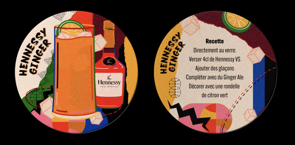
Hennessy wanted to approach this mural exploring urban culture and taking the brand into a more urban culture setting, like the Adidas Arena, which hosts basketball as its primary sport. We had multiple areas to explore urban culture, particularly Paris culture, as well as basketball, and also the beverage itself. When you look closely at the elements included in the mural, we have some subtle basketball links, cocktail elements, Paris/France elements, grape vines to tie into the Hennessy brand, and simple cracks and tears to bring in a little grittiness.

marcroy@peopleofprint.com
- The Virgil Reader Vol. 001: Virgil Abloh’s Legacy as an Open-Source Tool - March 10, 2026
- City Series #002: Amesbury, Massachusetts with Carl Unger of Harsh Realm and Monotype - March 9, 2026
- How Creatives Shut Off From Work - March 4, 2026