What happens when you take the humble form of a card, and build from it a system that’s both collective and expressive, that’s consistent yet playful? That’s exactly what design studio SMLXL, in collaboration with Principi, set out to achieve with Magenta.
“We wanted the card itself to be the foundation. Its shape, its potential for reveal and surprise—it became the DNA of everything,” explains the SMLXL team.
The Challenge
Magenta is not just another tabletop game publisher. Its brief was layered: build a packaging and identity system strong enough to unite a collection of games, but flexible enough to let each individual game shine with its own personality. It needed to feel coherent: when you see one game in the Magenta range, you know it belongs. But also surprising: each game should tell its own visual story, evoke its own world.

Design Starting Points: The Card & Packaging
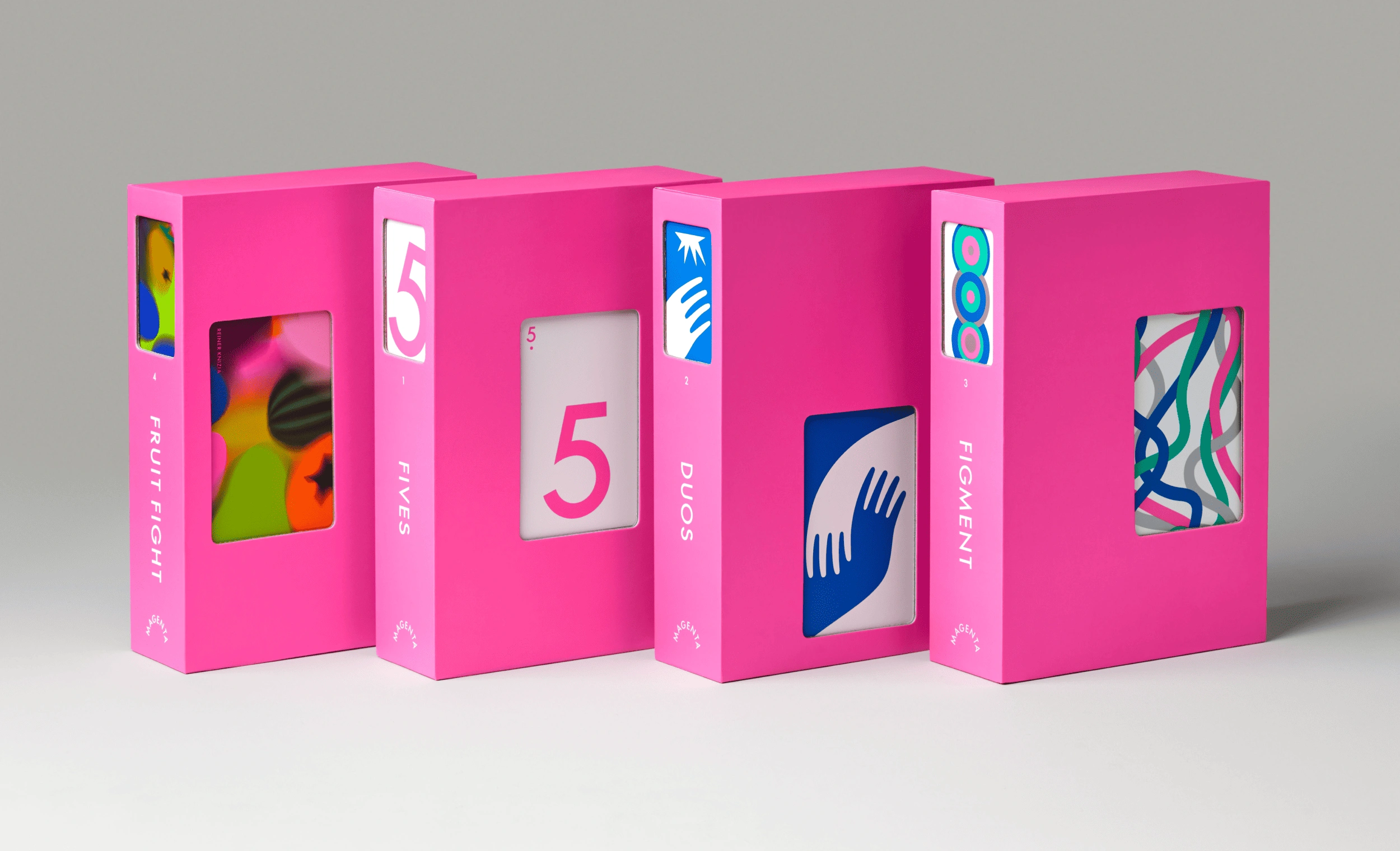
SMLXL’s thinking starts with the card itself. Its shape, the possibilities that die-cuts and reveal mechanics afford. This becomes the foundation for the visual identity, packaging, and communications.
Two levels of packaging get to do different jobs:
- Exterior casing / shell: This is about shelf presence. Consistency matters here: a coherent visual that unites all games in the Magenta family. Strong presence, bold identity.
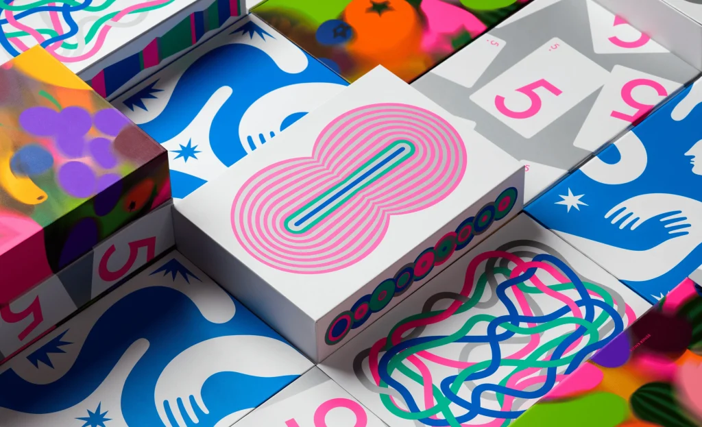
- Interior surprise: Peel back the cover (or open the “shell”), and each game gets to be revealed on its own terms. Unique imagery, illustration, specific colour palettes, this is where each game shows off.
The design uses die-cut windows in the cover, letting glimpses of the game’s unique artwork peek through. These cut-outs align with the back of the card illustrations, so that what’s hidden (or partially hidden) becomes part of the storytelling.

Identity, Colour & Brand Unity
Magenta (the colour) plays a kind of anchor role. It’s bold, it’s confident, and it threads through everything. Every game in the collection may live in its own colour universe, but magenta is always there, sometimes in a supporting role, sometimes more central, to bind the range together.
Gameplay, Accessibility & Usability
Design isn’t just about looking good: SMLXL were careful about the players’ experience.
- Packaging interior design is bespoke: shaped compartments, “bento-box” style, so the components (cards, tokens, whatever each game requires) are held neatly and with purpose. No wasted space; no one size fits all.
- Accessibility is a priority: there’s a system of indexed icons, placed below the numbers on cards, to help colour-blind players. This kind of detail ensures the games are playable and inclusive.
- Instructions are laid out like an editorial piece: chapters, clear structure, easy to follow. Clarity in how the game is taught is as important as its visual packaging.
Visual & Communication Style
The brand’s visual language does more than just hang together, it plays:
- Photography direction is playful, relaxed. Colours are bold. Graphics are strong. The aim is to highlight the vividness of each game, using imagery that leans into contrast, character, artful composition.
- Communications & motion elements echo the same logic: consistent identity from the outside in, movement and reveal for the unexpected, and enough variation to give each game its moment.

What Makes Magenta Stand Out
What we love about this project is how it balances unity and difference, surprise and clarity. Some key takeaways:
- It uses constraints (shape, die-cuts, cover/exterior vs interior) as opportunities, not limitations.
- It builds in moments of discovery: when you open the packaging, when you glimpse what’s behind the die-cut, when you read laid-out instructions.
- It doesn’t sacrifice usability for aesthetics: accessible design, thoughtful packaging shapes, coherent identity all around.
If you’re a designer or brand thinking about collections, series, product ranges: Magenta is a reminder that the smallest piece (a card, a colour, a mechanism of reveal) can inform everything, from packaging to brand voice to how people engage.

marcroy@peopleofprint.com
- The Virgil Reader Vol. 001: Virgil Abloh’s Legacy as an Open-Source Tool - March 10, 2026
- City Series #002: Amesbury, Massachusetts with Carl Unger of Harsh Realm and Monotype - March 9, 2026
- How Creatives Shut Off From Work - March 4, 2026