
The latest screen print release from printmaker Mark Frendo is a series of prints that revisit the rude playground songs from his Primary school days in the 70s.
Mark first got into screen printing after buying a piece he liked by Peter Blake, and curious of the process, he began to research. When he saw a print course advertised at Richmond Community College Mark decided to give it a go. He tells us; “We did lino printing, and a process involving coca cola, but I was taken with screen printing and it was all I wanted to do for the rest of the course.” When the course finished Mark signed up for membership at Sonsoles open acces studio in Peckham, and he hasn’t stopped screen printing since.
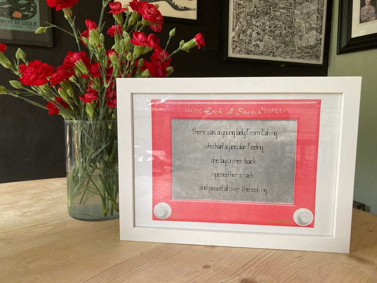
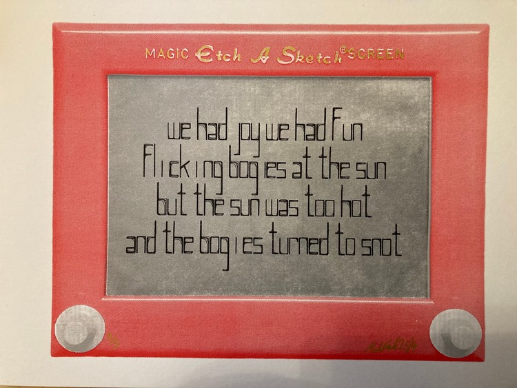
 “I am a self indulgent printer, or so my wife says,” states Mark. He continues; “I like to print what appeals to me, as opposed to what is trending. As a result I have entire editions unsold in the drawer.” His childhood holds a lot of inspiration for his artworks, thus most of his efforts can in someway be linked to the 70s and 80s, alongside a strong injection of humour too. His latest collection of Rude Playground songs is strong evidence of this, with imagery including an 80s etch a sketch and tongue-in-cheek playground rhymes.
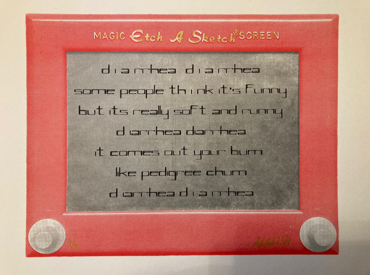
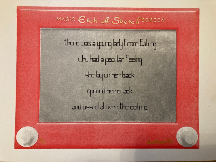
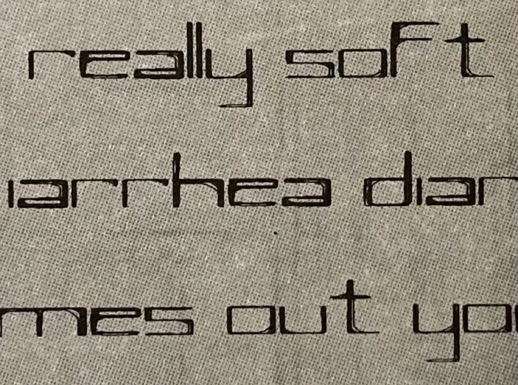
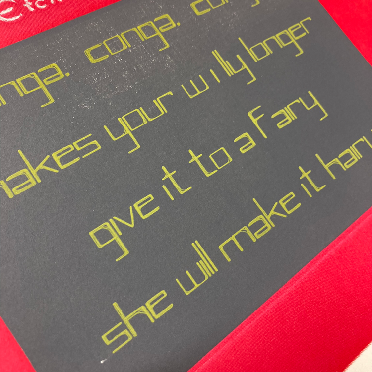
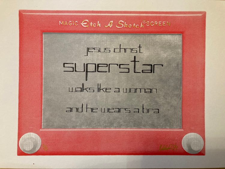 Mark asked people about the songs they remembered from their childhood, and he tells us; “There were quite a few more, and some of them very, very rude. What naughty kids we were!” 5 of the 6 songs included in the collection are from Mark’s childhood, and the last, Conga, Conga, Conga, is a next generation offering; “My 9 year old came home from school singing it. Some things never change!'”. Each print in the collection comprises 3 layers with hand finished lettering, printed on A4, and limited to either 5 or 10 prints.
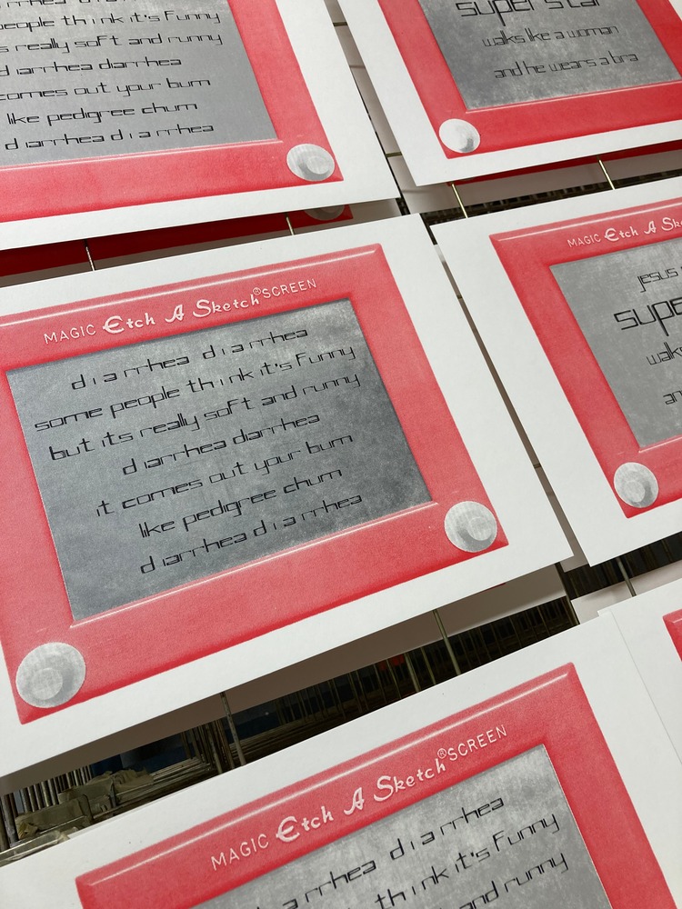
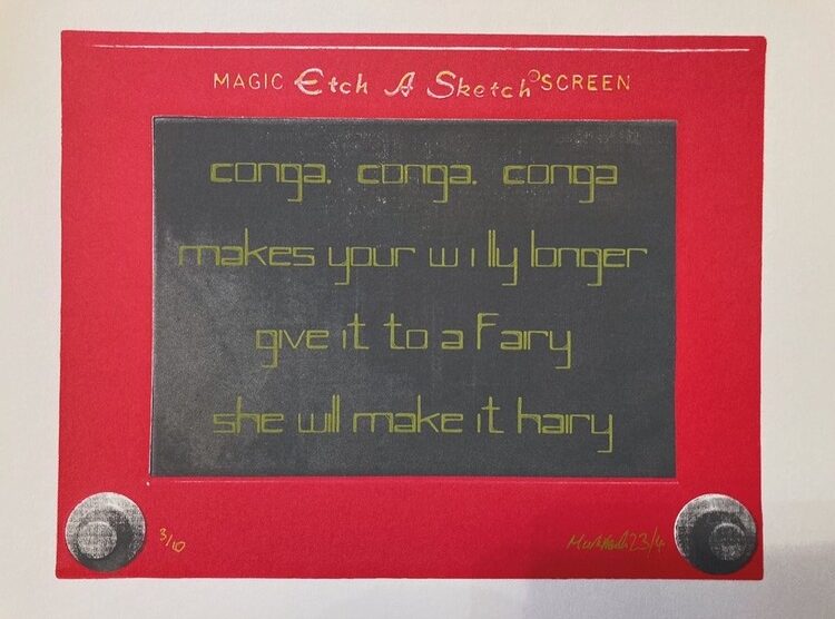 The series began when Mark purchased an etch a sketch from ebay (£10 bargain!) which he then photographed. He then skewed the image on Photoshop to make it as square as possible. Next, he half toned it and separated the screen and the frame for the positives. Finally, he chose a font, New York, which was used for the text.
Keep your eyes peeled for some more 80s inspired prints dropping in the Autumn.
Want to know more about our membership? Give us an email at members@peopleofprint.com.


