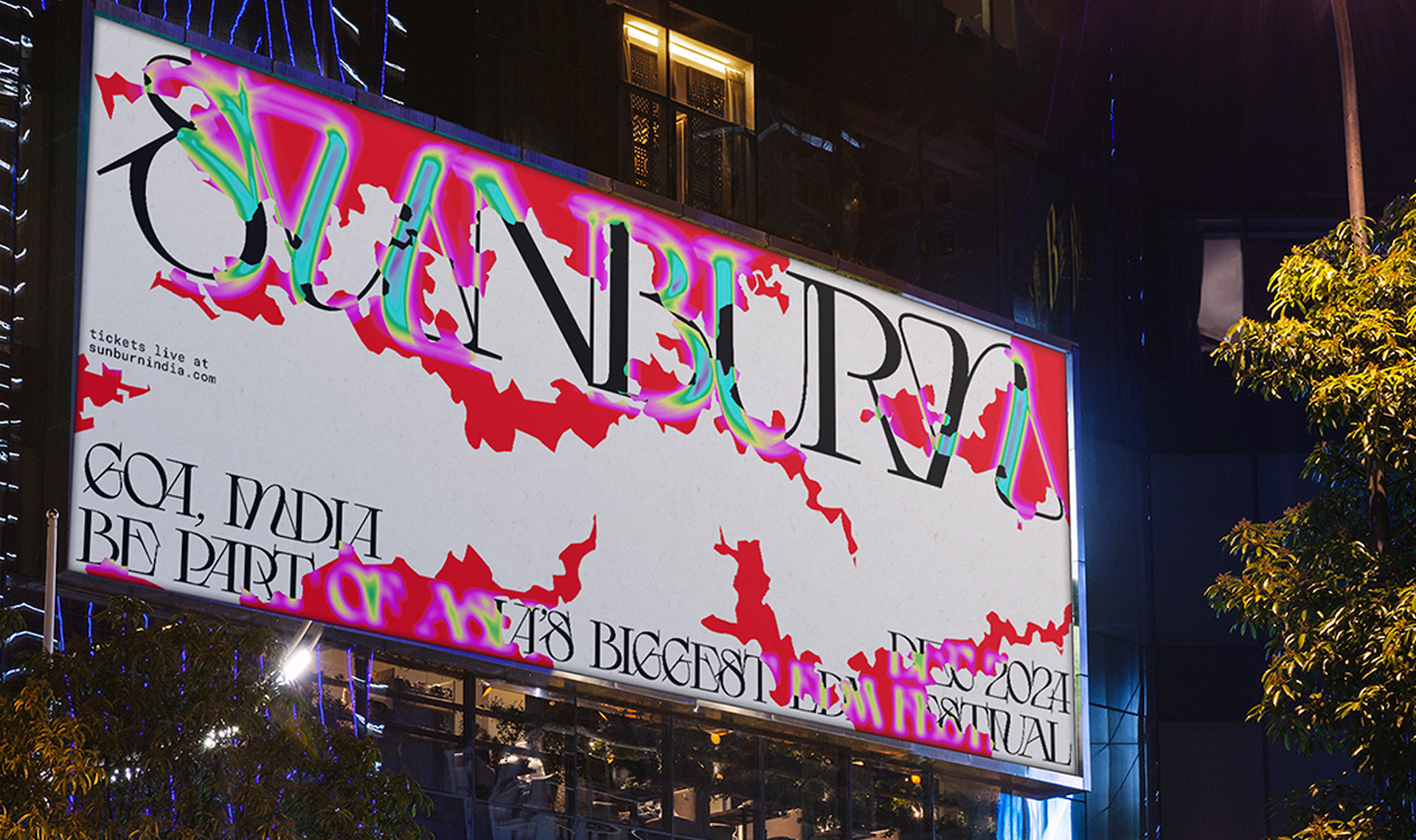
New York-based designer Ipshita Krishan reimagines the identity for Sunburn, India’s largest electronic music festival, using hand-drawn sunburn patterns, vibrating typography and an expansive colour language drawn from growing up in India to create a system that reflects the festival’s cultural origins and global ambitions.
Most festival identities reach for minimalism. Ipshita Krishan went the other way. Sunburn, India’s largest electronic music festival and a significant name in emerging global music culture, needed an identity that could speak to people who had never heard of it as fluently as it spoke to those who had grown up with it. That meant going back to the origin.
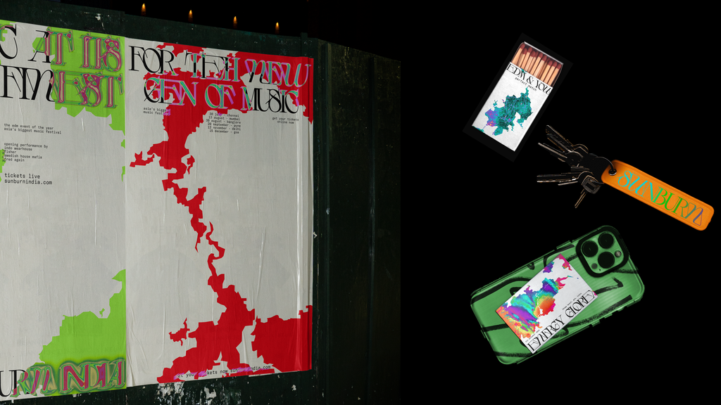

The research came first: the history of the festival, beach party culture in India, the appetite of the audience. The creative intuition came next: texture, layering, collage. The breakthrough came when Krishan placed a photograph of a shoulder sunburn on the back of a tee. The image locked into the concept immediately. Sunburn to show Sunburn. The tactile, physical sensation of being at an outdoor festival in Indian heat translated directly into visual language.
From that starting point, she drew the sunburn patterns by hand, tracing and building them through a process she describes as tedious and entirely worth it. The monotony, she says, is the point: “Do the tedious task. Spend insane hours on a simple thing. The monotony unblocks the brain for ideas.” The hand-drawn quality gives the patterns a specificity that generated imagery cannot replicate. Cut-outs, layering and collage extended the system across formats.

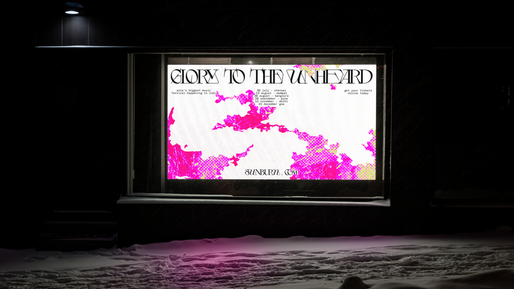
Colour came from lived experience. “Color can be your best friend in creating a system. Avoid containing it, let it flow.” Growing up in India gave Krishan an expansive, instinctive relationship with vibrant colour that she brought directly into the palette. Typography was chosen to alternate and shift, reflecting movement, and the combination of colour and type produced a vibrating visual effect that runs across the whole identity. Music, heat, energy and movement made visible as a system.

Ipshita Krishan creates identity systems at the intersection of cultural insight and design logic. Her work spans graphic design, spatial branding and identity creation. Previous work has been noted by Creative Boom, One Club and the Indigo Awards.
Website: ipshitakrishan.com Instagram: @ipshitark
Sunburn Festival Identity, 2025. Graphic identity, typography, pattern, print and digital applications.

Want to know more about our membership? Give us an email at members@peopleofprint.com.
- Elisa Dublanc & The Rhythms of (trans)formation - September 16, 2026
- For Me, Paper Is Part of the Art: Jana Nicole on Funga, Ötzi and the Living Possibilities of James Cropper Paper - September 16, 2026
- Sunburn to Show Sunburn: Ipshita Krishan’s Festival Identity - September 16, 2026