James Cropper Creates is more than a new identity; it’s a platform for artists, makers, and designers working with paper. We caught up with EXP for a quick-fire interview…
One typeface that never lets you down?
CG:
TG: I hate to get stuck with one typeface, but EXP uses Studio Pro, so I’ll go with that as my go-to. Nice, simple, understated.
Favourite paper stock?
CG: Changes all the time, but Vanguard Cherry at the moment
TG: Rydal Black and White was one of our first bits of work for James Cropper, so I’ve got a bit of a soft spot for the Rydal range.

Most underrated print finish?
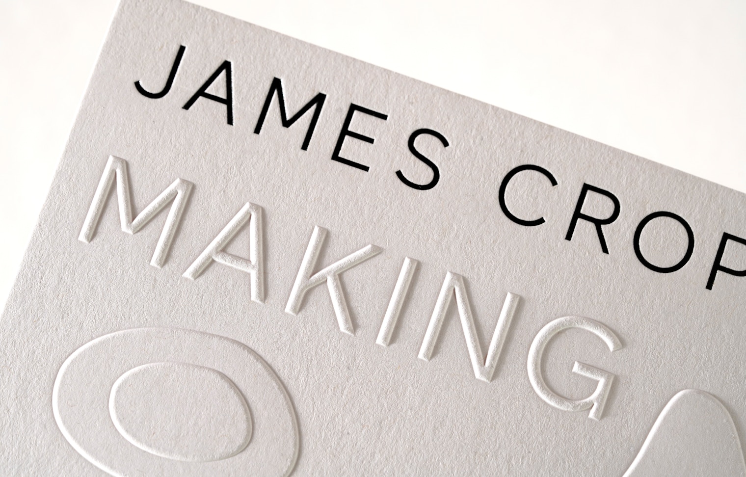
CG: Nothing beats a super crisp blind emboss
TG: Agreed – something really nice about emboss and how it casts shadows in the light.
Digital or sketchbook first?
CG: Sketchbook
TG: Digital for me!


What’s currently pinned to your studio wall?
CG: In the office, we’ve got the ‘A Match Made in Heaven’ prints we created for the James Cropper x Winter & Co collaboration for Coloursource. They are very limited and were only given out at IPS Manchester. At home, I have a couple of Mr Bingo prints…
TG: It’s a major mix between some of our work, OFFF Barcelona 2026 posters, Northern Design Festival posters, Mr Bingo prints, and some vinyls that have soundtracked our work over the past 13 years.
A book every young designer should own?
CG: Make Your Own Luck: A DIY Attitude to Graphic Design and Illustration, by Aries Moross. Really insightful and full of no nonsense advice on finding your own voice. Older generations will recommend you read ‘How to be a graphic designer without losing your soul’ by Adrian Shaughnessy, but it was so dense, I could never finish it.
TG: From a brand perspective, Lovemarks by Saatchi & Saatchi is a great reminder that brands need to be more than their logos. It was written over 16 years ago, and yet somehow, in a world of social media, more relevant now.


One project you wish you’d designed?
TG: Probably the OFFF Barcelona 2026 campaign by Uncommon. The idea of inviting a load of guests to an event, swabbing their glasses, and growing culture in a lab to create beautiful patterns from bacteria and germs is a disgusting and genius way to say how important mixing cultures is.
Coffee, tea or something else?
CG: Black coffee
TG: Diet Coke, although it’s an addiction I’m trying to quit!
The best piece of creative advice you’ve ever received?
CG: ‘If it stills works without it, keep it off’ is a good paraphrased one. I’m also a hypocrite, because ‘More is more and less is a bore.’ Is good too.
TG: Similar – but if you have to over-explain a concept, it doesn’t work.

Finish this sentence: Great design should always…
CG: …prompt a response, either positive or negative. The worst design is ‘just fine’.
TG: Agreed – Great design should always create a reaction! Who wants to be bland and forgettable?
James Cropper Creates is an ongoing platform connecting creatives with James Cropper, the last mill in the UK still making coloured paper. Discover more at jamescropper.com. EXP is a Manchester-based creative agency working across brand, digital and experience design.


Want to know more about our membership? Give us an email at members@peopleofprint.com.
- Nature Is Not Simply Something to Look At: Dorien Brouwers for James Cropper Creates - September 24, 2026
- The UK’s Biggest Online Seconds Sale Returns: Super Seconds Festival, Edition 12 - September 23, 2026
- Fast, Efficient and Super Precise: Raoul Wilke’s Laser-Cut Screen Print Stencils - September 17, 2026