
Finnish multidisciplinary artist and designer Superflinda has been building a limited-edition risograph alphabet since 2023, one letter at a time, each one hand-drawn from her background in hip-hop, sign painting and handlettering and transformed by the Riso process into something the design alone could never produce.
The Riso Alphabet began with M. It was 2023, and Superflinda wanted to find out what happened when expressive, calligraphic brushwork met the mechanical but gloriously imperfect language of risograph printing. What she found was a dialogue, one that has been developing letter by letter ever since.
Seven letters exist so far: A, E, L, M, O, P and S, each imagined in a different style and each standing for something the artist believes in. A is for analog. P is for Peace. S is for Super. That layering of meaning into letterform is characteristic of a practice rooted in hip-hop culture, sign painting and mural art, traditions in which letters carry weight beyond their function as characters. Each letter is first made by hand, built around rhythm, gesture and personality, before being separated into colour layers for print. The Riso process takes it from there.

And the Riso process, for Superflinda, is far more than a production method.
“I’m drawn to the tension between control and accident,” she says. “You prepare your layers carefully, but in the end the machine adds its own rhythm. The Risograph doesn’t just reproduce the work; it transforms it.”
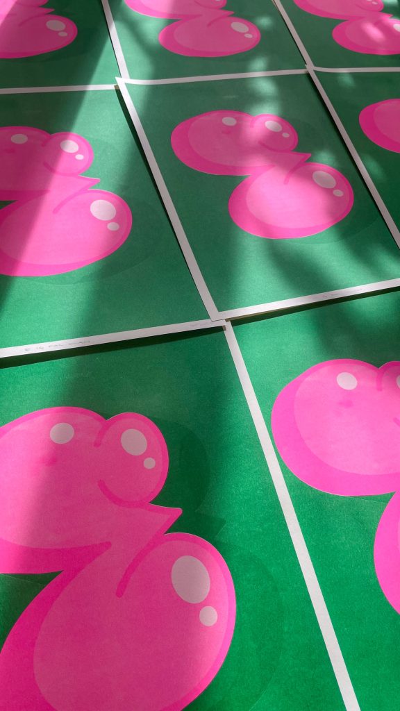

The intentional misregistration, the grain, the fluorescent inks: none of it is a compromise to be managed but a quality to be embraced. “The colours are insanely vivid, the textures are raw and alive, and the small misregistrations make everything vibrate. You never get the same result twice, and that surprise is absolutely addictive.”
Each letter is printed in small batches of 30 to 40 copies at RisoParadiso in Ljubljana on Fedrigoni Ivory paper between 150 and 250 gsm, hand-signed and numbered. The two-colour combinations are chosen carefully to balance nostalgia with contemporary punch, and the limited editions preserve the tactile, collectible nature of the work. Soy-based Riso inks keep the production in line with a broader commitment to mindful making. The goal, eventually, is a full alphabet, maybe even some special characters.

Superflinda is a multidisciplinary artist, illustrator and graphic designer based in Ljubljana, rooted in retro aesthetics and street culture. Her practice spans illustration, large-scale murals and public installations, bringing handcrafted techniques into everyday spaces.
ARTIST LINKS
superflinda.com
@superflinda
superflinda.com/shop
Riso Alphabet (A, E, L, M, O, P, S). A3, 29.7 × 42cm. Fedrigoni Ivory 170gsm. Limited edition of 30–40, hand-signed and numbered. Printed at RisoParadiso, Ljubljana. All photography by the artist. The project has been supported by Freelance-graafikot (Freelance Graphic Artists) https://freelancegraafikot.fi/english-summary/


