

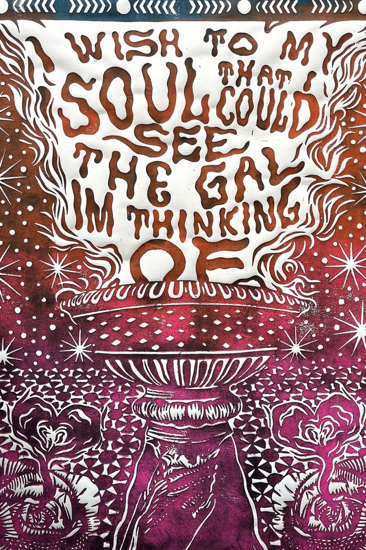
The Gal I’m Thinking Of is the first in a new series based on different quotes from some of Solty Design’s favourite musical artists. Steven Soltysik, the face behind Solty, picked out this quote from Bob Dylan’s Kingsport Town, and then got to work digging through his photos to bring visuals to his idea.

 The vast majority of visual inspiration for Steven’s works come from visiting antique shops and malls. He tells us; “One I enjoy visiting the most is The Manhattan Arts & Antique Center. There are all kinds of different statues, vases, candle holders, clocks, and other items from cultures all over the world inside.” Here, he will spend an hour or so walking around, taking pictures of things he finds interesting. He comments; “Sometimes an idea pops right into my head which initiates the photo. Other times, I know what i’m looking at can be included into part of a design. I just don’t know exactly how at the moment.” Thus, his phone is full with images from these places, saved for when it’s their turn to be used.
The hand that is holding the lantern in The Gal I’m Thinking Of is from an image he took while visiting this centre. It was taken a year prior to including it within this design. Steven describes; “I wanted the text in this piece to be the main element. Therefore, the placement of the hand and lantern allowed for the text to take up plenty of space.”
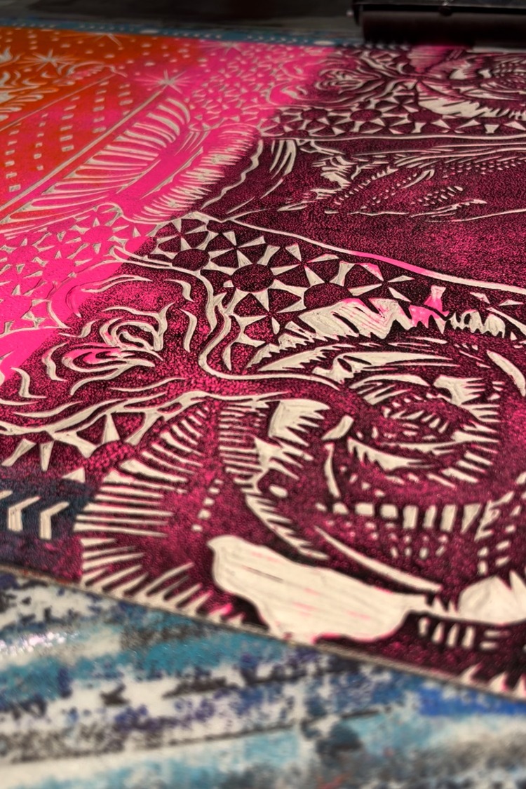

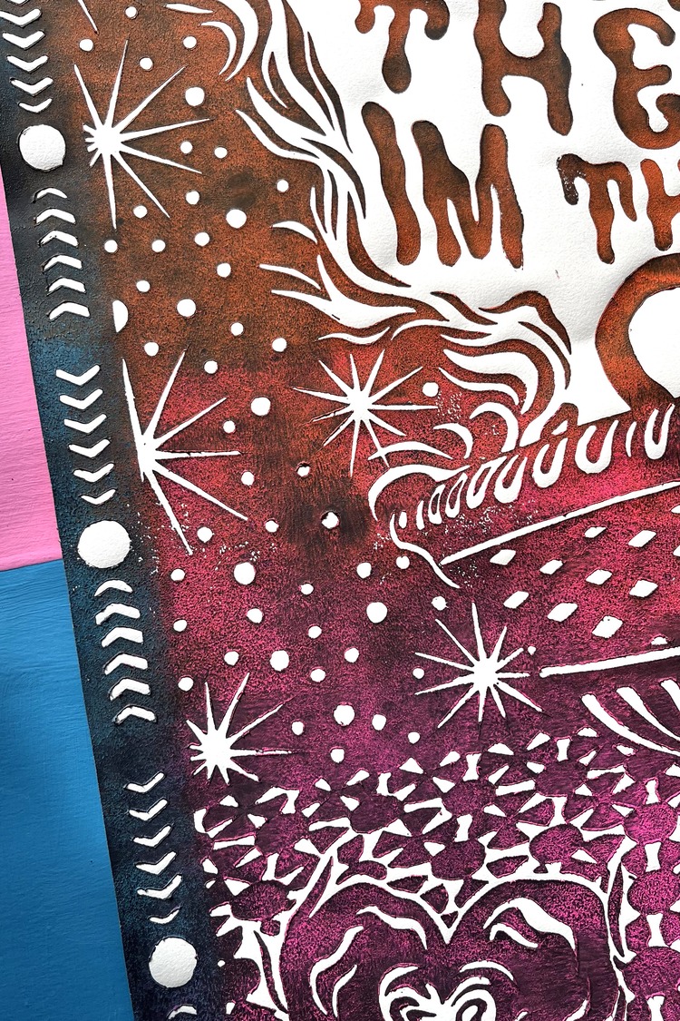
 Steven oftens nails down the main parts of his compositions before he starts to think about what will be behind. Being that the text is surrounded by negative space, Steven wanted to keep most of the surrounding linoleum. He states; “I have a rule of thumb I like to follow of 60% positive space to 40% negative space, or carved away areas.” This led to the design on the floor tile and night sky background; the two roses in the bottom corners were created to bring reference to the theme of the quote.

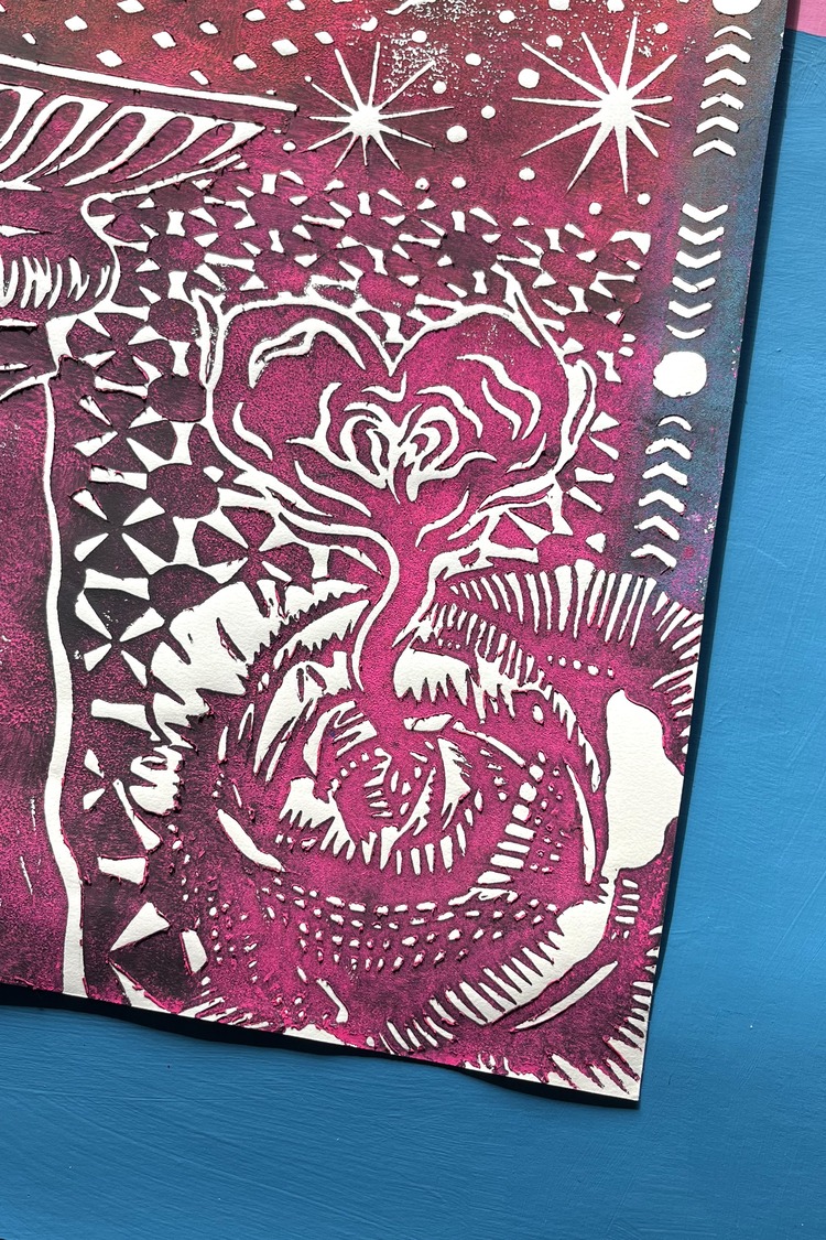 Recently, Steven has been working with a more cohesive and consistent colour palette across all of his projects, focusing on the combination of three colours; orange, pink, and teal as an accent colour. All 3 colours are rubbed onto the slab before he adds an additional light layer of black. “I do this to create more contrast from the paper and for the texture it gives the print,” says the printmaker. He continues; “Additionally, I like the ruggedness the black specs add to each piece. I never want my work to look super clean. It was made by hand and should look like a human crafted each print.”
 Steven is looking forward to continuing to combine his love for music with creating visuals to words. He concludes; “I hope to earn work with musical artists to create gig posters and other merch material. This series is good practice, that I enjoy, in order to reach that goal.”
Want to know more about our membership? Give us an email at members@peopleofprint.com.


