What happens when an iconic type foundry meets a trailblazing print format? The Monotype x Posterzine collaboration answers this question with six beautifully crafted issues that merge the art of typography with the tactile joy of print. This partnership is more than just a meeting of minds—it’s a celebration of design, storytelling, and the enduring power of print.

A Partnership Rooted in Design Excellence
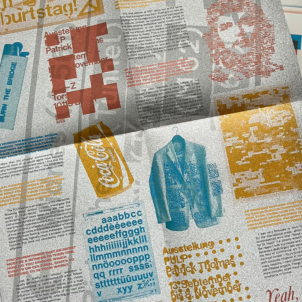
Monotype, a global leader in typeface design, has a storied legacy of creating fonts that shape brands, culture, and communication. Posterzine, on the other hand, redefines what a magazine can be—folding out from an A4 booklet into a striking A1 poster. Together, they’ve created a series of six issues that exemplify how typography and print design can elevate each other.
At Monotype, they believe typography is a cornerstone of visual expression, partnering with Posterzine enabled a new way to showcase how fonts come alive in print while reaching a community of designers who appreciate the craft behind every detail.
Unfolding the Process
Each Posterzine issue starts with an idea: how can typography not only enhance the content but also become a part of the storytelling? Monotype’s team worked closely with the designers at Posterzine to select typefaces that would complement the themes and personalities featured in each issue.
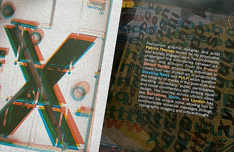
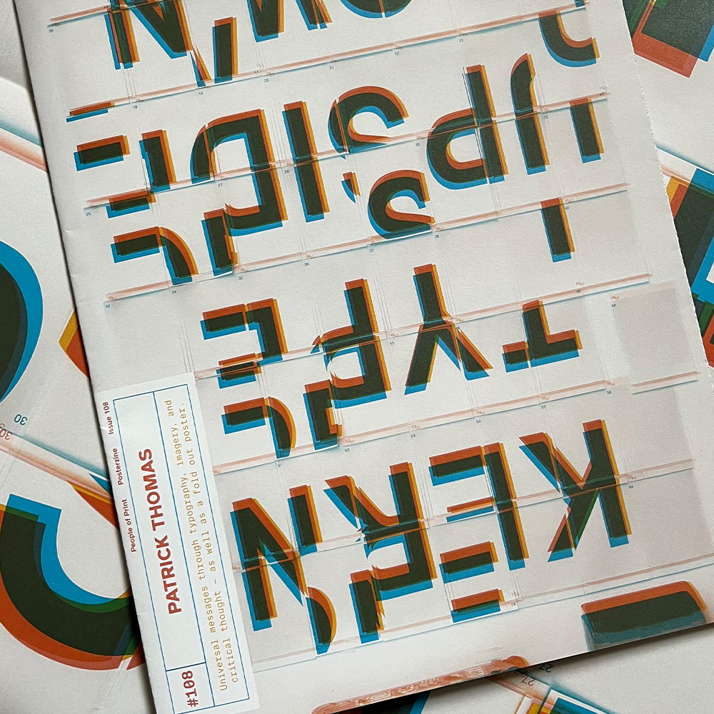
For instance, the Patrick Thomas edition explores themes of graphic design, typography and visual communication, with Rifton and Neufile Grotesk selected by the Monotype team anchoring the editorial. The result? A seamless blend of content and typography that feels cohesive, intentional, and impactful.
This collaborative process highlights the thoughtfulness required to design for print. Monotype’s expertise ensured that every typeface was optimised for readability and visual appeal across Posterzine’s unique format—whether folded as a zine or displayed as a poster.
Typography as the Star
While each issue celebrates a different theme or creative, one constant is Monotype’s contribution to the design. Fonts like Helvetica Now, Gilroy, and Neue Haas Grotesk (to name a few) take center stage, transforming Posterzine into more than a publication—it becomes a showcase for the art of typography.
These fonts don’t merely support the content; they shape it. Whether it’s the bold, modern look of a sans serif or the elegant curves of a serif font, Monotype’s typefaces provide the visual language that ties the issues together.
“When the typeface is right, it becomes invisible, but when you stop and really look, you see the craftsmanship that makes everything feel so seamless.”
Celebrating Print in a Digital Age
In a time when many publishers are turning to digital, the Monotype x Posterzine collaboration is a powerful reminder of the tactile and visual joys of print. Each issue is designed to be held, explored, and displayed—a collector’s item for design enthusiasts.
For Monotype, this collaboration is a chance to connect with a new audience and demonstrate the versatility of their typefaces. For Posterzine, it’s an opportunity to push the boundaries of print design, showing how type can inspire and innovate.
This partnership bridges the gap between tradition and modernity. It’s a love letter to the designers and creators who continue to push the boundaries of print.
Where to Find the Monotype x Posterzine Issues
The six sponsored issues are now available to order, featuring exclusive designs, interviews, and a fresh perspective on typography in print. Whether you’re a graphic designer, a typography enthusiast, or a print collector, these editions are a must-have.
Explore the collection to see how Monotype and Posterzine are shaping the future of design—one fold-out at a time.

marcroy@peopleofprint.com
- Nils Leonard on Craft, Culture, and Why Print Still Matters - April 28, 2026
- Our time at OFFF Festival 2026 | 10 Key Takeaways - April 19, 2026
- More Than Fish: Donna Cyril at Sasoon Dock - April 4, 2026


