
Art director and brand designer Kasia Konopka turns the language of consumer packaging against itself, building a modular typographic system that asks what it means when growth starts to look like branding.
Something is unsettling about how naturally the language of self-improvement borrows from the language of product marketing… Stronger, upgraded, new and improved. Kasia Konopka noticed that slippage and decided to take it literally.
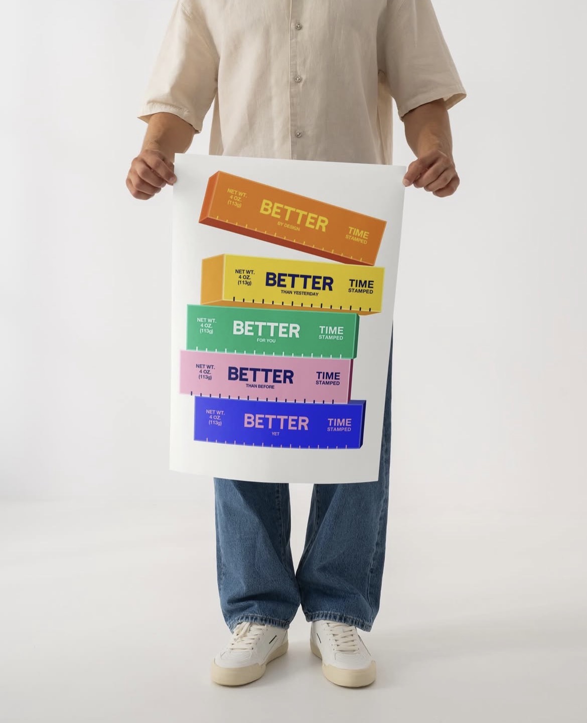
If Better Came in a Package is a digital print project from 2025 that treats abstract self-improvement as a shelf-ready consumer good, complete with bold colour blocking, weight stamps, promotional claims and the persuasive confidence of everyday retail graphics. The premise is ironic but the execution is precise: Konopka built a modular typographic system from scratch, studying how packaging hierarchies stack and prioritise information before constructing her own version of that logic with progress, growth and optimisation as the product.
“We’ve learned to measure progress the same way we measure products,” she says, “by weight, by upgrades, by what’s new.”
The result is work that operates on two frequencies at once. On the surface it is bright, graphic and immediately legible, drawing on the same high-contrast palette and structured clarity that makes a well-designed package stop you in the supermarket aisle. Underneath, it is doing something colder and more critical. “When improvement becomes a product, growth starts to look like branding,” Konopka observes, and the project makes that argument without needing to announce it. The form is the content: the more convincing the packaging, the more pointed the observation.

This piece sits within a broader ongoing body of work in which consumer packaging becomes a metaphor for human emotion and behaviour, a project of turning the familiar retail language of claims and upgrades into something that reveals rather than sells. The interest is not in parody for its own sake but in what the language of branding actually does to the things it describes when applied to experiences that resist being measured or optimised. The answer, here rendered in high-contrast type and playful restraint, is that it makes them feel simultaneously more urgent and less real.
Kasia Konopka is an art director and brand designer working at the intersection of typography, colour and conceptual packaging. Her practice draws from everyday consumer objects and retail language, building modular systems that evolve through constant experimentation and reframing.
ARTIST LINKS
kasiakonopka.com
@kasiaekonopka
If Better Came in a Package, 2025. Digital print. Kasia Konopka.


