

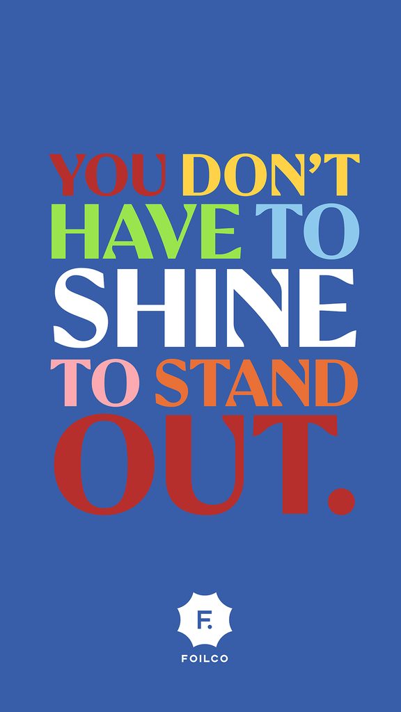
Say the word “foil” and most people picture the same thing: gold, silver, holographic, something that catches the light and demands attention through sheer shine. Foilco, one of our long-standing People of Print partners, wants to change that picture. With their Pigment Foil range, colour does the talking instead, and it turns out that’s just as arresting.
Beyond Metallic
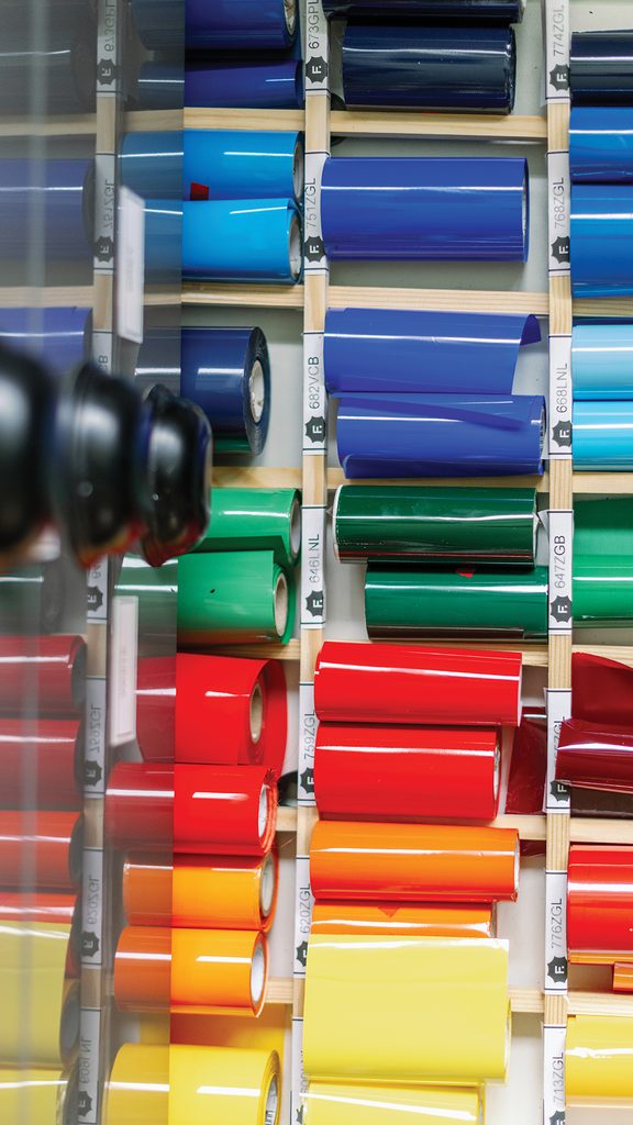
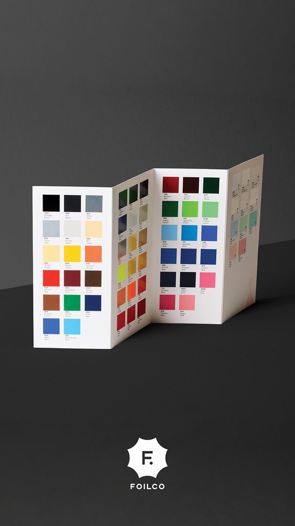
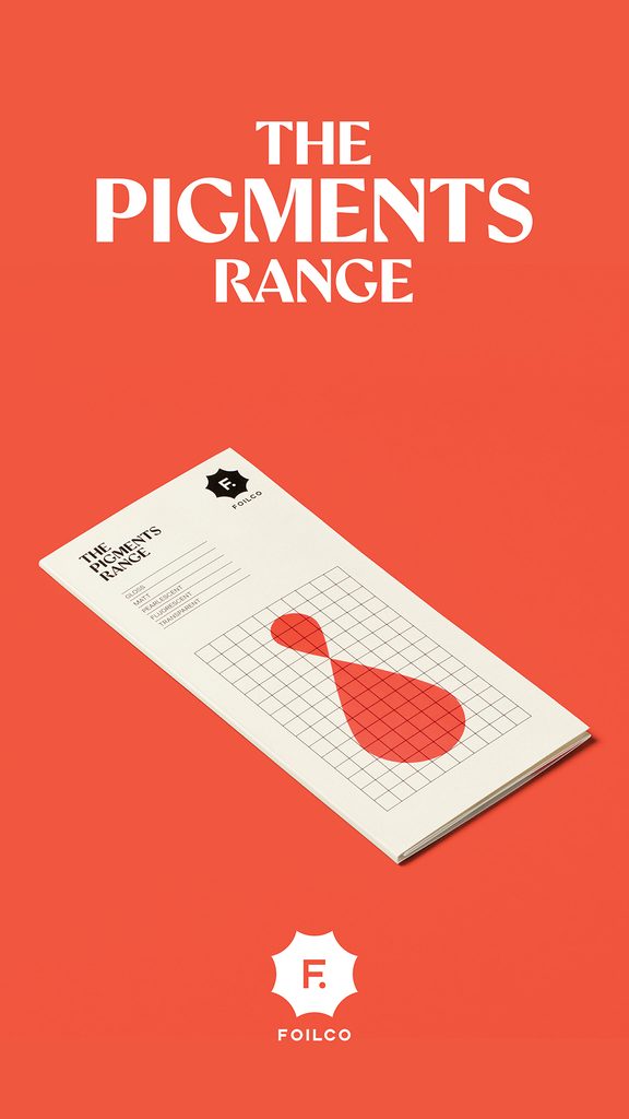
Foilco stocks one of the widest ranges of foils in the world, and buried within that range is a category that upends what most people expect from foiling: more than 40 pigment foils, available in matt and gloss, built to deliver rich, fully opaque colour with zero metallic sheen. No shimmer, no shine, just dense, saturated colour laid down with total precision.
It’s a reminder that foil’s real strength was never really about reflectiveness. It’s about control: total opacity, sharp edges, and a finish that behaves exactly the same way every time it’s applied. Pigment foil takes that strength and points it purely at colour.
Brush Stroke: Foil That You Can Feel
The clearest demonstration of what pigment foil can do is Foilco’s Brush Stroke collection, created for one of the company’s recent events. The concept is deceptively simple: recreate the texture and movement of a freshly painted brushstroke, entirely in foil. But the execution pushes the technique to its limit.
Each stroke combines Pigment Foil with an unusually deep, precise emboss, aligned so tightly that every ridge and groove of the “paint” is rendered in physical texture on the paper. It doesn’t just look like a brushstroke; it behaves like one, inviting you to run a finger across the page to check it isn’t wet.
The piece was hand-foiled in-house by Foilco’s hot foiling expert, Robert, and stands as much as a showcase of craft and technical skill as it is of the material itself, proof of what happens when design intent and production expertise are working toward exactly the same goal.


A Printer’s Perspective: Think Ink, Think Foil
For designers, pigment foil is a striking finish. For printers, it’s also a genuinely practical one. Building deep, solid colour with ink usually means multiple passes, layer after layer to get real opacity, each one adding drying time to the job. Pigment foil sidesteps that process almost entirely. A single pass delivers dense, opaque colour with crisp, well-defined edges, without the build-up, without the wait, and without the same reliance on solvent-heavy inks.
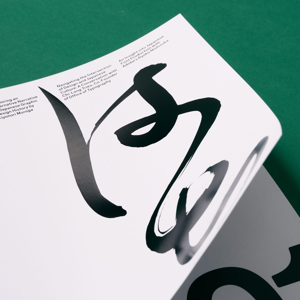
Foilco put that idea to the test on the cover of TYPEONE Magazine, Issue 08. This issue was built around Japanese design, typography, and visual storytelling, where every material choice was made with intention. Rather than layering ink to achieve a rich black, the cover uses Foilco’s solid black pigment foil in a single application, achieving a flat, opaque finish with sharp, consistent detail from edge to edge.
That consistency is one of pigment foil’s advantages: unlike ink, which can vary in density depending on coverage and layering, foil holds a uniform finish across the whole surface, every time. Ink isn’t going anywhere, and it shouldn’t, but for the right job, pigment foil offers a faster, cleaner, solvent-free alternative with results that are hard to replicate any other way.

Colour, Not Shine
Across the Brush Stroke collection and projects like the TYPEONE cover, the message from Foilco is consistent: foil doesn’t need to sparkle to make an impression. Sometimes the boldest choice on a page is simply a flat, perfectly opaque colour, laid down with total precision.
Want to see it for yourself? Foilco is offering samples of the Pigment Foil range to try in your own studio — get in touch to request one.

Want to know more about our membership? Give us an email at members@peopleofprint.com.
- You Don’t Have to Shine to Stand Out: Foilco on the Art of Pigment Foil - September 7, 2026
- From Amsterdam to Rome: Alice Pugini Marks Ten Years of Design with a New Chapter for Block & Branch - September 1, 2026
- Showing Up Regardless: Mrudula Kuvalekar’s 30 Days of Poetry Comics - September 1, 2026


