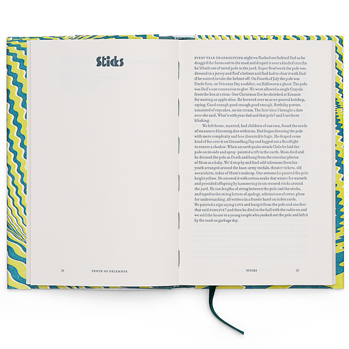
Berlin publisher TOC marks its tenth edition with a letterpress Tenth of December that pairs Zuzana Licko’s Filosophia with a deliberately chaotic set of chapter heading typefaces, combining optical illusion bookmaking with a typography that honours, then gleefully disrupts, Saunders’ own narrative spirit.
Tenth of December is the tenth edition in TOC’s library, which made the choice of George Saunders feel quietly right.
The rave reviews, as publisher Birgit Schmitz puts it plainly, are all true: “Not just about the craftsmanship of his short stories, that’s only one layer, but he’s everything you want in an author: witty, surprising, mind-bending, and deeply compassionate, not only toward individual lives but also the society we all share.”
Finding a design language equal to that description was the challenge.
Susanna Dulkinys approached the jacket first through optical illusions, images where things are not what they appear to be. She selected patterns and colour with a sharp, deliberate eye: three-dimensional waves resting on a contrast of blue-green linen, complemented by pistachio-coloured endpapers. The effect is composed and quietly disorienting, which is exactly the territory Saunders occupies.

Inside, typographer Erik Spiekermann saw a chance to push design boundaries in the same way Saunders pushes narrative. His first instinct was disciplined: Filosophia, the typeface designed by Czech-American type designer Zuzana Licko, based on Bodoni, classic, refined, and structurally perfect for the body text. Then the temptation proved irresistible. Spiekermann opened what he calls his “dirty fonts” folder. Every chapter heading is now set in a wildly different, playful typeface, creating a sequence of delightful typographic contrasts that run through the book like Saunders’ own tonal shifts, serious and then suddenly not, formal and then loose, always in service of the story.

The production combines TOC’s in-house digital workflows with a Heidelberg Cylinder press operated by Daniel Klotz, transferring layouts onto polymer plates via lasersetter to achieve the smooth impression of letterpress without the prohibitive cost of traditional metal typesetting. The result is what TOC describes as the best of both worlds: refined digital typography and a tactile analogue reading experience, the precision of one tradition and the warmth of another.

TOC is a Berlin-based publisher dedicated to reimagining the art of the book, combining the precision of analogue craftsmanship with digital innovation. Designers Erik Spiekermann and Susanna Dulkinys lead the visual work; Birgit Schmitz is publisher.
ARTIST LINKS
toc.berlin
@tocpublishing
Tenth of December by George Saunders, TOC Edition 10. Letterpress on Heidelberg Cylinder press. Jacket design: Susanna Dulkinys. Typography: Erik Spiekermann. Publisher: Birgit Schmitz. Photography: Norman Posselt.
People of Print Members
TOC Publishing is a People of Print Member. Membership gives artists, designers and printmakers access to a growing community of creatives, opportunities to be featured across POP’s platforms, and a space to share work with an engaged, print-focused audience. Find out more at peopleofprint.com.
Want to know more about our membership? Give us an email at members@peopleofprint.com.