Graduating NID designer Neya Prabu reimagines how the Tamil script can be learned through visual relationships and form, developing an experimental publication in the Netherlands that grew from her grandmother’s teaching methods and became a way to share a part of her cultural identity through design.
The idea did not arrive in India. It arrived in the Netherlands, where Neya Prabu was studying, surrounded by people from different cultures and languages, and finding herself explaining Tamil letters to anyone who expressed an interest. The method she fell back on was the one her grandmother had used: visual associations, comparisons, patterns between forms. That approach, grouping Tamil vowels and consonants by their visual similarities rather than their conventional order, became the foundation of the publication.
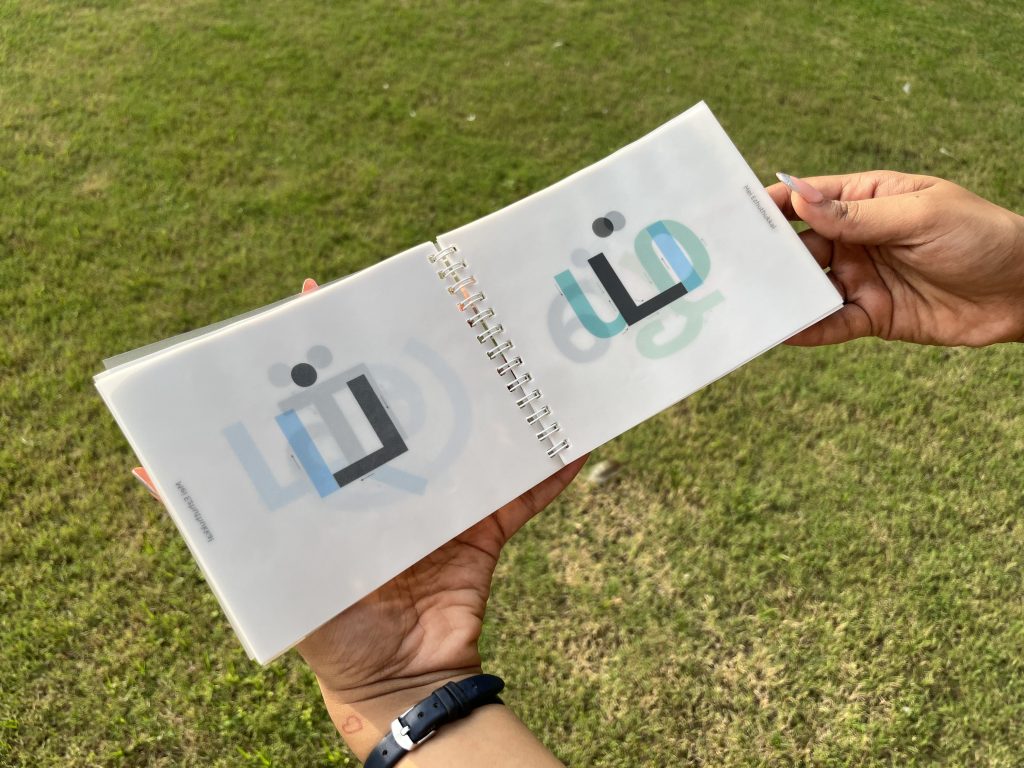
Tamil is an experimental type publication developed over four months and printed in December 2024, printed on 70gsm tracing paper and spiral-bound so the pages lie perfectly flat. Photographed in sunlight, the translucent pages reveal how forms evolve and transform as they overlap, the letters shifting and combining across layers. Arrows throughout the publication indicate the correct stroke direction for writing each character, making the work both analytical and instructional. The design is driven by experimentation: extensive trial and error across categorisation, overlays, sequencing and composition, iterated until the visual logic of the Tamil script became navigable through form rather than rote.
“I’ve always been someone who felt the need to have everything perfectly figured out before beginning, and often that stopped me from making at all,” Prabu says. “This project was different. I simply started making, and the ideas developed as I translated what I imagined into form. Through that process, I became comfortable with not getting it right the first time, or even the tenth time.”

The honesty in that reflection is part of what makes the project meaningful. It did not arrive polished. It arrived through making.
She was, by her own admission, initially hesitant to submit it. “I felt it needed to be more polished and refined. But I’ve moved past that way of thinking now.” The publication currently exists as a printed object, with the potential to evolve into interactive learning tools, games and practice books. For now it stands as something more immediate: a designer working through cultural reconnection by making something genuinely useful for others.

Neya Prabu is a graduating designer at the National Institute of Design, Ahmedabad, whose practice explores visual systems, user experiences and storytelling. She is co-founder of CUT LOOSE, a collaging club at NID.
Website: neyaprabu.com
Instagram: @neyaa_prabu
Tamil, 2024. Experimental type publication. 70gsm tracing paper, spiral-bound.
People of Print Members
Neya Prabu is a People of Print Member. Membership gives artists, designers and printmakers access to a growing community of creatives, opportunities to be featured across POP’s platforms, and a space to share work with an engaged, print-focused audience. Find out more at peopleofprint.com.
Want to know more about our membership? Give us an email at members@peopleofprint.com.